This course focuses on uGUI and Sprite as the main objects drawn on a 2D plane in Unity and how to use them.
uGUI and Sprite can also be placed in 3D space. uGUI and Sprite can be used for various expressions in VR/AR in addition to 3D data.
What is uGUI?
uGUI is a mechanism for creating UI in Unity.
Specifically, it is a generic term for a series of game objects (hereinafter referred to as uGUI objects) that can be created under the “UI” menu in the hierarchy, and a mechanism that consists of those components.
Just to be clear, UI stands for “User Interface,” which literally means the part of the system that interfaces with the user.
Usually, the system performs some kind of processing by the user’s operation and shows the result or reaction to the user, such as buttons, text, and other components.
It may be easier to understand if you think of the menus of games and apps.
In VR and AR, UI can be placed in a 3D space, so UI itself can take various forms without being limited by 2D constraints. uGUI is designed for a 2D screen or UI placed on a flat surface in a 3D space, and consists of 2D buttons, text, and other components.
In VR and AR, various interactions and expressions are possible by utilizing uGUI.
About the term “uGUI” and its designation
Although uGUI is referred to as ” Unity UI ” in the Unity version 2019.3 manual, we will refer to it as “uGUI” in this course for the following reasons.
- To distinguish it from other existing Unity UI systems and make it easier to identify.
- In Unity 2019.3, it is provided as a package by Package Manager, but its official package name is “com.unity.ugui”, so
Canvas.
The Canvas is the essential object to configure the UI in uGUI.
This object can be created by selecting UI > Canvas from the hierarchy menu.
In addition to the Canvas component, several other components are attached from the beginning.
The following are some points to note
- All uGUI objects must be children of Canvas (if there is no Canvas in the scene and you create a uGUI object such as Text, for example, Canvas will automatically be created as the parent object).
- Within a Canvas, the children are drawn in the order of the hierarchy structure, e.g., if a Canvas has two children, the second child will be drawn after the first, i.e., on top.
Render Mode
The Render Mode property of the Canvas component determines on which space the uGUI objects that are children of Canvas are placed.
Mainly, it determines whether it will be placed on Screen Space (space on the screen plane) or World Space (anywhere in world coordinate space).
Specifically, the following modes are available
World Space
Can be placed anywhere in world coordinate space like a 3D object.
It can also be manipulated by touching it with a VR controller.
Screen Space – Overlay
The object is always drawn (placed) as an overlay at the very front of the screen.
This is the default mode.
Specifically,
- STYLY VR APP
- This is not displayed on the HMD, but is displayed in the application window on the PC display if the HMD is a PC-connected HMD.
- Other STYLY environments (STYLY Studio, STYLY Mobile, etc.)
- It will be displayed at the top of the display.
uGUI (STYLY Studio screen) on Canvas set to “Screen Space – Overlay
Screen Space – Camera
Specify a Camera to draw on, and draw on the screen plane of the Camera.
For example, you can set a Render Texture as the Camera’s Target Texture and use the Material with that Render Texture to display on the GameObject.
If you do not specify a Camera, it is the same as “Screen Space – Overlay”.
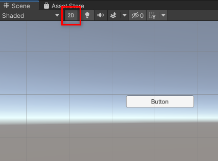
Editing the Layout of uGUI Objects
Let’s prepare a new scene.
One tip for editing uGUI is to turn on the 2D button on the control bar of the scene view, so that the view becomes a 2D editing view.
This will make it easier to edit the uGUI since the Canvas will face forward to the camera in the scene view.
Use it as needed.
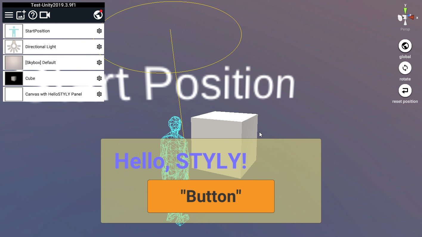
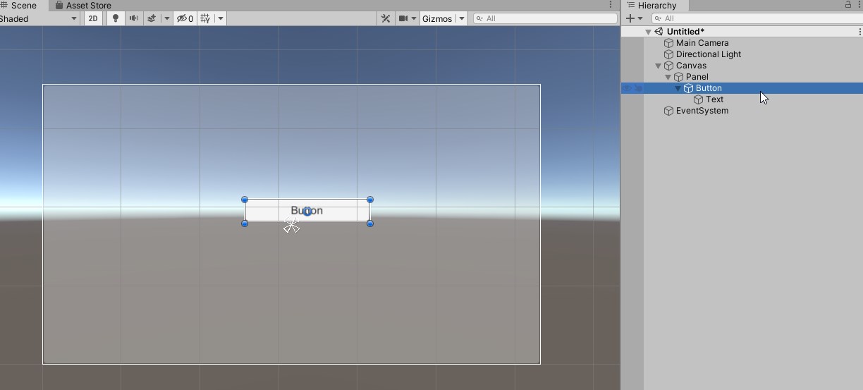
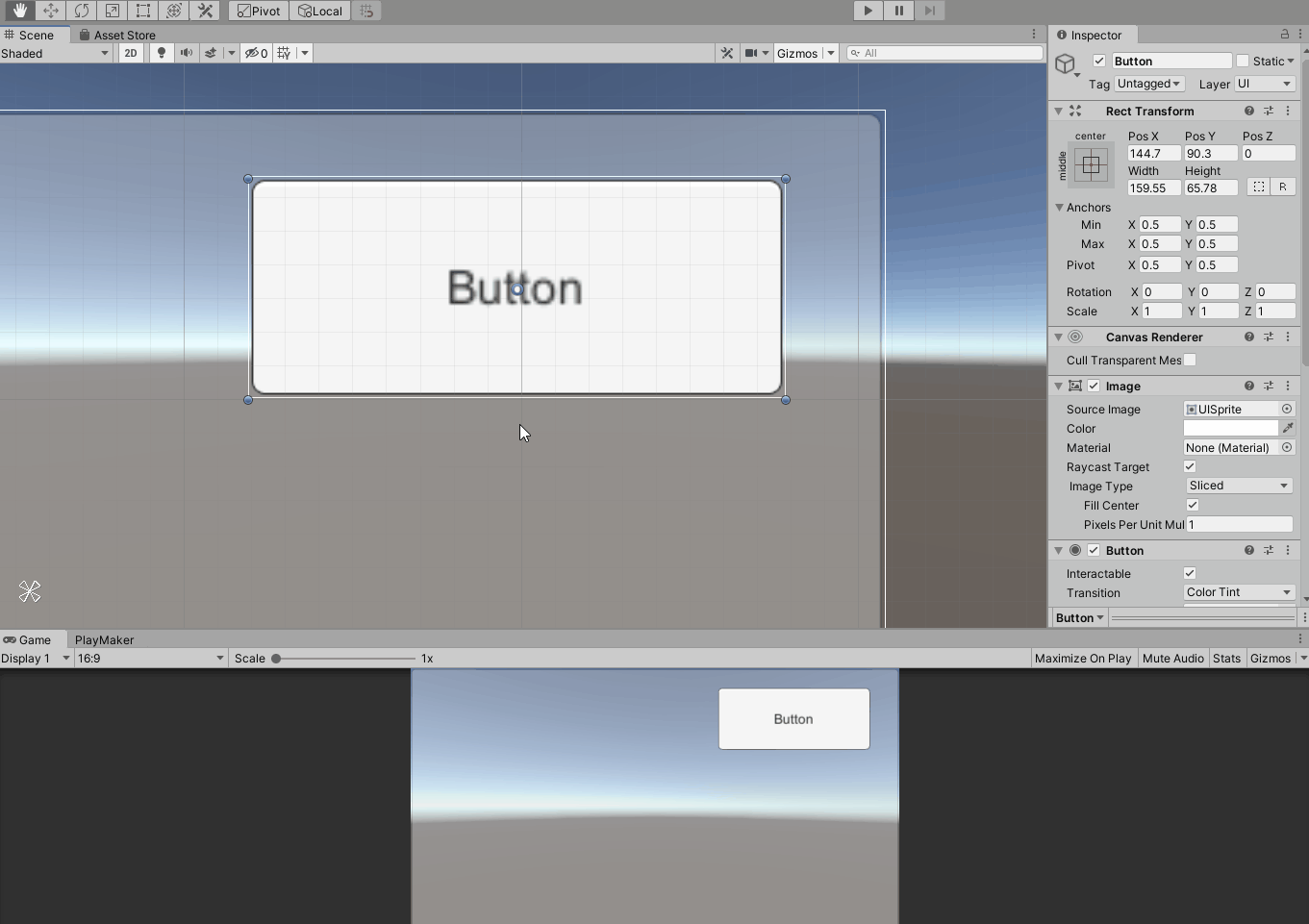
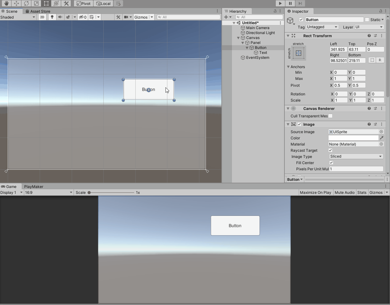
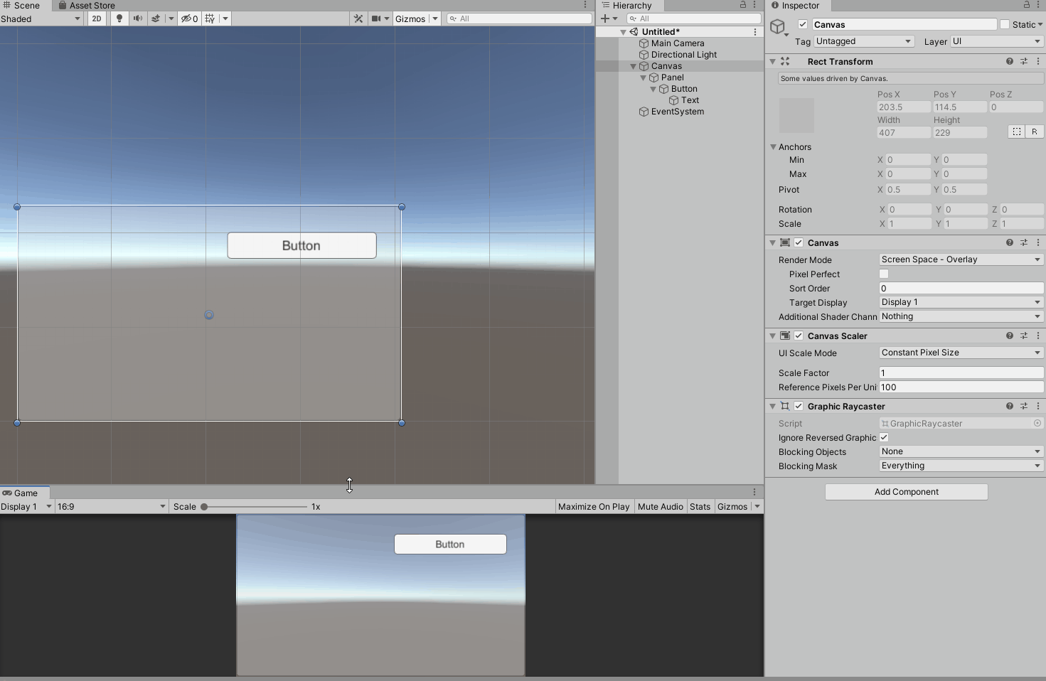
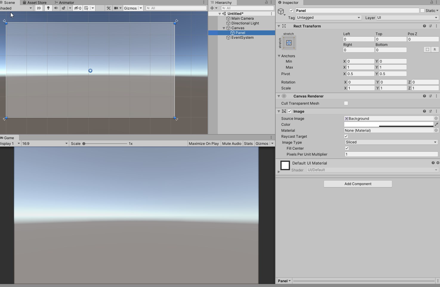
Preparation: Place a Panel and a Button
As an example, we will use uGUI’s Panel and Button.
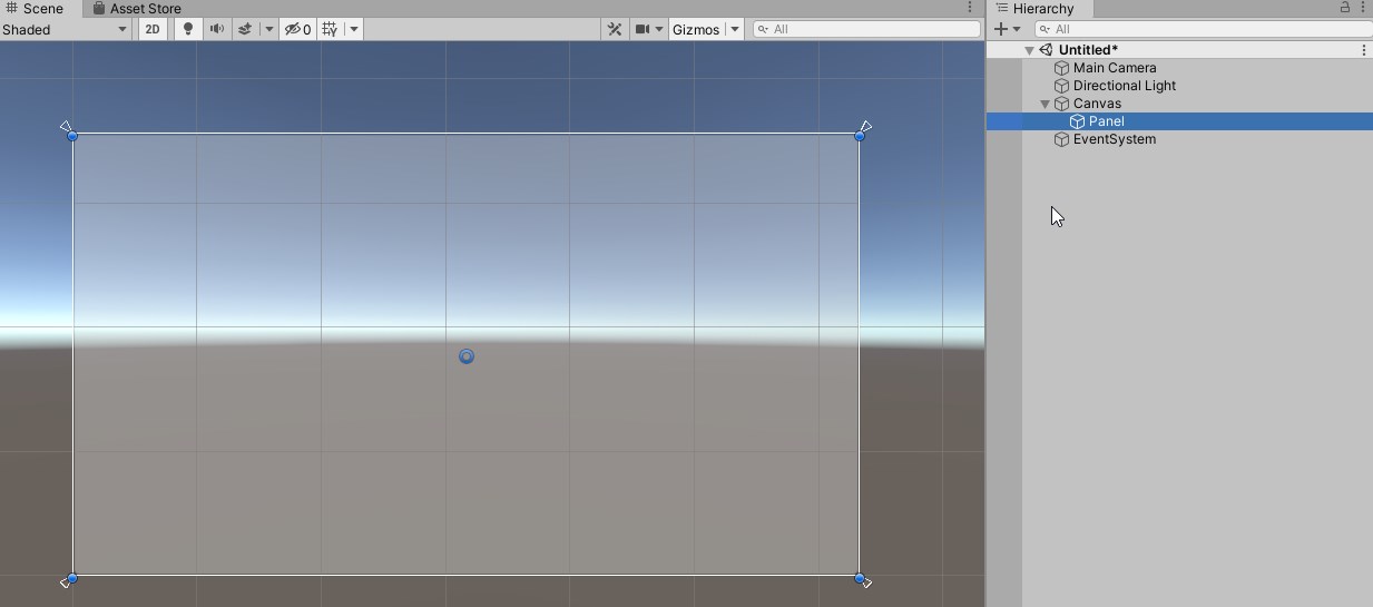
First, create a Panel in the scene.
It can be created by clicking [UI] > [Panel] in the hierarchy.
About the coordinate system of the space
The scale of a uGUI object on the scene view looks quite large compared to a Cube with Scale of 1, for example.
As explained in the Render Mode section, uGUI is Screen Space by default,
As explained in the Render Mode section, uGUI is in Screen Space by default, and 3D models such as Cube are in World Space, which are originally in different coordinate systems.
Screen Space is a pixel-based space that depends on the screen size (game view in the Unity editor) and camera settings.
In order to force these different coordinate systems to be displayed on the same space called scene view, they are displayed respectively in the scene view definition, so they are displayed with different scales in scene view.
Incidentally, in scene view, the uGUI object is placed at the lower left corner of the Canvas at the origin of World Space, and one pixel is displayed at a scale of 1 unit.
If the Render Mode of the Canvas is set to World Space, it will be in the same coordinate system as the Cube, etc., so adjusting the Scale will display it at the same scale.
In the case of Screen Space, it is necessary to keep the screen size in mind while creating the uGUI layout.
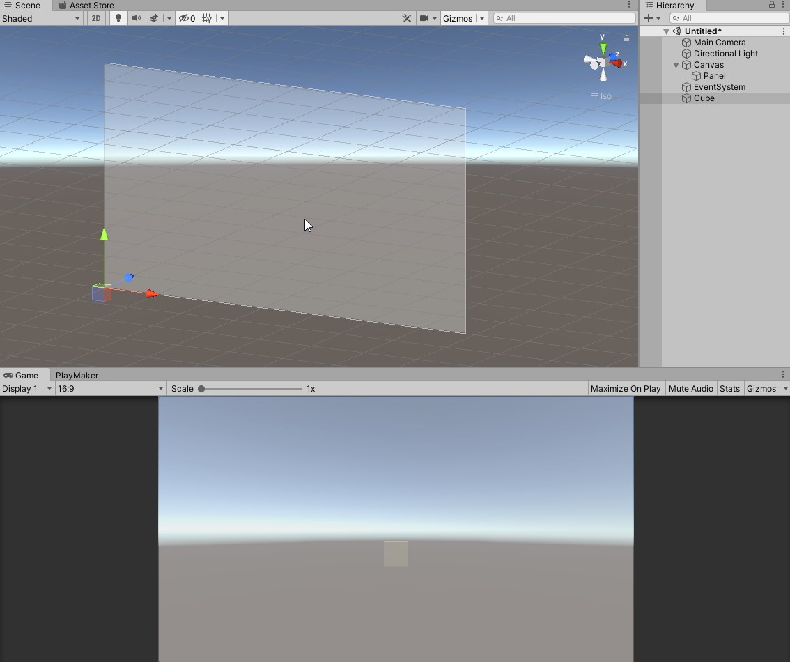
When a Panel is created, a Canvas is automatically created as the parent of the Panel since there was no Canvas yet.
Also, an object called EventSystem is created together at this time.
This object has the function of sending user input to the UI.
We won’t go into details this time, but it is easy to understand if you think of this object as being able to use buttons, etc. with it.
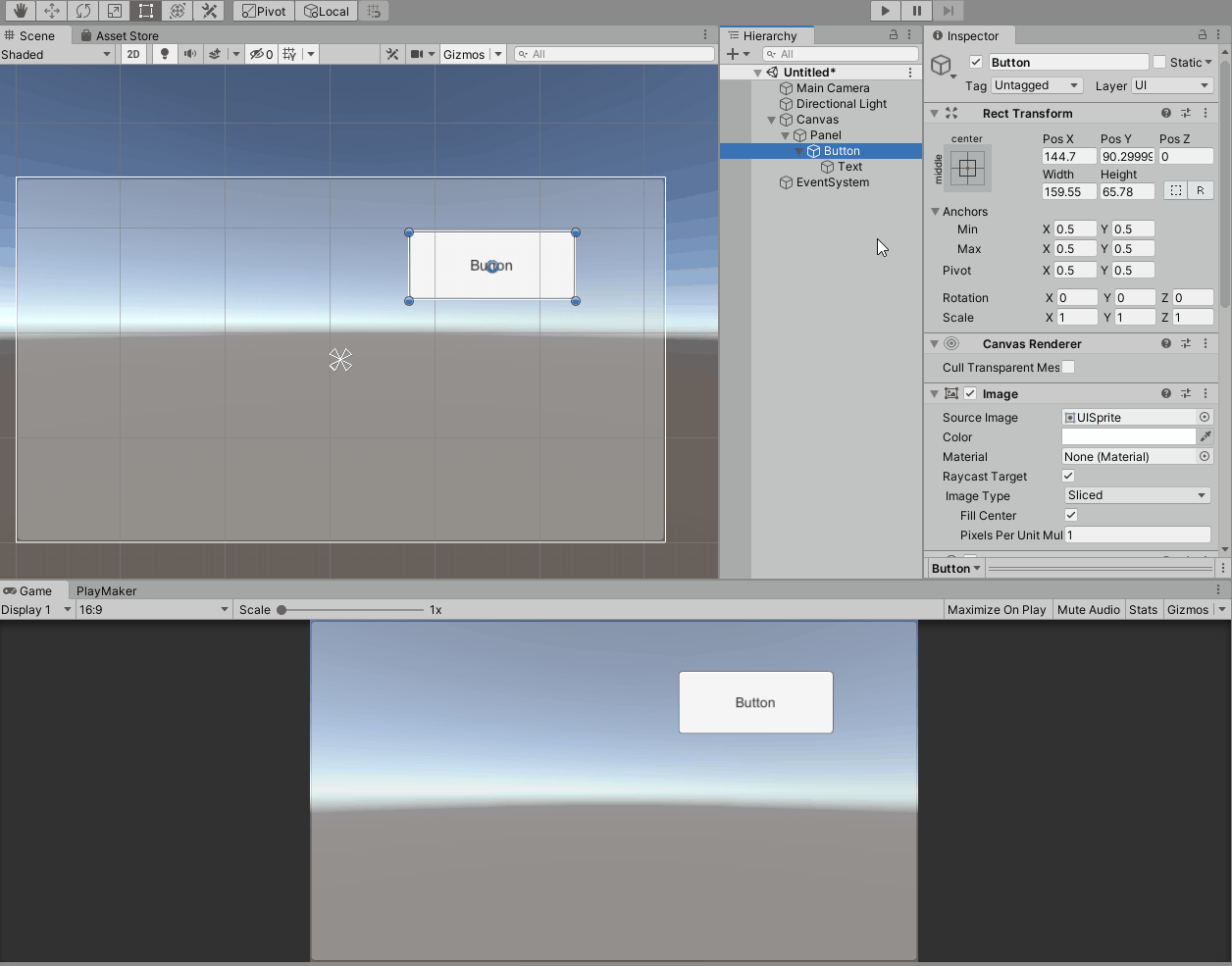
Next, create a Button and make it a child of Panel.
Create it by going to Hierarchy > UI > Button and drag and drop it onto the Panel you created earlier.
(The Button will automatically have a uGUI object named Text as a child).
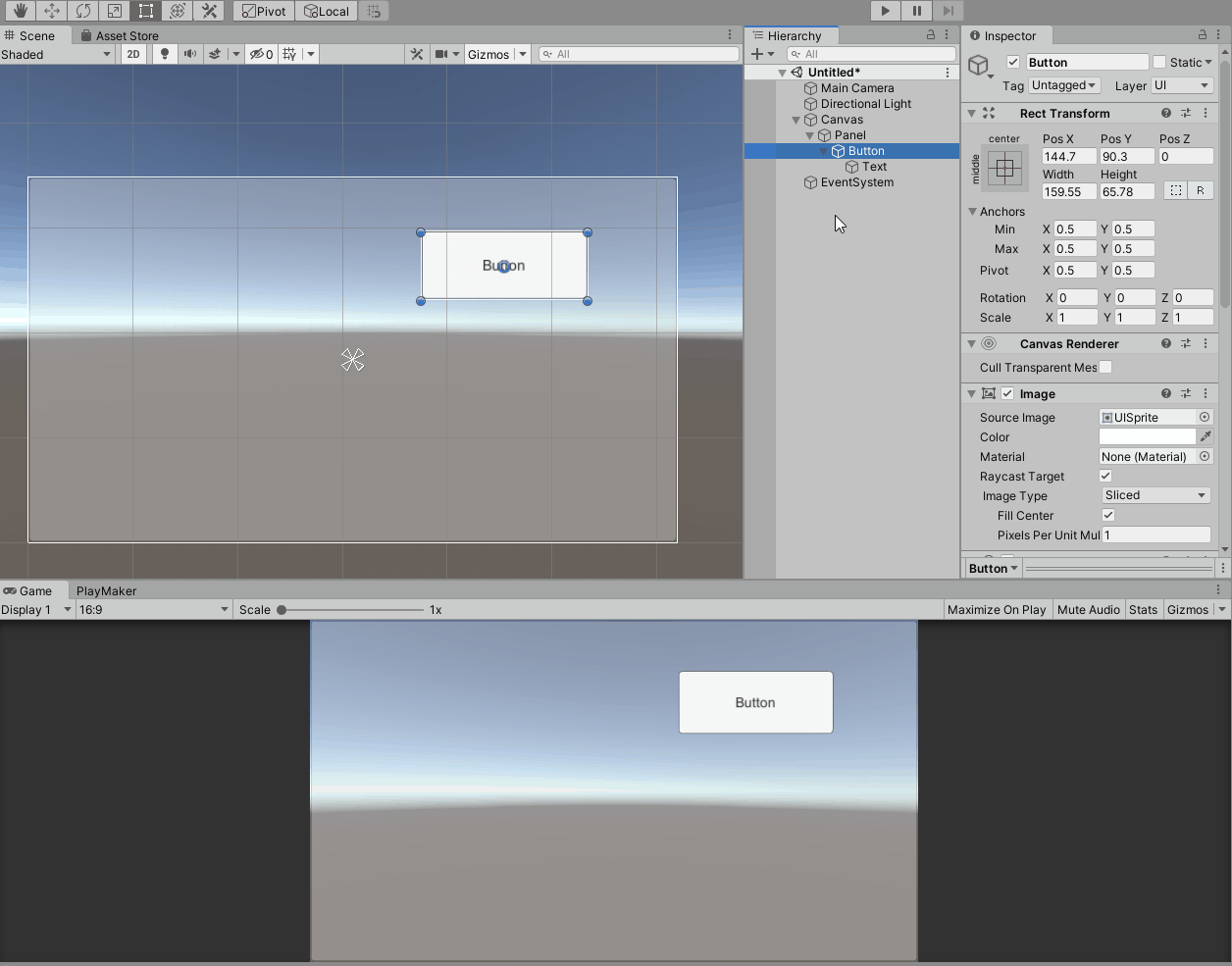
How to use RectTransform and RectTool
The uGUI object has a dedicated component called RectTransform component instead of Transform component.
Like Transform, it has position, size and rotation information, but its properties and how to edit them are different.
To edit the position, size, and rotation of uGUI objects, there is a dedicated tool called RectTool that corresponds to RectTransform.
Rect means rectangle.
All uGUI objects are represented as rectangles when editing layout, and layout is performed by editing and manipulating these rectangles.
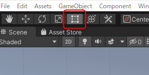
The RectTool can be selected from the toolbar in the upper left corner of the Unity editor, so switch to this tool when editing the position, size, or rotation of the uGUI.
When the *2D button is turned on, RectTool is automatically selected.
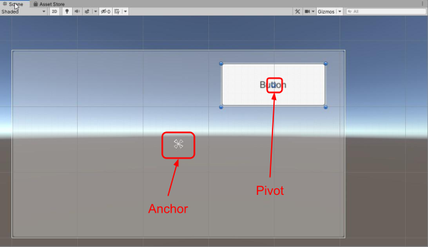
Look at the scene view with Button selected in the hierarchy.
There is a blue circle in the center of Button.
This is called the Pivot and is the center of the uGUI object.
The four corners of the Button’s rectangle are shown as filled blue circles.
There are also four triangles in the center of the parent Panel.
These are called Anchors, which will be explained later.
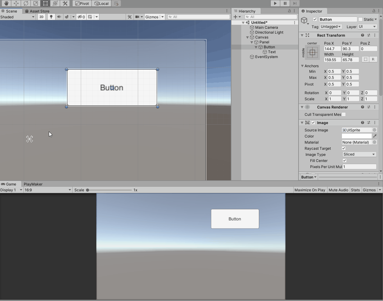
Changing the Position
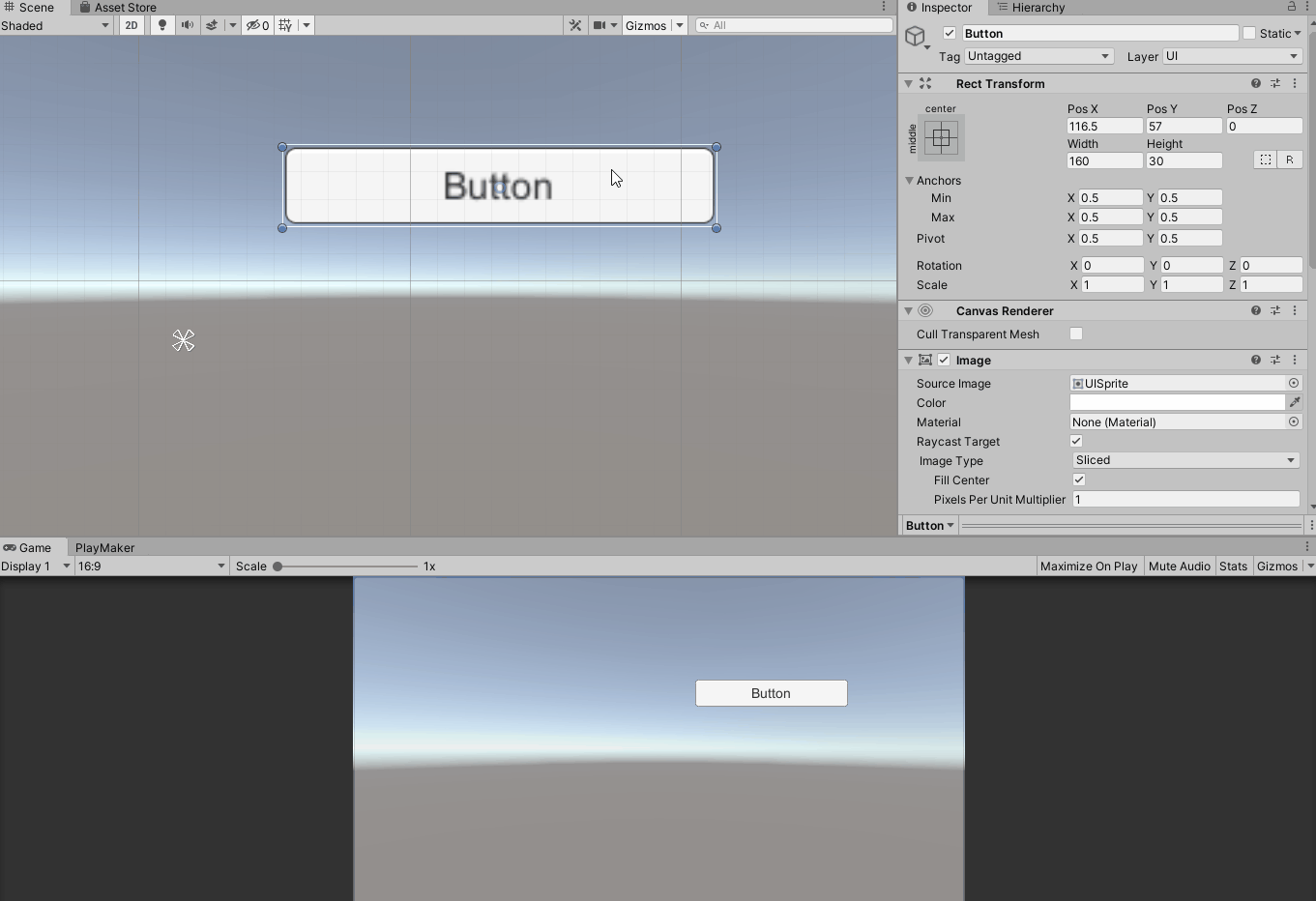
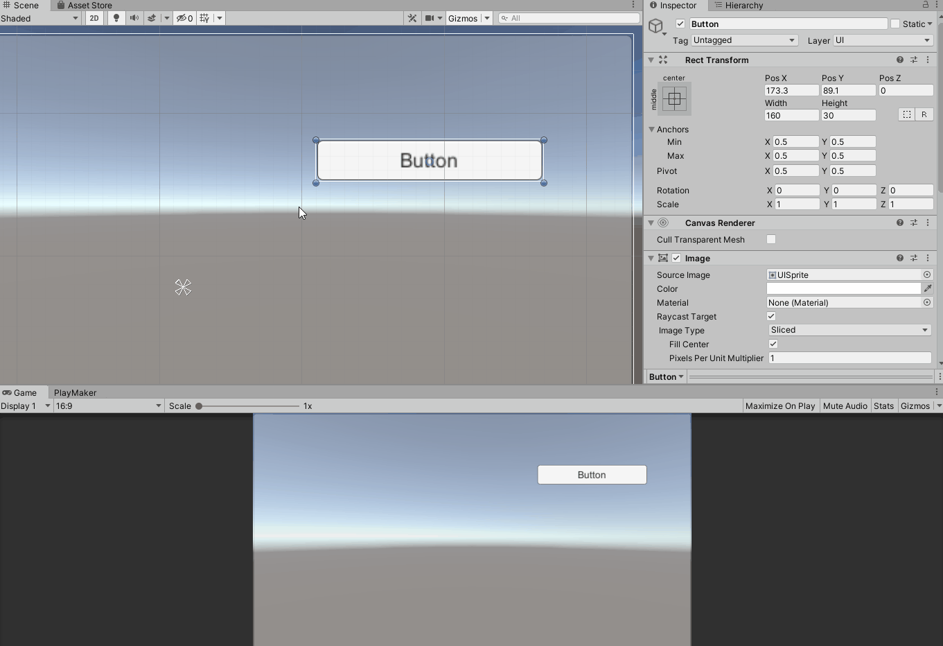
Changing the position can be done by grabbing and dragging anywhere on the uGUI object in the scene view.
In the inspector, you will see that the Pos X and Pos Y values of the RectTransform have changed.
The “Pos X” and “Pos Y” values are the X and Y coordinates relative to the Pivot’s Anchor, respectively.
You can also edit the values by entering them into the respective fields in the inspector.
In the scene view, the Pos X and Pos Y values are displayed with a white dotted line for visual indication while dragging.
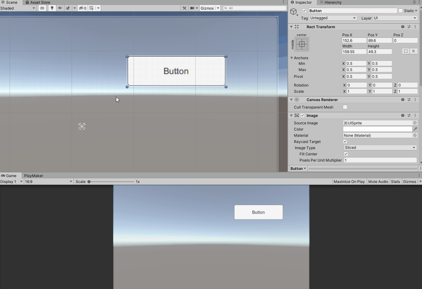
Changing the size
To change the size of a uGUI object, drag the blue circles on the four corners of the rectangle to change the width and height at the same time, or drag the edges of the rectangle to change either the width or height.
In the inspector, you will see that the RectTransform’s “Width” (and Pos X) value changes when the width is changed, and the “Height” (and Pos Y) value changes when the height is changed.
The “Width” value is the width of the uGUI object’s rectangle, and the “Height” value is the height of the rectangle.
Of course, you can also edit by entering numerical values in each field of the inspector.
When editing by dragging, the Pivot’s position will also change, so the Pos X and Pos Y values will also change.
In the scene view, while dragging, the values of Width and Height and the white dotted line of the axis on the Anchor side corresponding to the item to be changed are displayed so that the user can visually understand the change.
Changing the Rotation Angle
To rotate, grab the mouse cursor close to the blue circles at the four corners of the rectangle with the cursor in Rotate mode, and drag.
If you look in the inspector, you will see that the value of Rotation Z in RectTransform has changed.
The Rotation Z value is the angle of rotation around the Pivot.
Of course, you can also edit it by entering a numerical value in the inspector field.
Changing the Position of Pivot
You can change the position of the Pivot of the uGUI object when it is in Pivot mode using the Pivot/Center toggle button in the upper left corner of the Unity editor.
To change the position of Pivot, grab and drag the blue circle on Pivot.
In the inspector, you will see that the X and Y values of the Pivot in the RectTransform have changed.
The Pivot X and Y values are the coordinate values of the Pivot position when the lower left edge of the rectangle is the origin (0, 0) and the upper right edge is (1, 1).
For example, (X, Y) = (0.5, 0.5) for the center of the rectangle and (X, Y) = (1, 1) for the upper right edge of the rectangle.
Of course, you can also edit the values by entering them in the inspector.
Anchor
uGUI has a flexible layout function based on the Canvas size.
This is especially useful when placing in Screen Space, as it is necessary to accommodate screens of various sizes (resolutions) and aspect ratios.
Anchor is an important part of this functionality.
Anchor determines how it positions and sizes itself relative to the parent uGUI object.
As mentioned above, Anchor consists of four triangles.
Each triangle corresponds to a point at the four corners of its own rectangle, and when the position or size of the parent changes, i.e., when Anchor’s position changes, its position and size change so that the distance between each of the four remains constant.
It is as if they are struck by Anchor and fixed in place.
Let’s try this out.
Let’s see how a Button is laid out when its Anchor is positioned at the center of its parent Panel and the position and size of the Panel are changed.
You can see that the distance between the center of the Panel and the four corners of the Button is laid out so that the distance between the center of the Panel and the four corners of the Button is constant.
If the Panel becomes somewhat smaller, the Button will protrude.
Changing the Anchor Position
Next, let’s change the Button’s anchor position to the upper right corner of the Panel.
We can change the position of each triangle, but we will move them all to the upper right edge.
To move them, grab the center of the Anchor and drag it.
Let’s see how the Button will be laid out if we change the position and size of the Panel in this state.
The Button is now laid out at a constant distance from the upper right edge of the Panel.

Now we want to position each of the Anchor triangles differently.
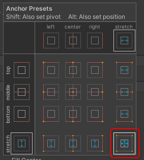
In the previous example, we dragged the Anchor directly, but there are presets of frequently used Anchor positions that can be selected to change the Anchor position.
Button Anchor presets can be selected from the Anchor Presets button in the upper left corner of the RectTransform.
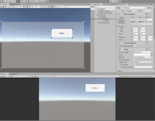
Let’s set the Button’s Anchor to the four corners of the parent with the bottom right preset.
Let’s see what happens when we change the Panel in this case.
In this case, the size of the Button changes in conjunction with the change in the parent (Panel).
The result is a layout that keeps the distance between the four corners of the parent, which is the position of the Anchor, and the four corners of the corresponding Button at a constant distance.
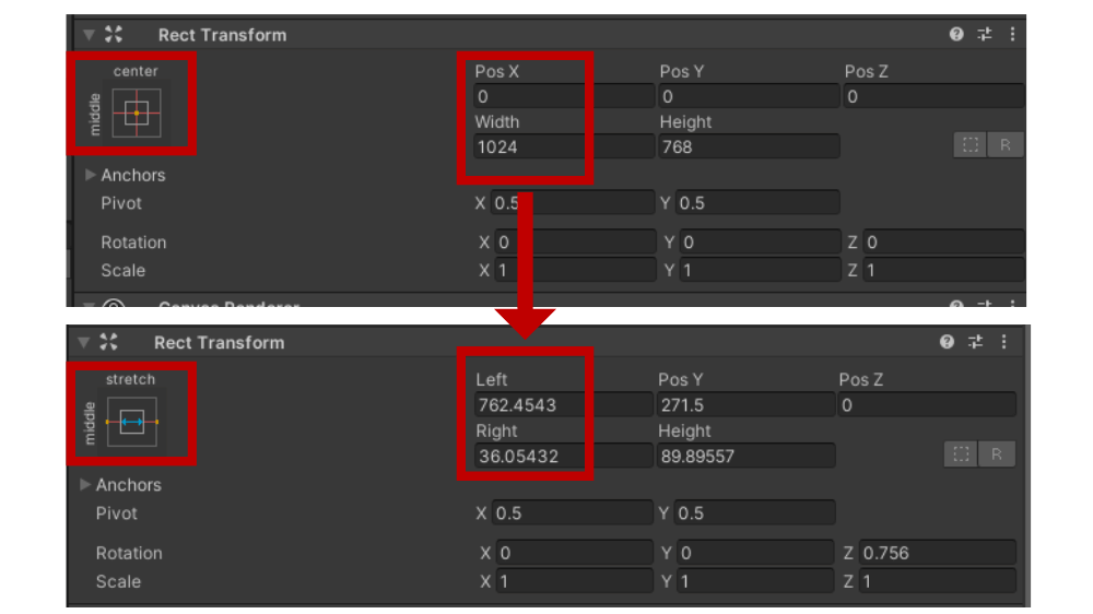
RectTransform display when Anchor is split
When an Anchor is split, the RectTransform display changes.
When all four are split, the display changes as follows
- Pos X → Left
- Pos Y → Top
- Width → Right
- Height → Bottom
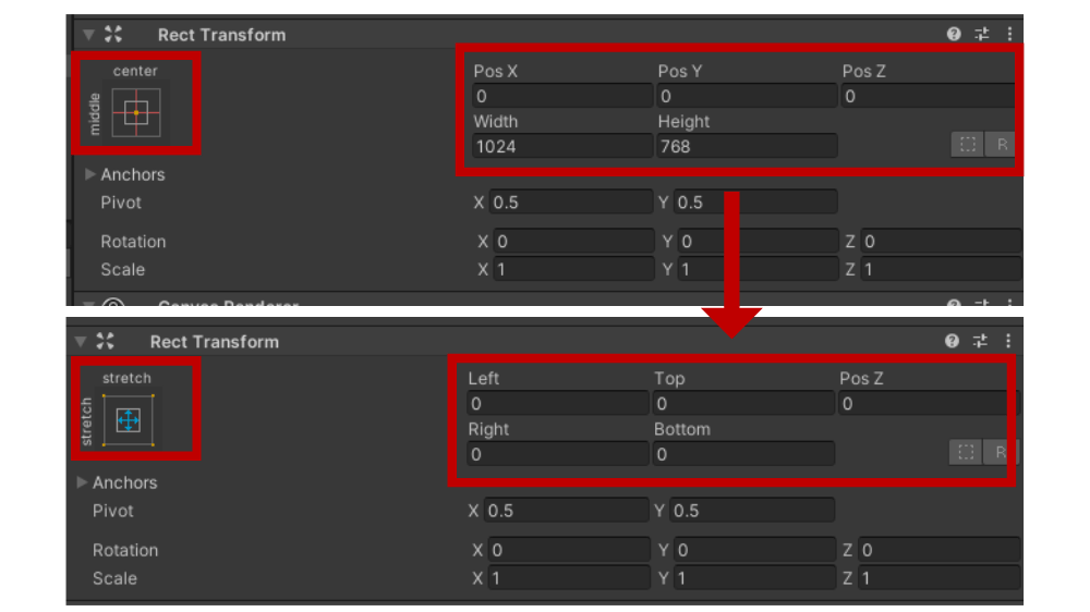
It is easy to understand that Left, Top, Right, and Bottom are the padding of the parent rectangle as a container for the uGUI object.
In other words, Left is the distance from the left edge of the parent to its own left edge, Top is the distance from the top edge, Right is the distance from the right edge, and Bottom is the distance between the bottom edges.
When you drag a Button, it is visualized as a white dotted line and a numerical value in the scene view, so it is easy to understand.
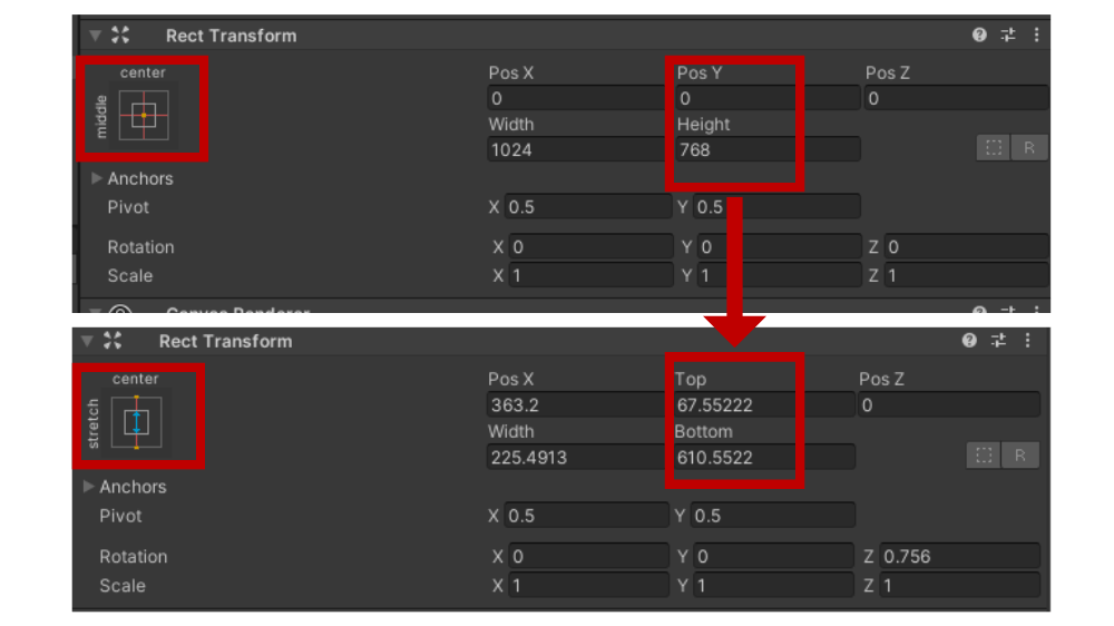
Incidentally, this display changes partially in response to the direction in which the Anchor is split.
If Anchor is split only in the X-axis direction, the display changes as follows
- Pos X → Left
- Pos Y → As is
- Width → Right
- Height → As is
When Anchor is divided only in the Y-axis direction, the display changes as follows.
- Pos X → As is
- Pos Y → Top
- Width → As is
- Height → Bottom
Let’s take a look at the display of Anchor values in the inspector.
Anchors in RectTransform have Min and Max, and X and Y respectively.
Anchor Min is the Anchor of the bottom left triangle and Anchor Max is the Anchor of the top right triangle.
The respective X and Y coordinates are the origin (0, 0) at the lower left corner of the parent rectangle and (1, 1) at the upper right corner.
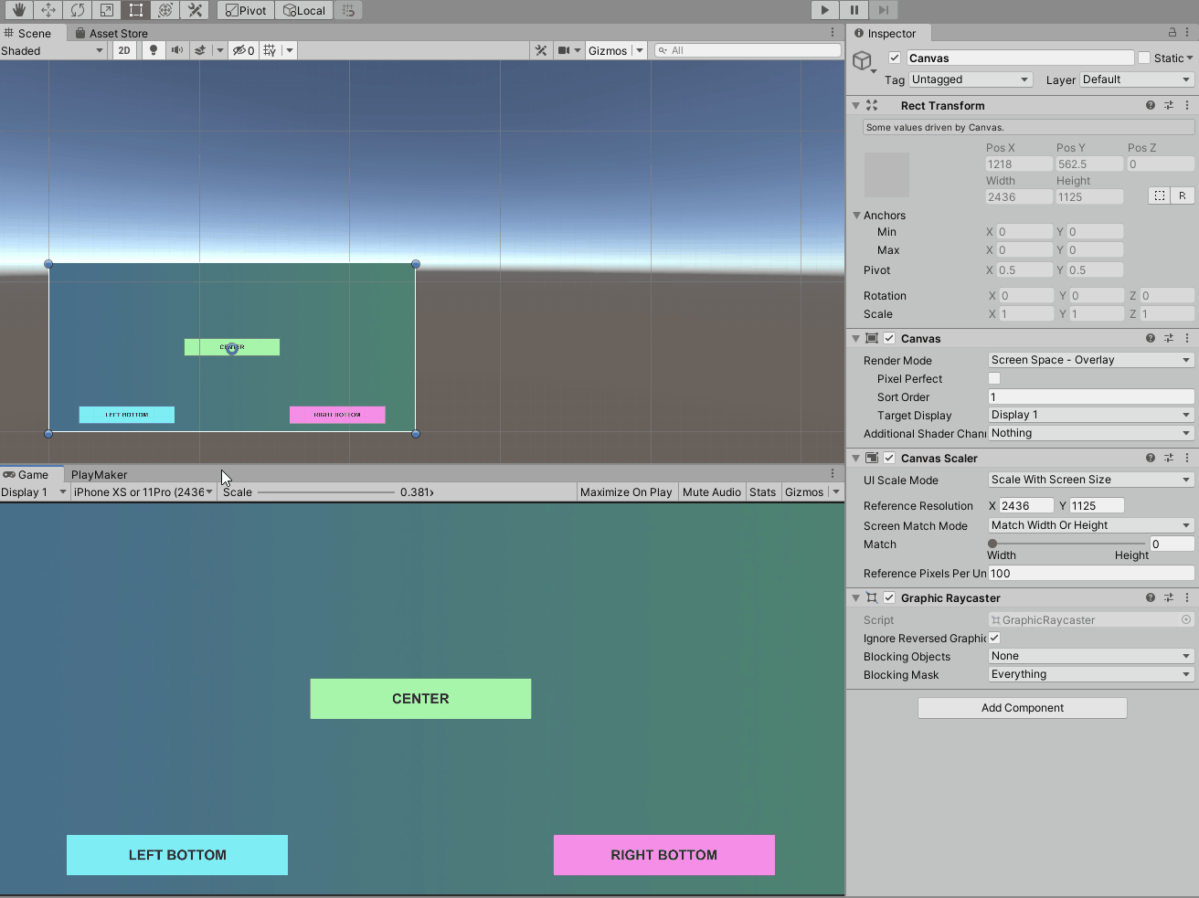
Canvas Scaler
Anchor determines how it positions and sizes itself in relation to the parent uGUI object and is flexible in its layout when the parent changes.
There are other flexible layout features of the uGUI as well.
The Canvas Scaler component, which is attached to the Canvas by default, can scale the position and size of the Canvas and all uGUI objects within it in various ways.
If the Canvas size is not fixed, the uGUI layout may not be as intended if the Canvas Scaler component is not properly configured.
In particular, when the uGUI is overlaid on the screen with the Render Mode set to “Screen Space – Overlay,” the screen size and aspect ratio of the device environment experienced by the user will directly affect the Canvas size.
Therefore, if there is a wide range of screen sizes and aspect ratios, the Canvas Scaler component must be configured appropriately.
Screen Size Simulation in the Unity Editor
To simulate various screen sizes and aspect ratios, use the control bar and window size in the game view.
- Select an aspect ratio (e.g. 16:9) and move the window to change the screen size while maintaining the aspect ratio.
- To set a fixed resolution, select the item for which the resolution is set; in this case, moving the window only scales the display in the game view and the layout simulates the selected resolution (it is only scaled by the Scale value in the control bar).
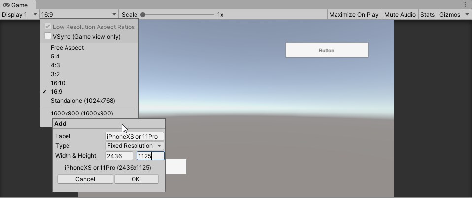
- In addition to the preset resolutions and aspect ratios, you can create your own fixed resolution and aspect ratio items using the + button.
Select resolution or aspect ratio in the game view control bar.
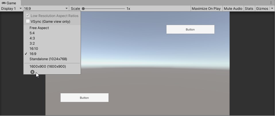
Creating a fixed resolution item
UI Scale Mode property
The UI Scale Mode property determines the basic scaling mode.
Each mode switches the properties that can be set, so set each of them.
The following is an explanation for each mode.
Constant Pixel Size
This is the default mode.
In this mode, the position and size of uGUI objects are fixed in pixels.
If the canvas size is fixed, this mode may be suitable.
If the Canvas size is not fixed, the uGUI object may be out of view or at worst invisible, depending on the position of the Anchor.
The Scale Factor property allows you to specify the scaling factor.
For example, setting Scale Factor to 2 will double the position and size of all uGUI objects in the Canvas.
In either case, there will be no scaling with screen size.
Scale With Screen Size
In this mode, uGUI objects are scaled according to screen size and aspect ratio.
In order to determine how the Canvas Scaler will scale with this mode, a reference resolution, called Reference Resolution, must be determined.
Set this reference resolution to X (width) and Y (height) in the Reference Resolution property.
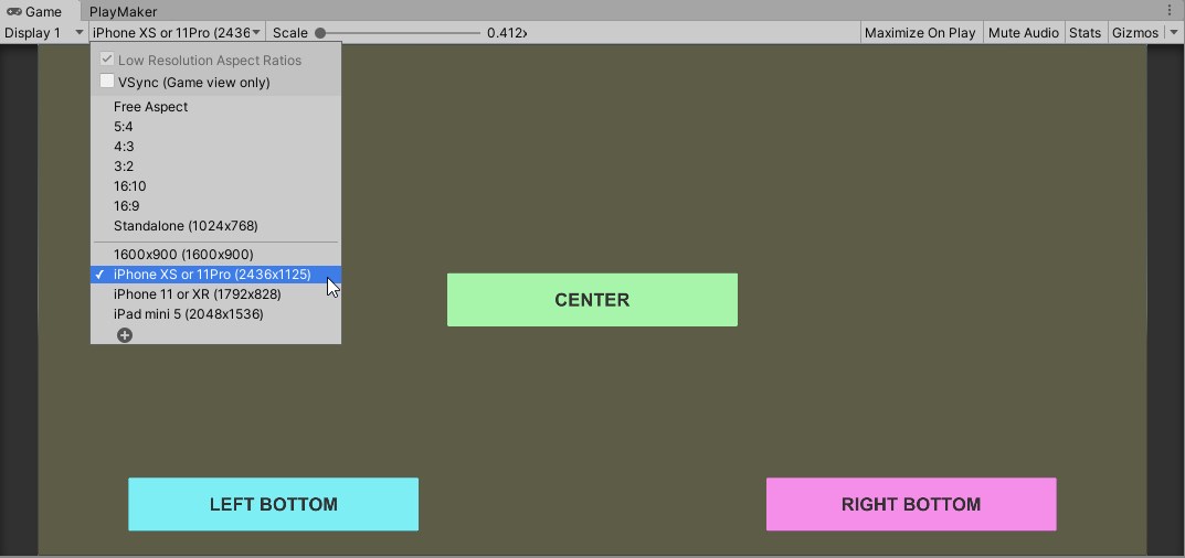
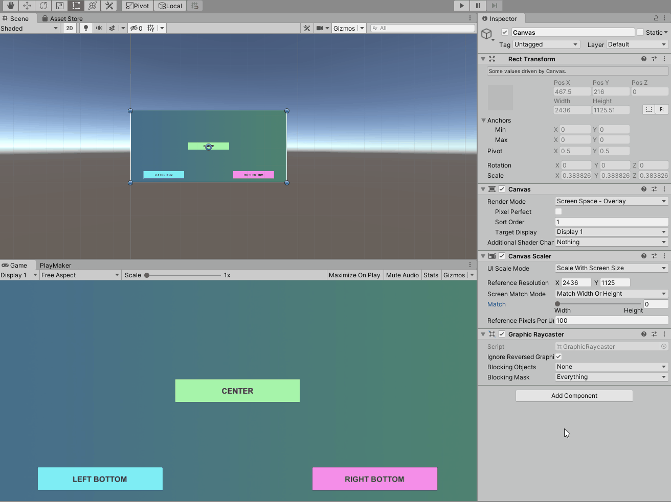
In the image below, the screen resolution (2436 x 1125) is set for the landscape orientation of the iPhone XS.
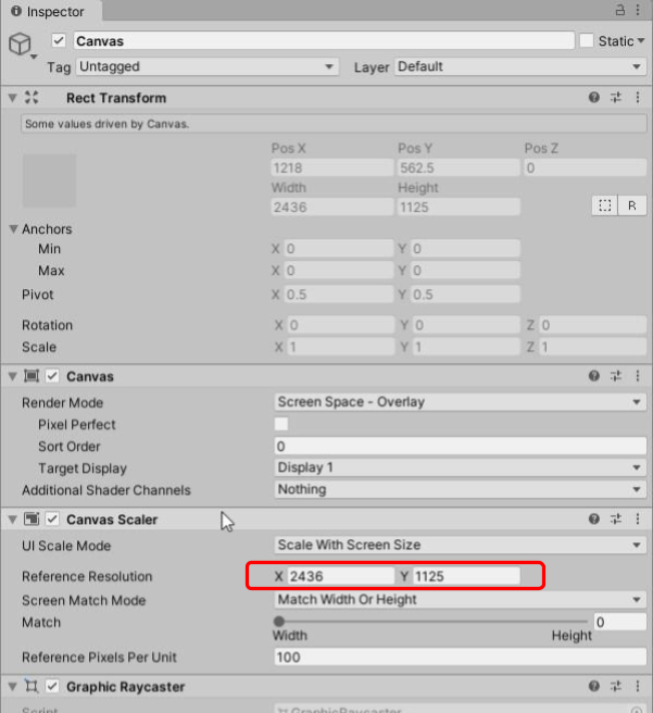
The game view is also set to this resolution, and the uGUI is laid out as designed at this reference resolution.
In the image below, the game view is also set to the iPhone XS landscape orientation (2436 x 1125), and the layout is set to this resolution.
The Anchor for each Button is positioned with the Button labeled “LEFT BOTTOM” at the bottom left of the Panel, the Button labeled “RIGHT BOTTOM” at the bottom right of the Panel, and the Button labeled “CENTER” at the center of the Panel.
How the image is scaled on a screen with a resolution different from the reference resolution depends first of all on whether the aspect ratio is the same as the Reference Resolution.
- When the aspect ratio is the same as the Reference Resolution
The image is scaled to the layout set in the Reference Resolution regardless of the screen size.
- When the aspect ratio is different from the Reference Resolution
When the aspect ratio differs from the reference resolution, the layout will inevitably differ from the layout set in the reference resolution.
In this case, the Screen Match Mode property determines the layout.
The Screen Match Mode has the following modes.
- Match Width or Height
The mode maintains either the width or height of the layout created with the reference resolution.
When the value of Match property is “0” (Width), the layout is scaled horizontally, and when the value is “1” (Height), the layout is scaled to maintain the vertical orientation.
If the value of Match is between 0 and 1, the layout is scaled accordingly to balance the horizontal and vertical orientation
- Expand
Scales the canvas so that the base resolution area fits into the canvas size
- Shrink
Shrink・The canvas is scaled down so that it fits into the standard resolution area.
Let’s take a look at each Screen Match Mode.
To make it easier to see the base resolution area, an image of the base resolution (with a green gradient background) is placed in the same Canvas as the Image.
Match Width or Height, Match=0 (Width)
The image below shows Match Width or Height mode with Match set to 0 (Width) to change the aspect ratio.
You can see that the layout is scaled while maintaining the width direction.
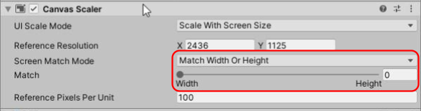
Match Width or Height mode, Match is set to 0 (Width) and the aspect ratio is changed.

Match Width or Height, Match = 1 (Height)
The image below shows Match Width or Height mode with Match set to 1 (Height) and the aspect ratio changed.
You can see that the layout is scaled while maintaining the height and width direction.
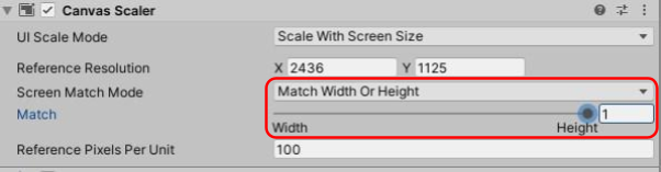
Match Width or Height mode with Match set to 1 (Height) and the aspect ratio changed.
Expand
The aspect ratio is changed in Free Aspect mode with Expand set to 1 (Expand).
The uGUI object laid out in the base resolution is scaled to fit on the screen without fail.

Shrink
The aspect ratio is set to Shrink and changed with Free Aspect.

As for the aspect ratio of the device, the following resolutions are common for iPhone/iPad.
iPhone 8 or earlier: 16:9
iPhone X or later : 19.5 : 9
iPad : 3 : 4
Main uGUI Objects
This section describes the main uGUI objects and how to use them.
Unless otherwise specified, uGUI objects are created by selecting them from the “UI” menu in the hierarchy.
These objects are used to represent visuals such as images.
They are also used to compose parts of uGUI objects for interaction, which will be explained later.
uGUI Objects for Visual
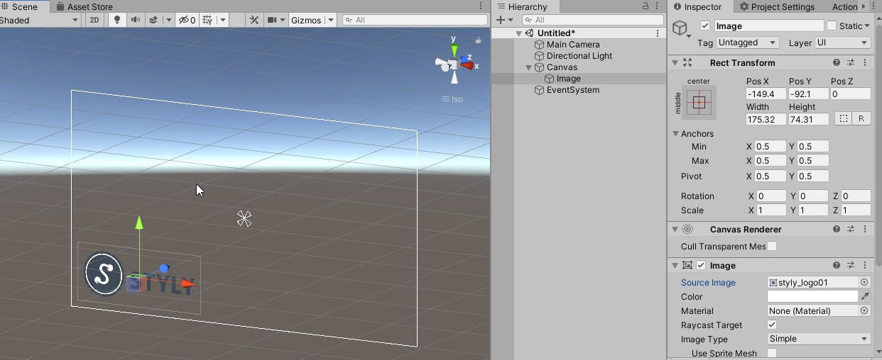
Image
This uGUI object is used to display an image.
When created, just a white board is placed.
To display any image, it must be imported into the project and set to the Source Image property of the Image component.
Only Sprite can be set here.
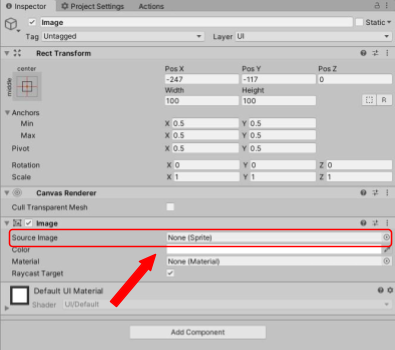
If a Sprite is set to the Source Image property, the image will be displayed.
Panel
Panel is actually an Image object with Anchors attached to the four corners of the Canvas.
It is useful for creating a menu panel, for example, by arranging other uGUI objects.
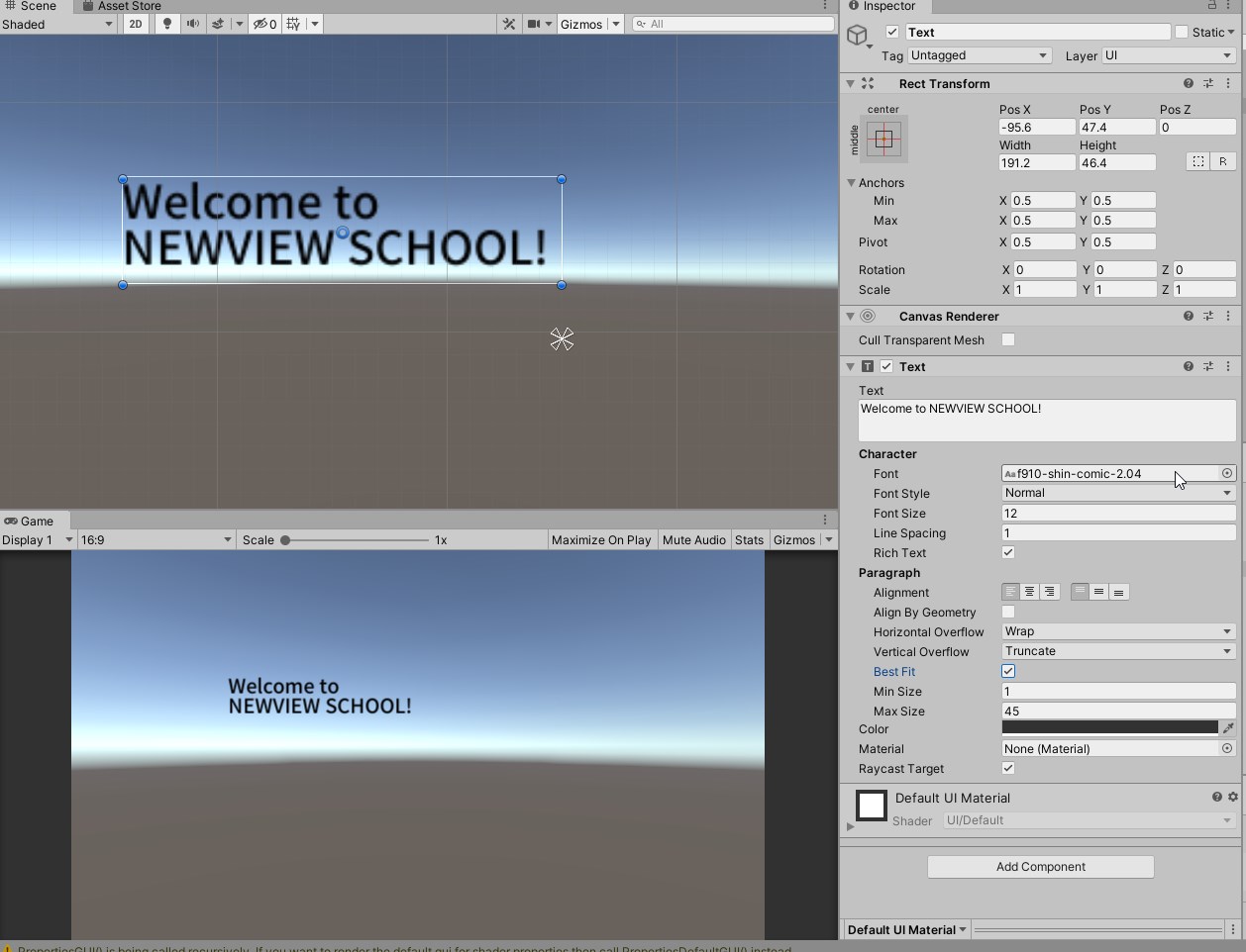
Text
An object to which a Text component is added to display text.
By entering any text in the Text property, the text will be displayed.
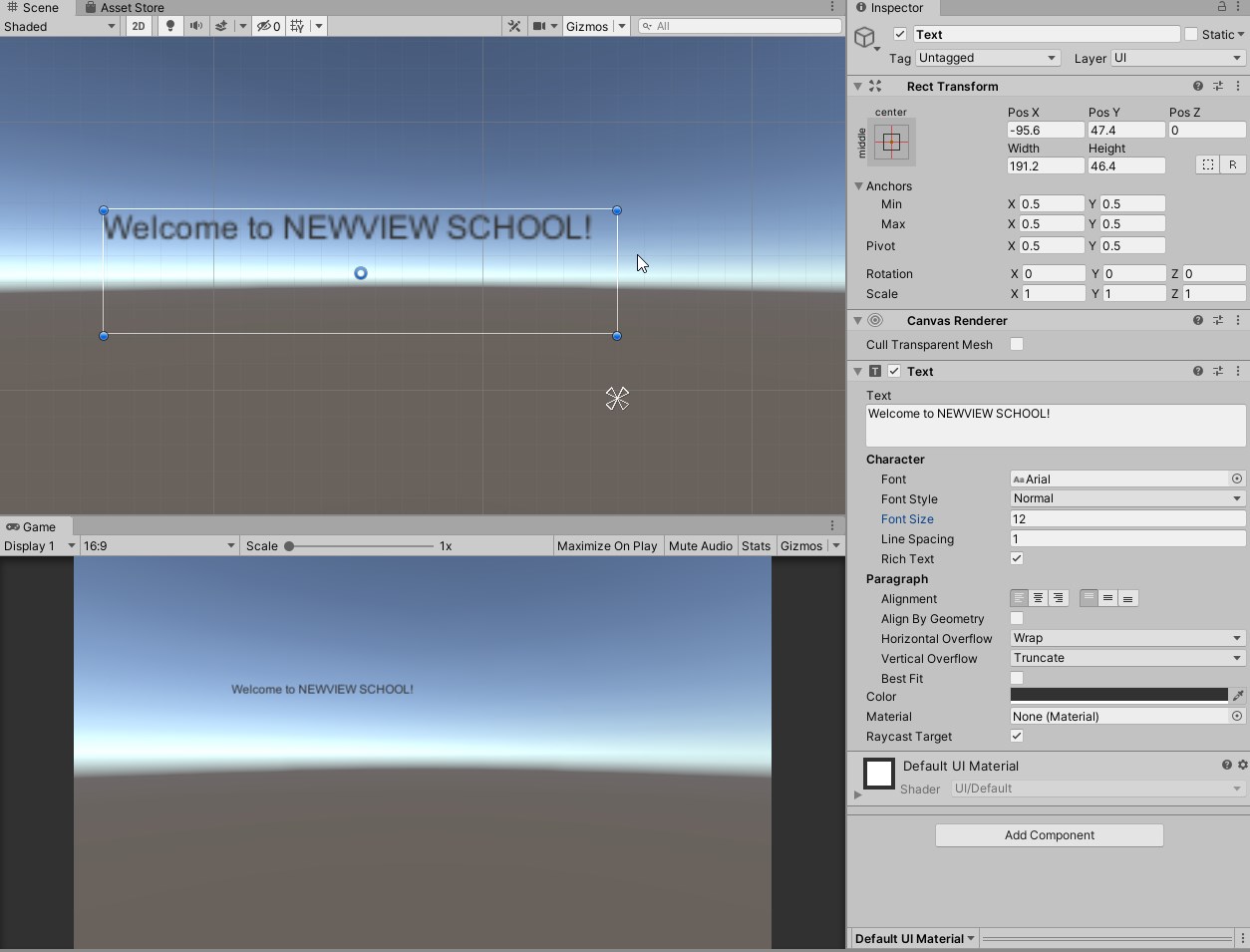
The font size can be changed with the Font Size property.
By default, if the font size is too large or there are too many characters and the text cannot fit into the rectangle, the text will be invisible.

Checking the Best Fit property will make the font size fit the rectangle.
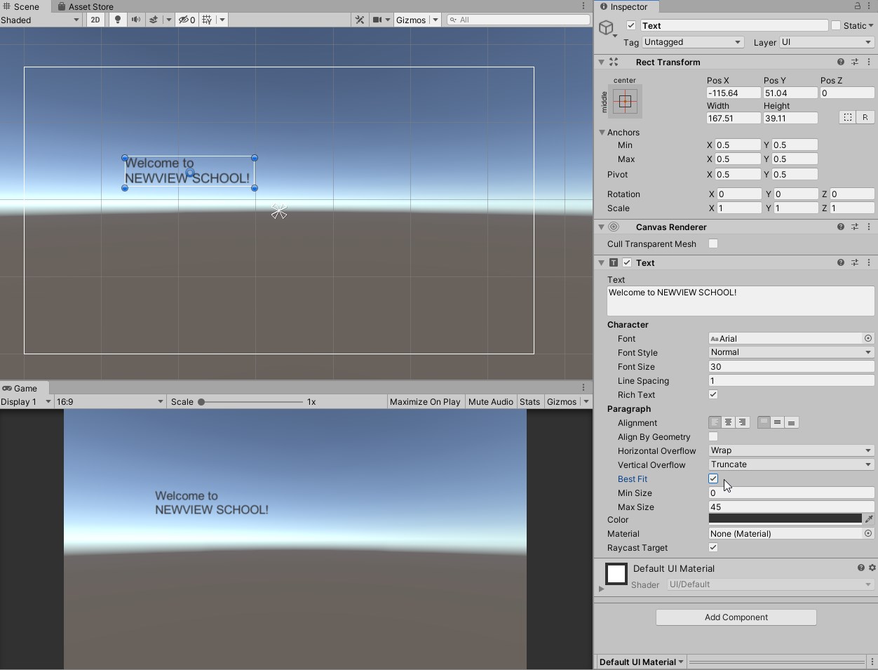
Horizontal/Vertical Overflow can also be set for horizontal and vertical text overflow, respectively.
Fonts can also be changed by importing ttf or otf font files and setting the Font property.
uGUI Objects for Interaction
uGUI objects originally equipped with functions to respond to user operations such as buttons.
It has states such as normal, highlighted, pressed, etc., and has settings (transition options, transition options) to respond to each state.
In addition, events (UnityEvents) are generated when the user operates the object, and processing can be incorporated in response to the events.
However, in order to incorporate processing in response to user operations in STYLY, it is necessary to use PlayMaker to do so.
Button
A Button is an object with a Button component and an Image component that sets the button’s graphic, and a Text object is set as the button’s label in a child object.
The Button is an object that can perform any action when the user clicks (taps) on it, and when combined with PlayMaker, it can be used to configure the action that occurs when the user clicks (taps) on it.
Transition is the transition option.
It sets the state when the user clicks or after the click is made.
In the case of “Color Tint,” you can set the color of each state.
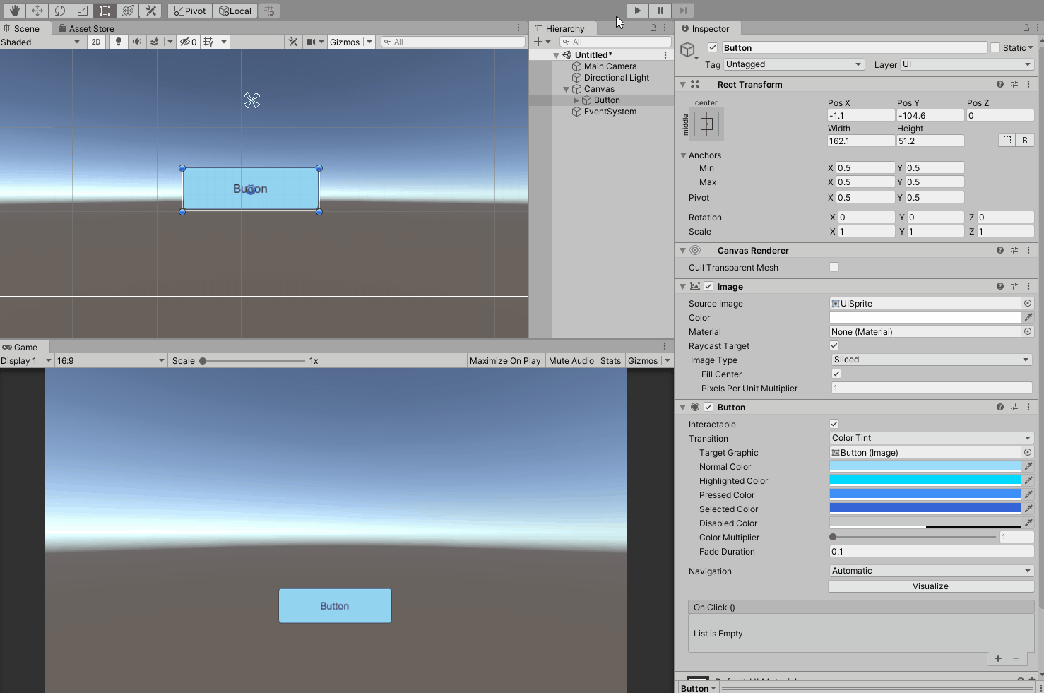
Other transition options include “Sprite Swap,” which switches the image, and “Animation,” which uses the Animator to animate the image.
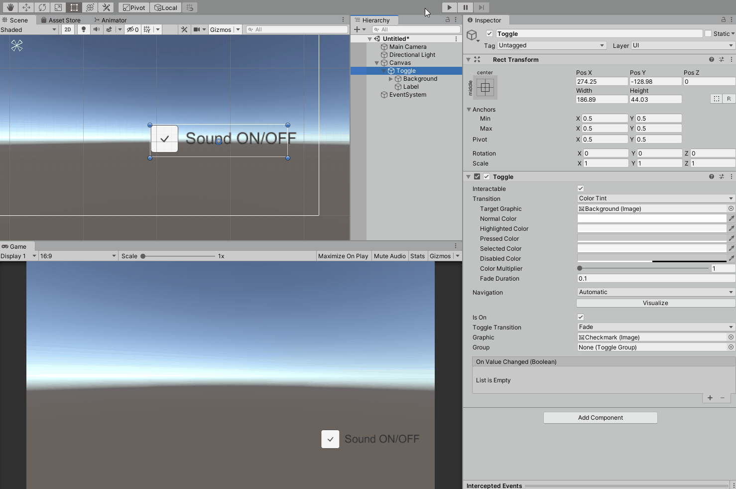
Toggle
A checkbox object that can be toggled ON/OFF.
This ON/OFF value can be used to perform some kind of processing.
For example, to turn sound on or off.
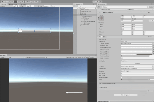
Slider
By moving the slider, you can set the value from the value set for Min Value to the value set for Max Value.
These values can be used to perform some kind of processing.
For example, you can set the brightness of a light.
There are other uGUI objects and components that can be used with uGUI.
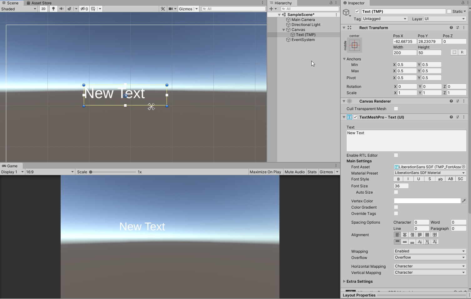
TextMeshPro
What is TextMeshPro?
TextMeshPro is a text object with more functions than Text.
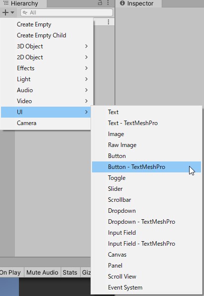
Like other uGUI objects, it can be added to a scene from the Hierarchy.
The first time you try to create a new object, the “TMP Importer” window shown in the image below will appear and prompt you to import the required packages.
You must import these to use them, so press the “Import TMP Essentials” button to import them.
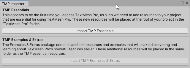
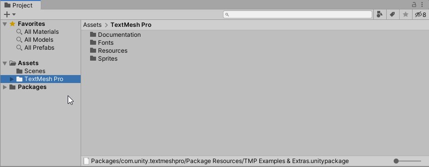
After importing, a folder called “TextMesh Pro” will be placed under the Assets folder with the necessary files for the TextMesh Pro object, and a TextMesh Pro object will be created in the scene.
When TextMesh Pro is imported, a version of the object using TextMesh Pro for the label, such as “Button – TextMesh Pro” will be added to the hierarchy menu.
Adjusting Visibility
Now, let’s adjust the appearance by actually changing the properties.
Text Mesh Pro – text component
First we will look at the Text Mesh Pro -text component.
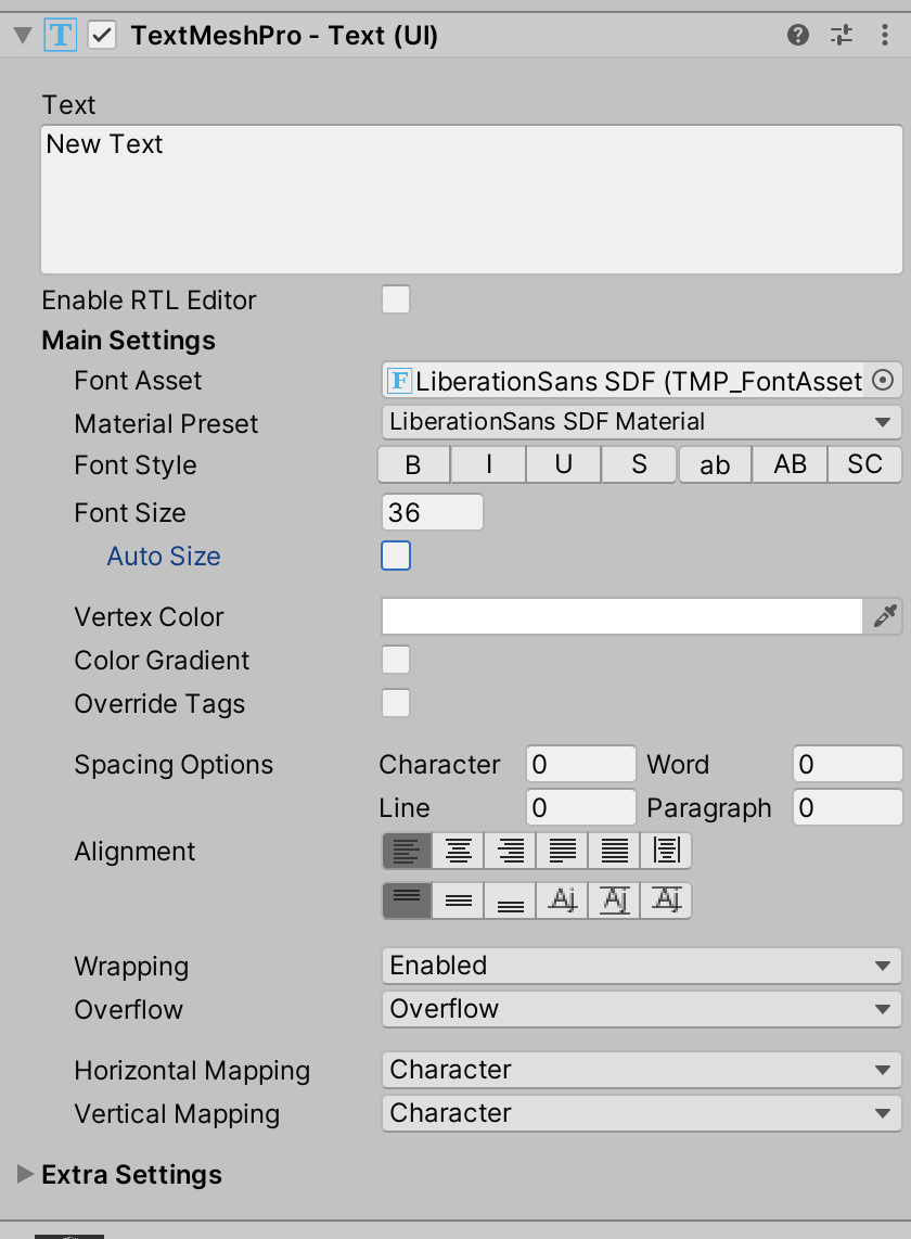
Since there are many properties, we will excerpt some of them for explanation.
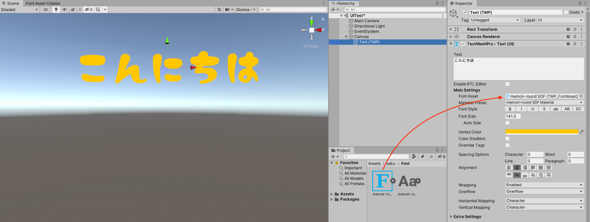
Text
Allows you to enter text text
Font Asset
allows you to change the font of the text
Font Size
Allows you to change the size of the text
Auto Size
Check this box to adjust the size of the text to fit the available space
You can also set the maximum font size for auto-adjustment
Vertex Color
Allows you to change the base color of the text vertices
Spacing Options
Allows you to change the amount of white space between characters, words, lines, and sentences.
Material
Next, let’s take a look at Material.
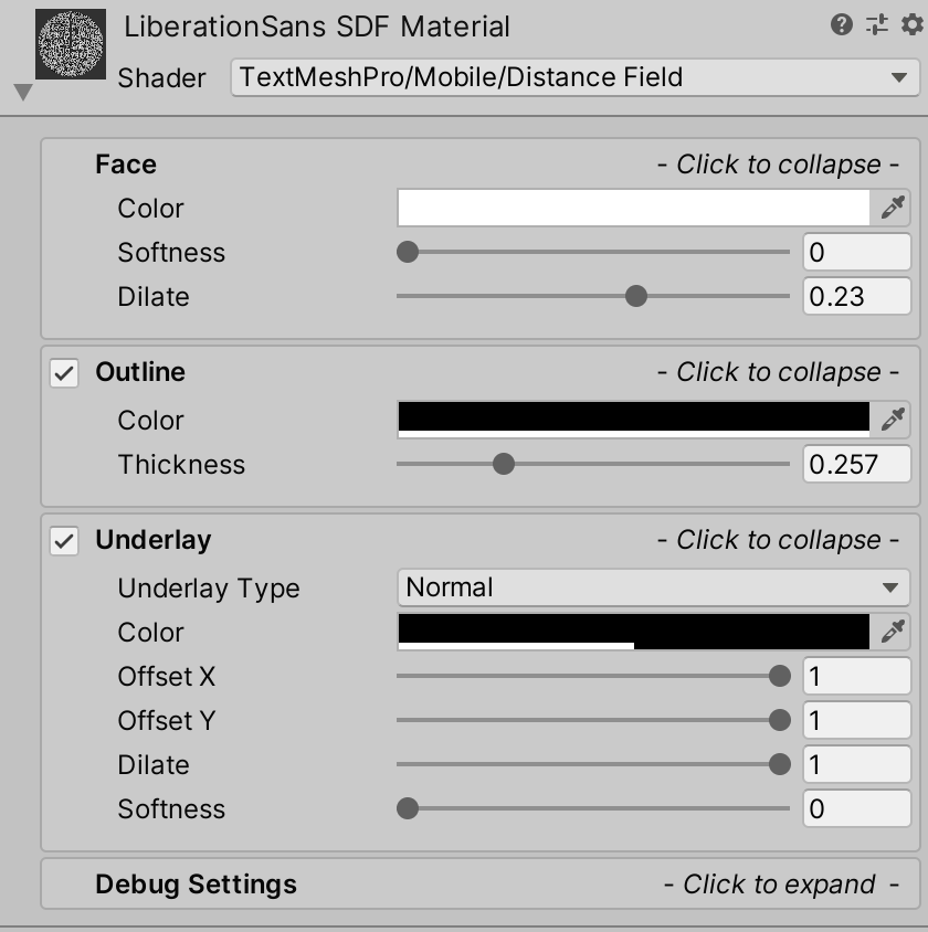
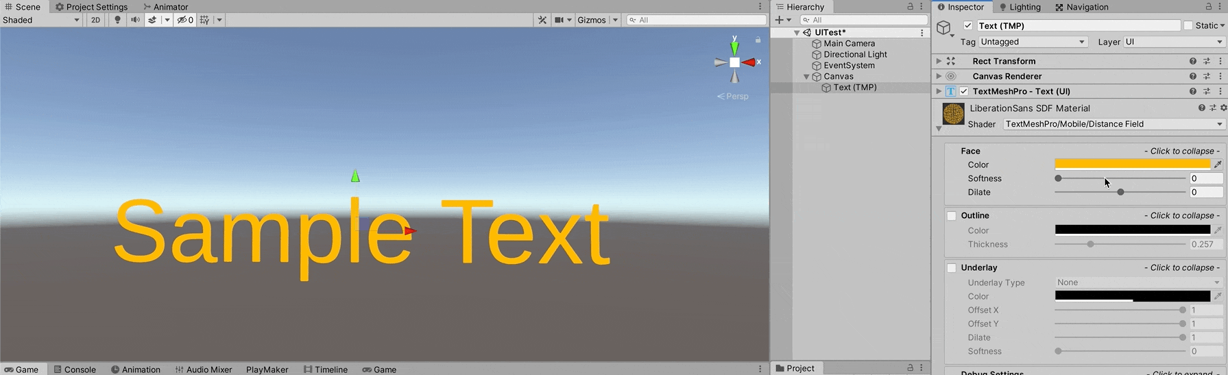
Face: Sets the general appearance of the text
Color: Sets the color of the text
Softness: The degree of blurring of the text
Dilate: The degree of shrinkage of the text outline
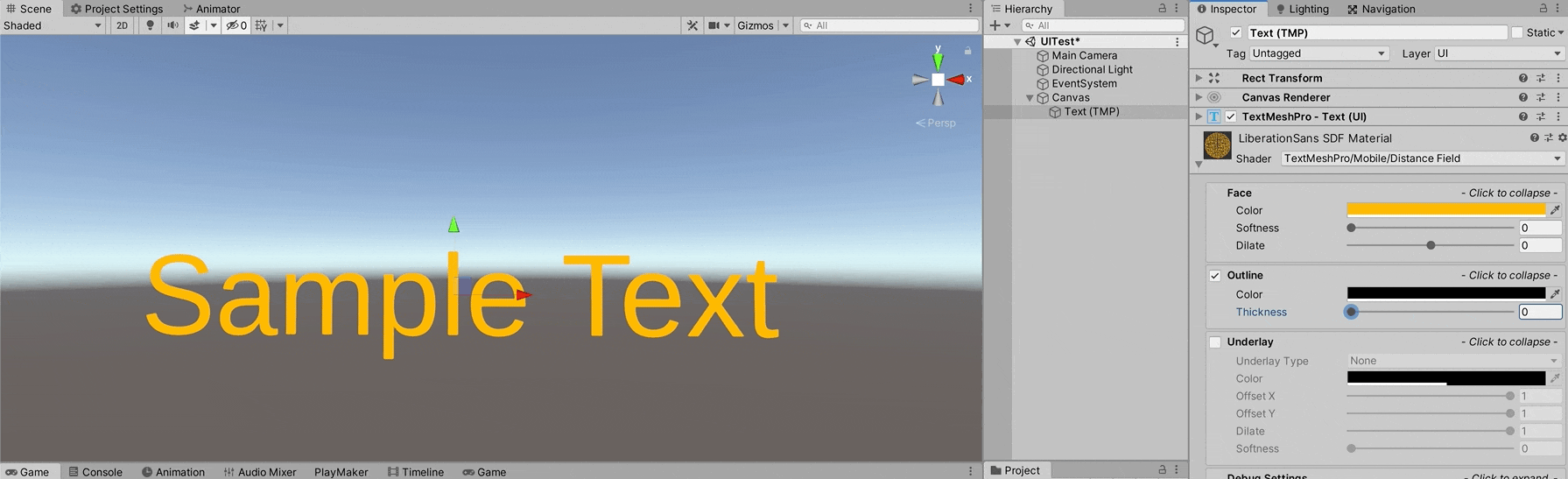
Outline: allows you to set an outline for the text
Color: color of the outline
Thickness: thickness of the outline
Underlay: draws the same text below the text
Underlay Type: specifies the underlay format; Normal underlays the text outside the text, Inner underlays the text inside the text
Color: sets the color to underlay
Offset X/Y: sets the offset coordinates to underlay
Dilate: degree of shrinkage of the underlay outline
Softness: degree of blurring of the underlay
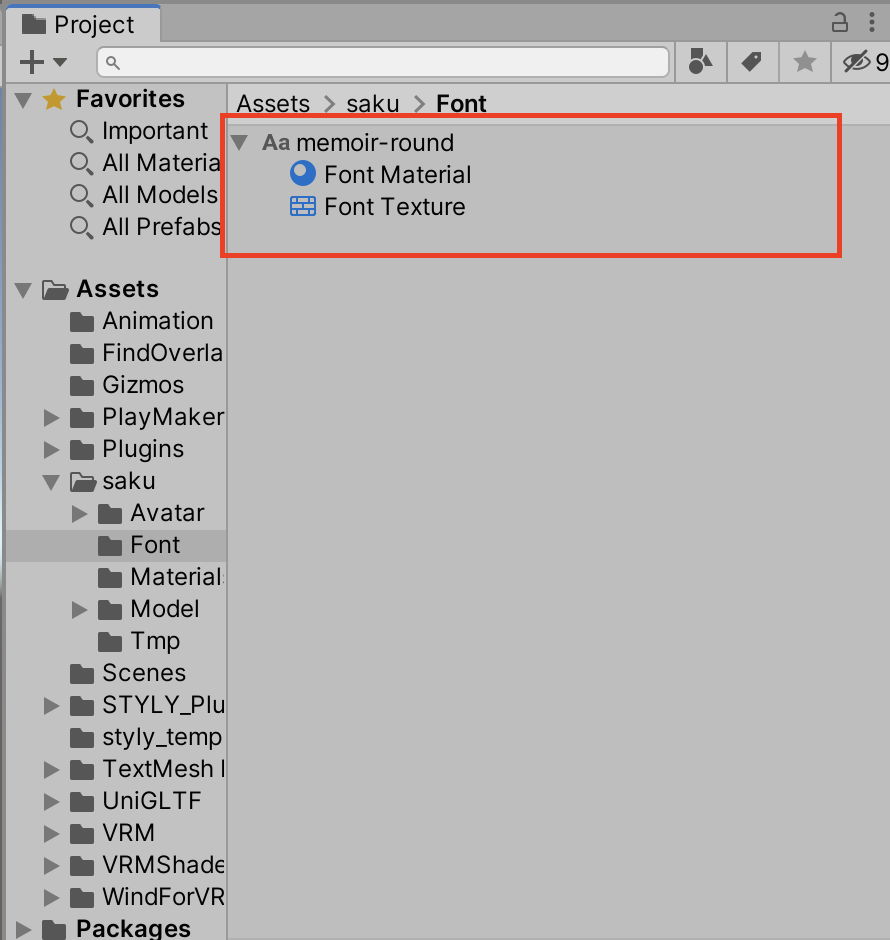
Adding fonts
Finally, we will explain how to add your own fonts.
First, prepare the ttf / otf fonts you want to use.
Once prepared, import the font files by drag & drop into your Unity project.
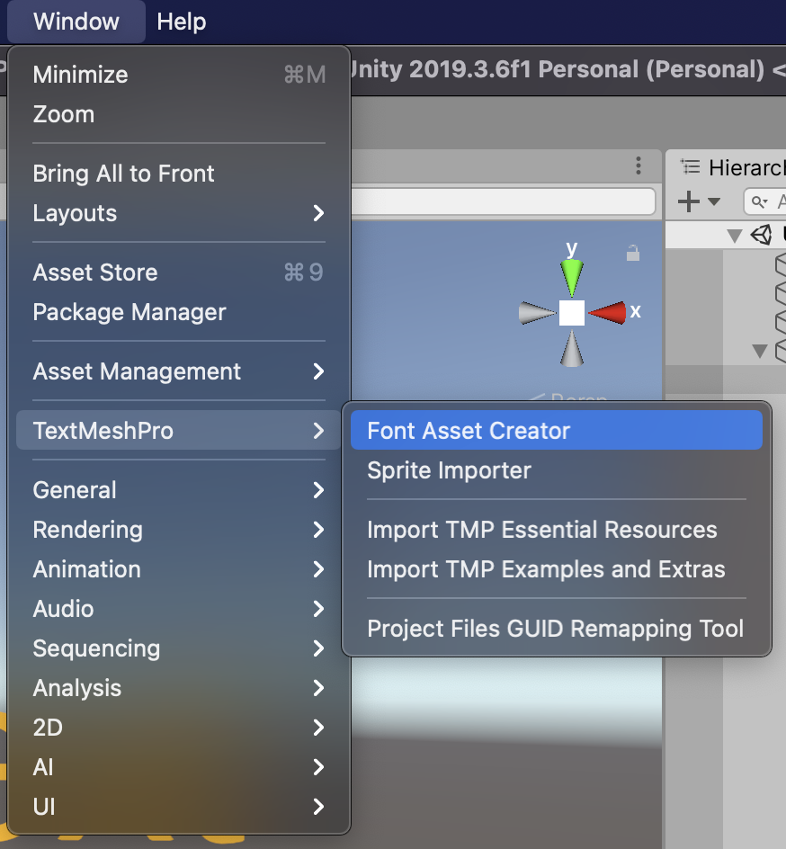
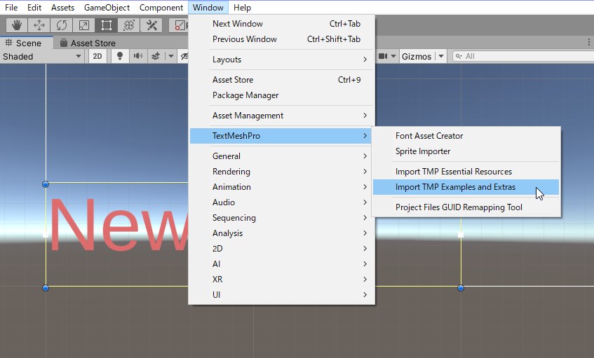
Once imported, open the Font Asset Creator by going to Window > Text Mesh Pro > Font Asset Creator.
After opening the Font Asset Creator, specify the imported file in the “Source Font File” field.
Also, set “Character Set” to “Custom Character”.
Type the characters you want to generate the font in the space below.
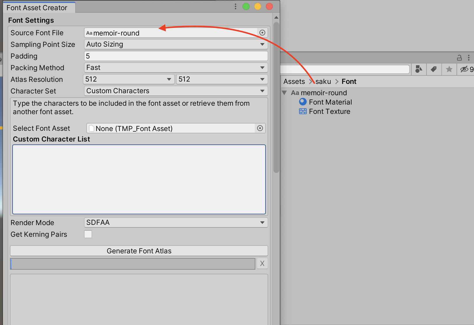
It is tedious to type all the characters, so I picked up hiragana below.
Copy the text below and paste it into the Custom Character List.
|
aaaaaiiiuueeooooooooooooooooooooooooooooooooooooooooooooooooooooooooooooooooooooooooooooooooooooooooooooooooooooooooooooooooooooooooooooooooooooooooooooooooooooooooooooooooooooooooooooooooooooooooooooooooooooooooooooooooooooooooooooooooo…. |
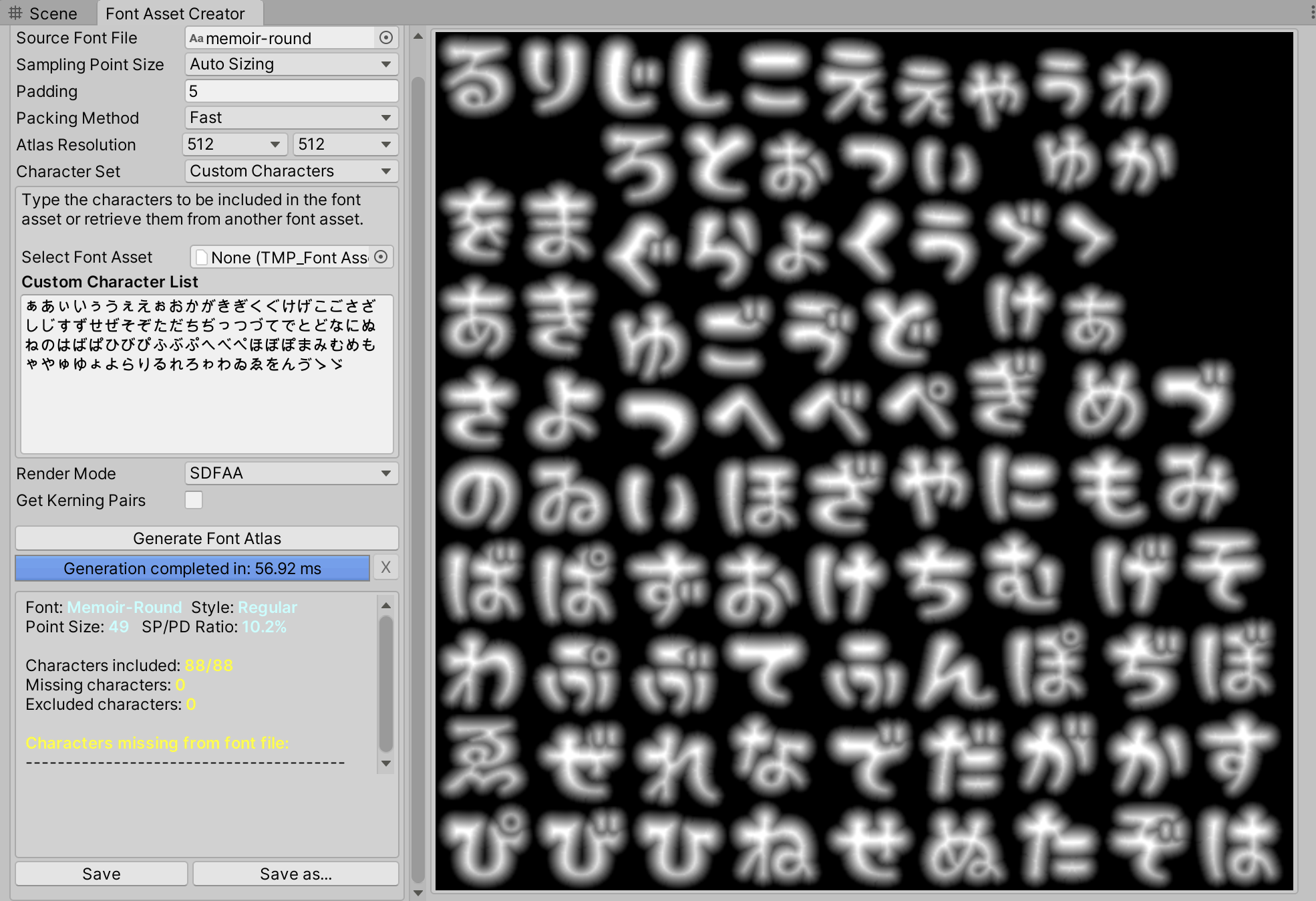
After entering text, click “Generate Font Asset” to generate the font.
Save your font from “Save as…”.
Let’s actually create a sentence using the generated font.
This concludes the basic usage of Text Mesh Pro.
Other Samples
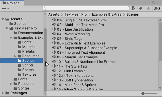
You can import packages containing various samples from the “TMP Importer” window or from the Window menu [TextMesh Pro] > [Import TMP Examples and Extras], so take a look.
Various sample scenes can be found in the Assets/TextMesh Pro/Examples & Extras/Scenes folder.
Sprite
Turning an image file into a Sprite
When any image file is imported into a project, it is by default treated as a texture, which can be set for a material to appear on the surface of a game object (hereafter referred to as “object”).
If you want to handle the image by itself, it is convenient to treat it as a Sp rite, rather than a texture, since Sprites are generally used for 2D games, but can also be used for VR/AR since they can be placed in 3D space.
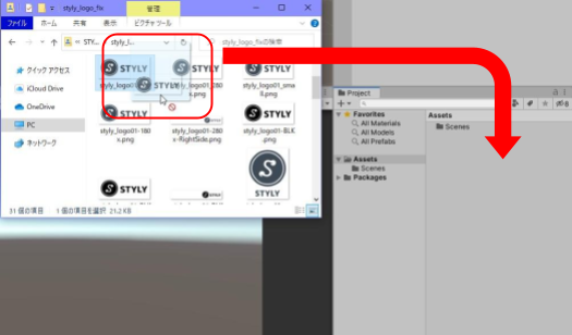
First, import the image file into your project.
Import image files by dragging and dropping them from File Explorer (Windows) or Finder (macOS) into the Unity editor’s Project window.
(You can also import from Assets > Import New Asset…)
After importing, look at the Inspector with the image file selected.
To make the image file a Sprite, the Texture Type must be set to ” Sprite (2D and UI )” in the Import Settings displayed in the Inspector of the image file.
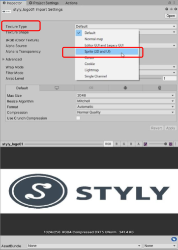
After changing the Import Settings, press the Apply button to apply the settings.
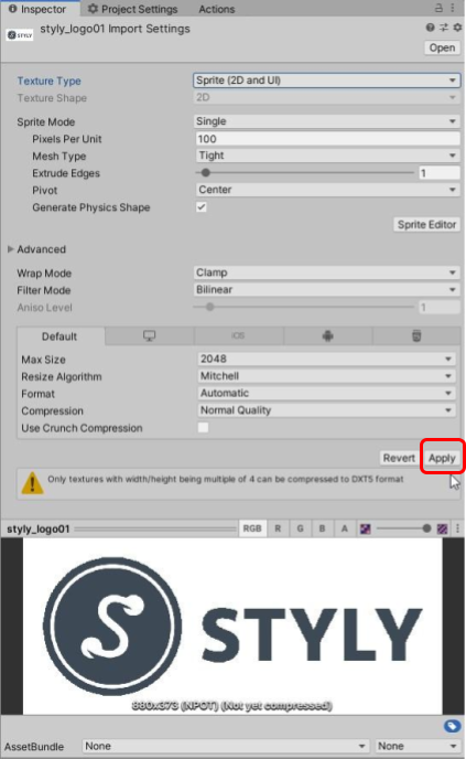
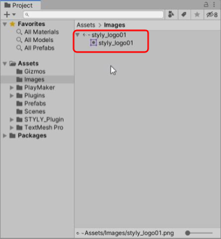
When set to Sprite, the Project window will also be displayed for Sprite.
Placing a Sprite in the Scene
Now let’s place Sprite in the scene.
If the Texture Type is set to “Sprite (2D and UI),” nothing special is required.
Drag and drop the image file from the project window to the scene view or the hierarchy window (hereafter referred to as the hierarchy), and it will be placed in the scene as it is.
In the case of transparent PNGs, the transparent areas will be transparent without any settings.
Masking with SpriteMask
SpriteMask makes it easy to apply a mask to a Sprite.
Masking here means cropping an image to a specific shape and displaying only a portion of it.
Prepare two Sprites, one to be masked and one to be masked
First, you need to prepare two Sprites, one to be masked and displayed, and the other to be cropped, i.e., the masking side.
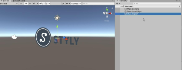
For example, let’s say you want to crop a rainbow-colored square image (Sprite1) with an ink-like image (Sprite2).
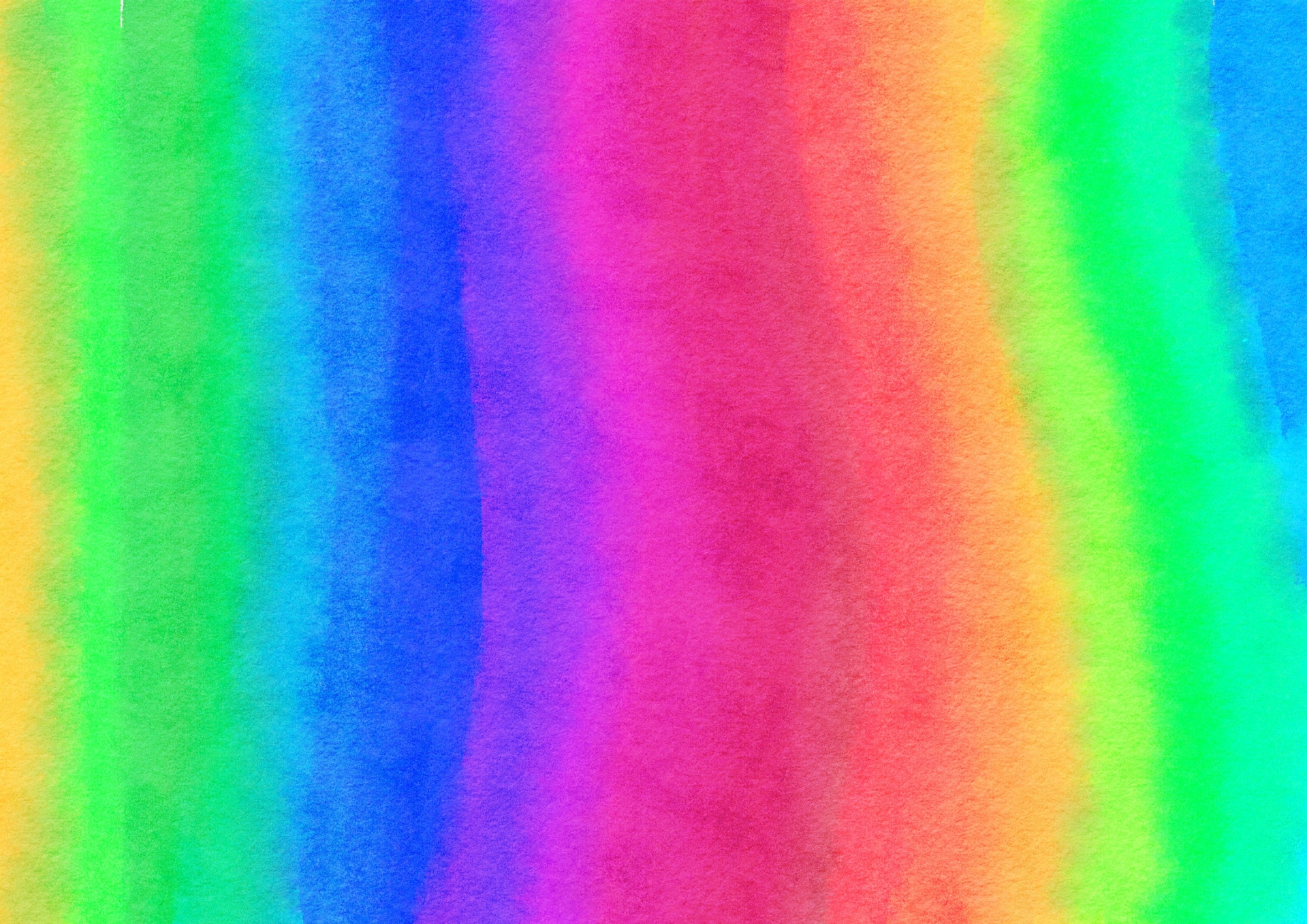
Sprite1

Sprite2
You can download this sample image from the following link
https://drive.google.com/uc?id=1lU7q7_e3UiTiOIcTf4bQt4HSusLACNro
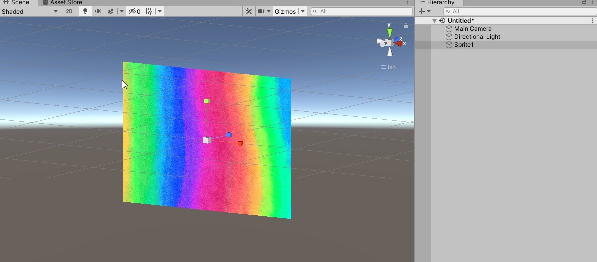
Place the masked Sprite in the scene as it is
The Sprite to be displayed is placed in the scene as it is.
(The Sprite to be displayed is placed in the scene as it is (in this case, Sprite1).
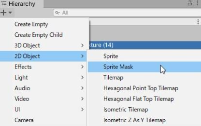
Creating a SpriteMask
Next, create a SpriteMask.
A SpriteMask can be created by going to [2D Object] > [Sprite Mask] in the Hierarchy.
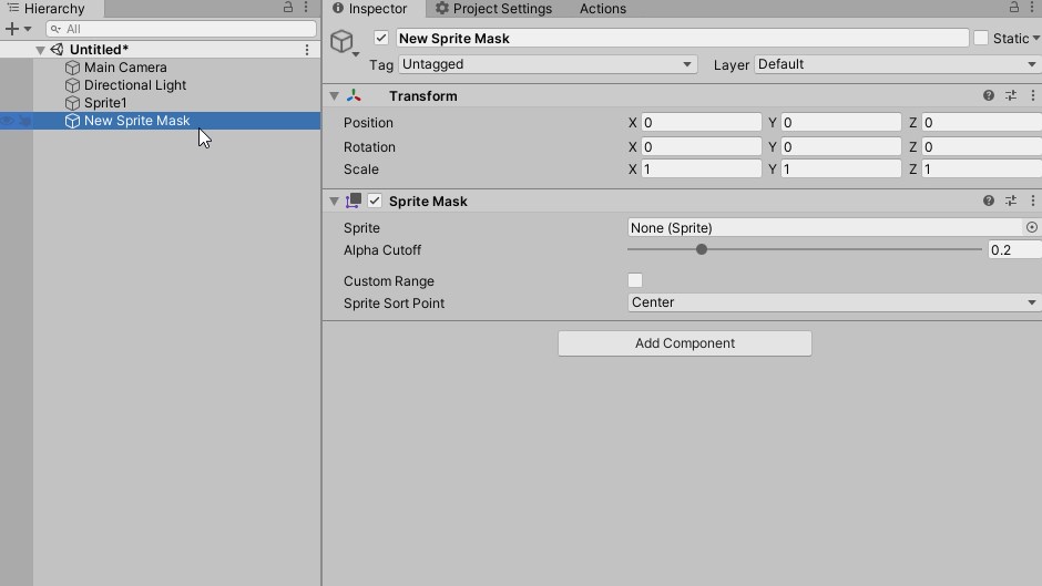
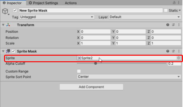
Specify the Sprite for the mask in the Sprite property of the created SpriteMask (in this example, the Sprite is the one used for the mask).
(In this example, Sprite2 is specified.)
Setting up the mask to interact
Next, we configure the Sprite to interact with SpriteMask for the Sprite to be masked (Sprite1).
This is the Mask Interaction property of the Sprite Renderer component.
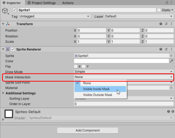
Setting this to ” Visible Inside Mask ” will show the inside of the masked Sprite, while setting it to ” Visible Outside Mask ” will show the outside.
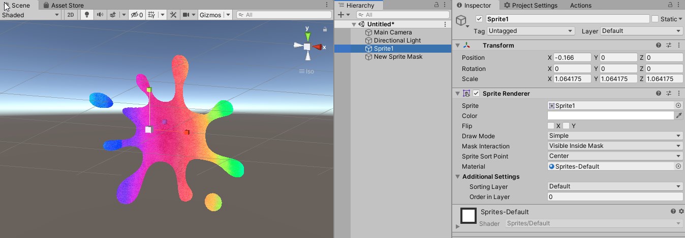
When set to “Visible Inside Mask
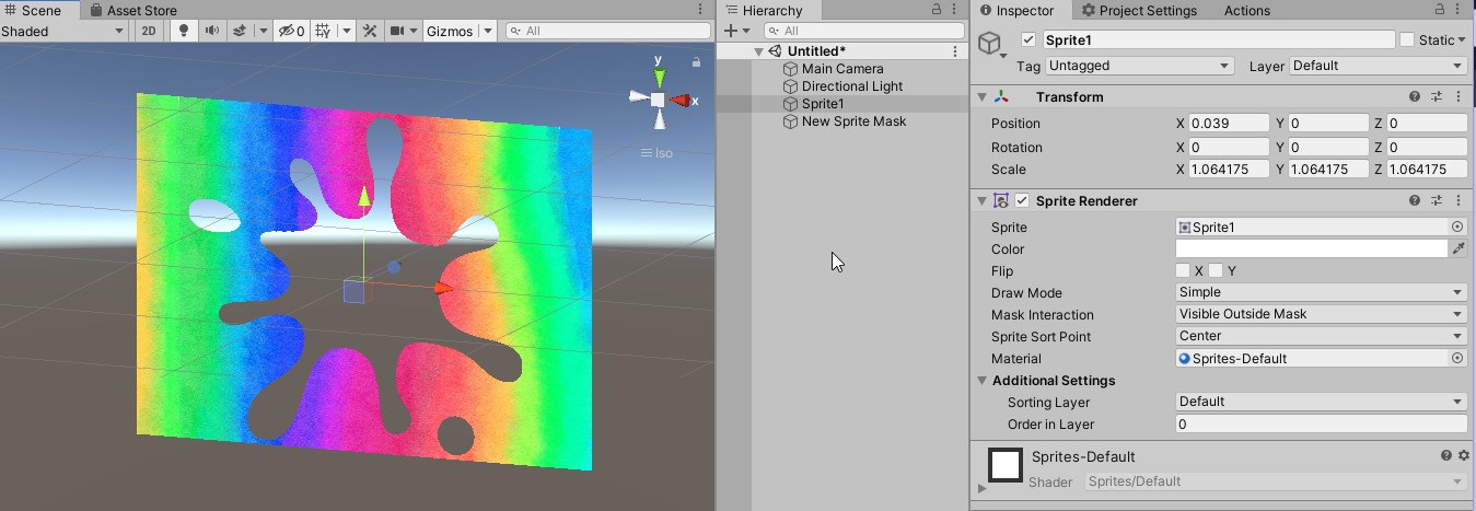
When set to “Visible Outside Mask
Now the image is masked.
By making good use of SpriteMask, various expressions are possible with just a combination of Sprites.
This concludes the basic explanation of UI (uGUI) in Unity.
You may find it difficult at first because of the unique placement and scaling methods, but as you become more proficient, you will be able to express yourself in a variety of ways, so please get used to it gradually.