This article explains in detail about “Color Grading” in “Post Processing“, an asset for implementing post-effects in Unity.
By using this effect, you can freely change the color of the entire scene, allowing for richer spatial expression.
It is intuitive and can greatly improve the quality of the scene, so let’s take this opportunity to try Color Grading while referring to the sample scene!

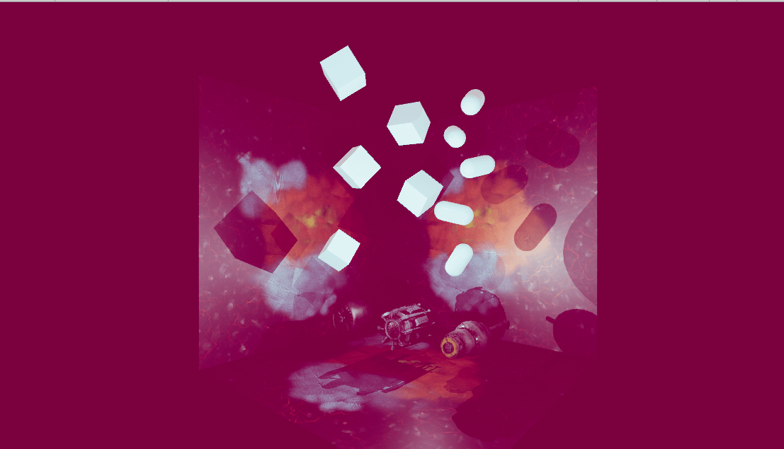
Sample image
Sample
You can experience the sample scene from the STYLY GALLERY.
You can download the Unity project described in this article from here.
Color Grading Sample Scene
What is Color Grading?
Color Grading is an effect in Post Processing, an asset for implementing post-effects that modifies or alters the color and brightness of the final image generated by Unity.
With this, you can freely change the saturation and brightness of the space, just like in Instagram or Photoshop.
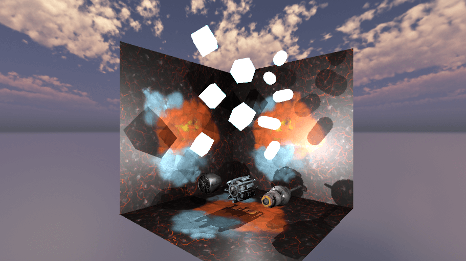
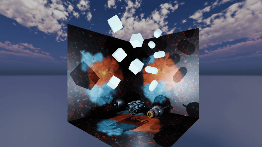
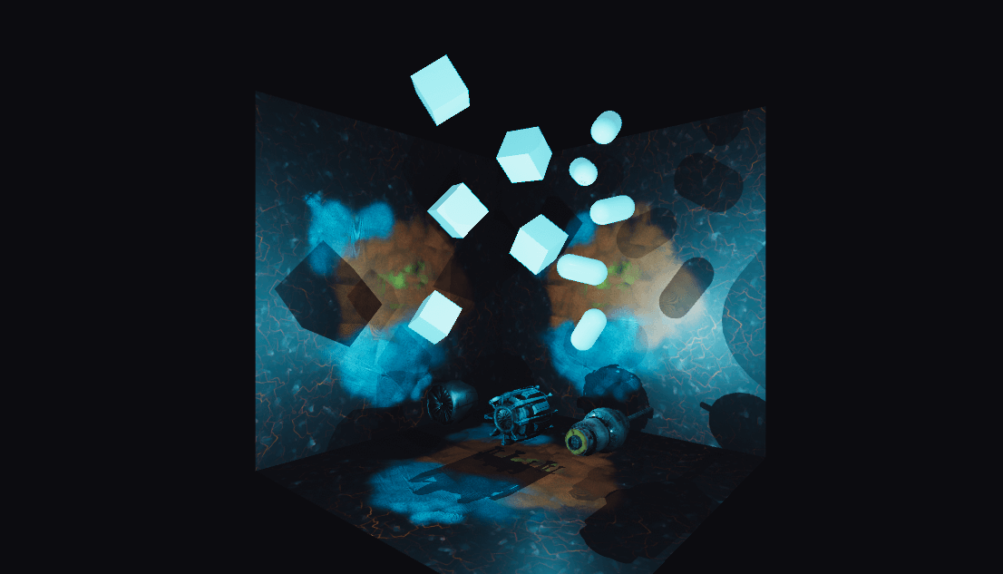
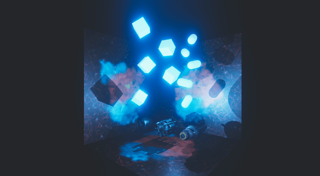
I used Bloom in Post Processing to create a glowing object, and then used Color Grading to change the overall color to blue.
By doing this, I was able to create a much more unified image than without any correction, and the quality of my work went up a notch.
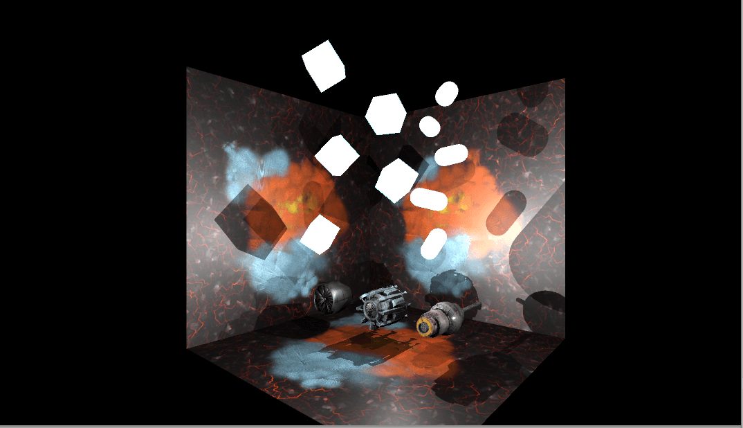
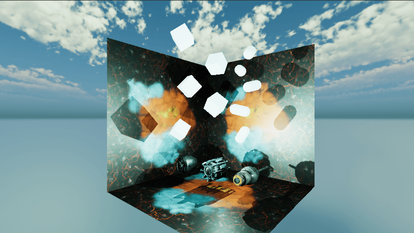
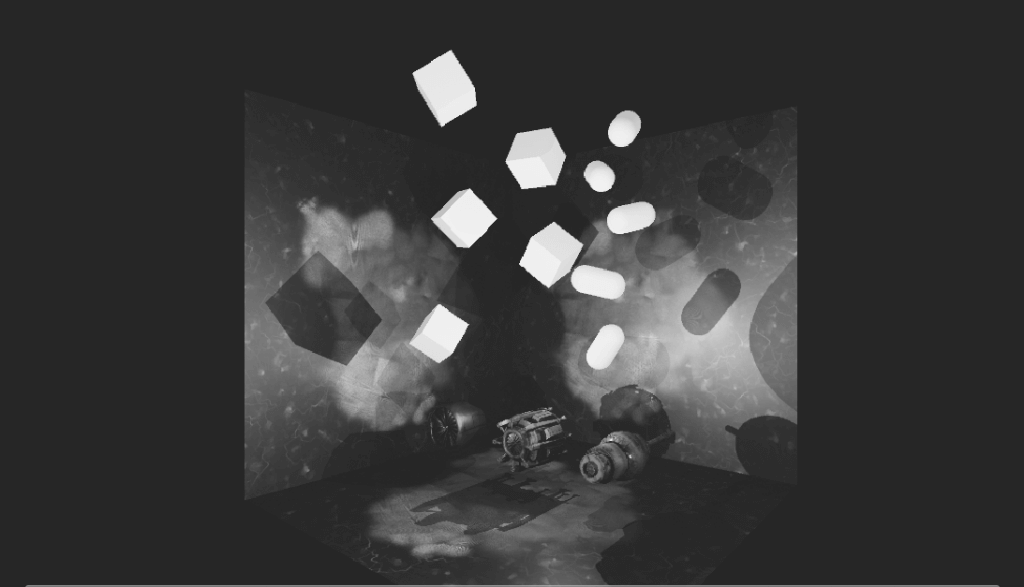
Without effects
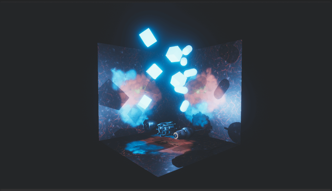
With effects
Advance preparation
For more information on Post Processing, please refer to this article.
![[Unity]Understanding the Basics of Post Processing](https://styly.cc/wp-content/uploads/2020/07/EYECATCH-1-160x160.png)
Click here to see the assets used in this article.
*Note: About the assets available on STYLY
Please see below
For more information, please refer to the STYLY DOCUMENT here.
Importing a project
Import the project from Package Manager.
First, let’s import the Post Processing Stack v2 into the project.
Select the Package Manager from the Window tab at the top of Unity.
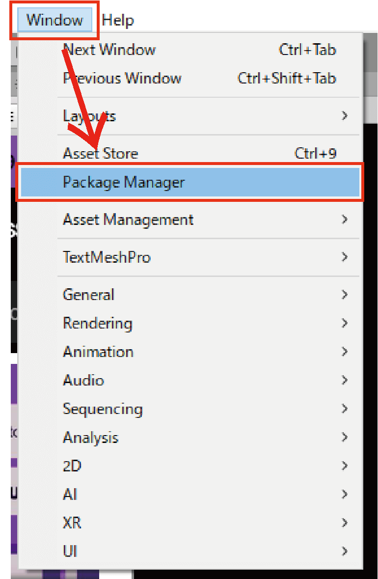
Select the Package Manager from the Window tab.
After opening the Package Manager, type “Post” in the search field in the upper right corner to find Post Processing.
This completes the import of the project.

Search for “Post” in the search box and select the Install button at the bottom right.
Installing in the scene
Let’s actually install the Post Processing Stack v2 into the scene.
Select MainCamera in the Hierarchy window.
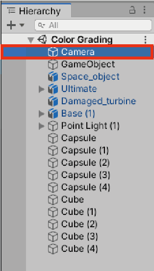
Select MainCamera
Click on the Layer button at the top of the MainCamera inspector window and select Default from the layers that appear (Default is selected by default).
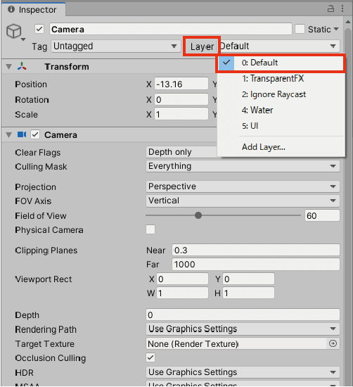
Click on Layer, then select Default.
Return to the MainCamera inspector, click Add Component at the bottom, type “Post” in the search bar that appears, and select Post-Process Layer.
*Make sure you don`t accidentally enter Post-Process Volume, as I made a mistake here.
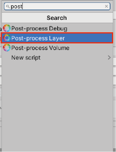
Type Post in the search bar and select Post-Process Layer.
The Post Process Layer component will be added to the inspector.
Change the Layer tab in the Post-Process Layer to Default.
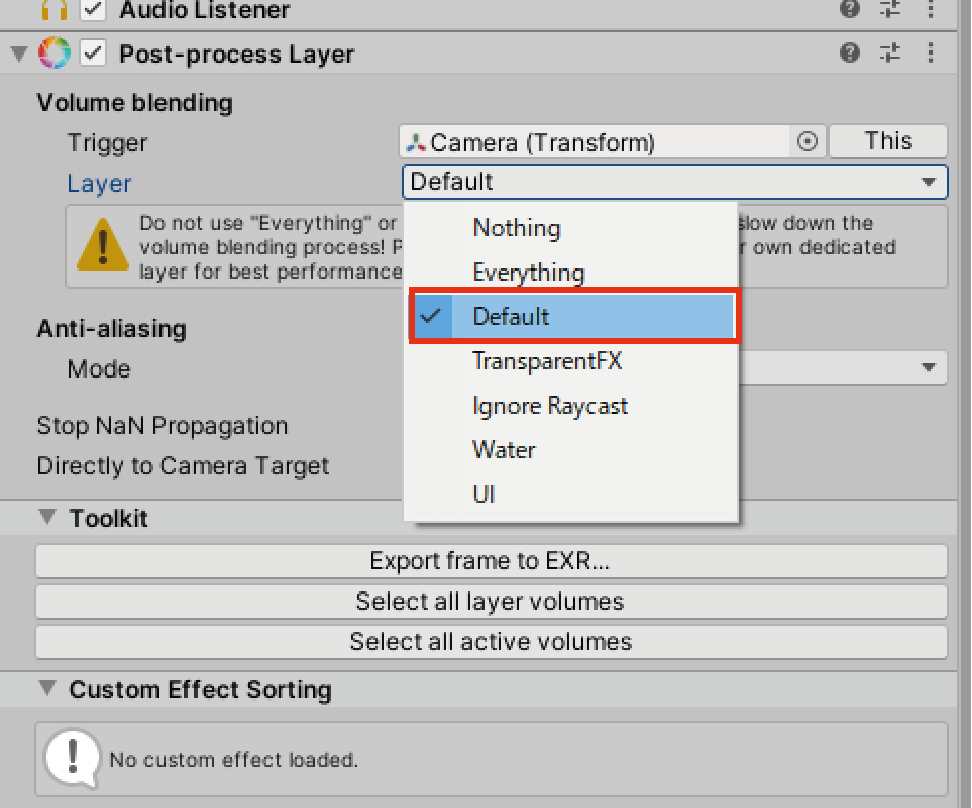
Change the Layer tab to Default.
The next step is to create an object to manage the Post Process screen effects.
Right-click on the hierarchy -> Create Empty to create a new GameObject.
Create Empty to create a new GameObject
Click add Component from the bottom of the generated GameObject’s inspector.
Type “Post” in the search bar and add the Post-Process Volume component.
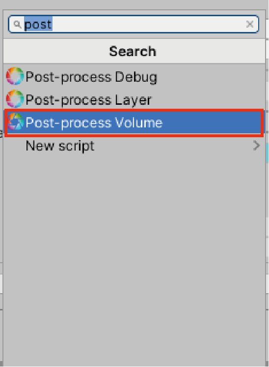
Type Post in the search bar and add the Post-Process Volume component.
Check the “Is Global” checkbox in the added Post-Process Volume.
Click the New button to the right of the Profile item.
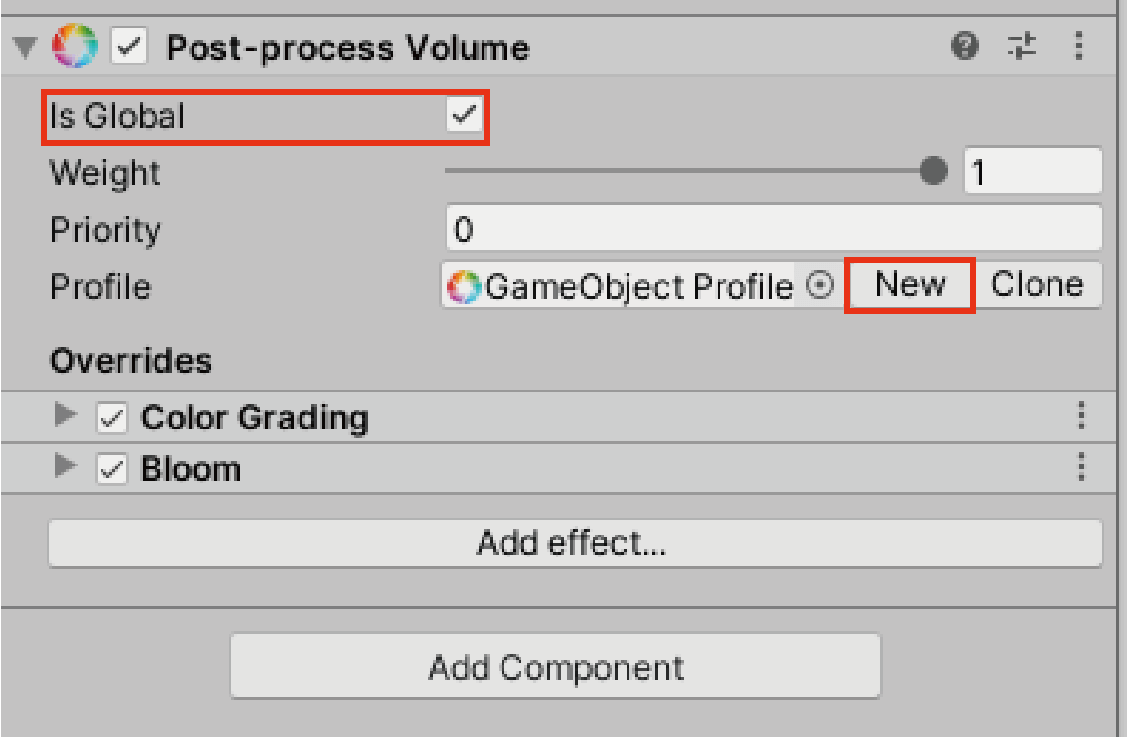
Check Is Global and select New on the right side of Profile.
Now the preparation is complete.
Let’s try to use Color Grading!
Let’s try to use Color Grading
Once you have installed Post Processing, let’s start using Color Grading.
Select “Add effect…” in the Post-Process Volume of the Gameobject created in the previous preparation. In the Post-Process Volume of the Gameobject we created in the preparation, and select Color Grading from the list.

Select Add effect… and select “Color Grading” from the list.
How to use Color Grading
First, let’s take a look at the basic usage of Color Grading.
【Mode】
There are three basic modes of Color Grading.
| Mode | |
| Low Definition Range (LDR) | For low-end platforms. It is suitable for STYLY use with relatively low load. |
| High Definition Range (HDR) |
For high end platforms. All color operations are applied in HDR, resulting in a wide range of brightness and vivid colors. But it is also very demanding. |
| External | For custom 3DLUTs created with external software. |
The sample scene was created using High Definition Range (HDR), but there were no problems with the scale of the sample scene.
It is a good idea to use different Modes depending on the size of the scene you are creating.
【Tonemapping】
Tonemapping is a function that re-maps the brightness according to the display we are using, and this function can be used to create a sense of atmosphere for the entire space.
Tonemapping is especially effective for HDR, which has a wide range of brightness.
There are four modes of Tonemapping.
I’ll explain them one by one, comparing them to the image without the effect.
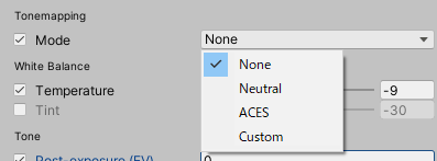
There are four modes of Tonemapping.
Compare the image with the one without the effect and see for yourself.
- None
The above is the Default setting. - Neutral
This mode has low saturation and low contrast.
The overall effect is gentle.
Neutral
- ACES
ACES is the tone mapping used in movies and other media, and it gives a crisp impression with high saturation and contrast.
When using ACES, I found that it works well with mechanical objects and man-made objects such as concrete.
However, make sure to set up the lighting properly because it can easily cause blacks to be lost.
ACES
- Custom
This is the mode which you can set your own tone mapping.【White Balance】
White balance is a term you’ve probably heard before if you’ve ever taken a picture.
Color Grading’s white balance is similar to the color temperature in photography, which may confuse those who understand white balance when they touch this function.There are two different modes here.
White Balance has two modes.
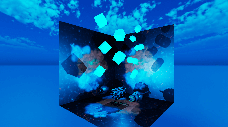
- Temperature
This is the mode that corrects for color temperature.
The further to the right you move the bar, the more reddish the image becomes, and the further to the left, the bluer it becomes.The color temperature refers to the color of the light, and is expressed in K (Kelvin).
The higher the Kelvin number, the bluer the color, and the lower the Kelvin number, the redder the color.
White balance is a function that compensates for the color temperature to make the colors more realistic.
Warm colors
Cold colors
- Tint
It is recommended to use this mode as an auxiliary mode after determining the general color tone with Temperature.
The higher the value (+100), the more magenta the color will be, and the lower the value (-100), the more green the color will be.
+The more the value goes to +100, the more magenta it becomes.
The more you go to -100, the greener it becomes.
【Tone】
This mode is used to adjust the color tone of the scene. You can adjust mainly brightness, saturation, and hue.
If you have used Photoshop’s color correction before, this mode is easy to imagine.There are five different modes.

Five different modes
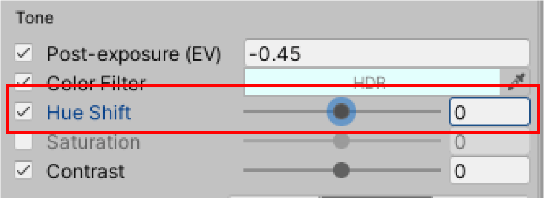
- Post-exposure (EV)
Post-exposure (EV) is only available in the High Definition Range.
This mode adjusts the amount of exposure. It must be used in conjunction with tone mapping, or the image will be blown out.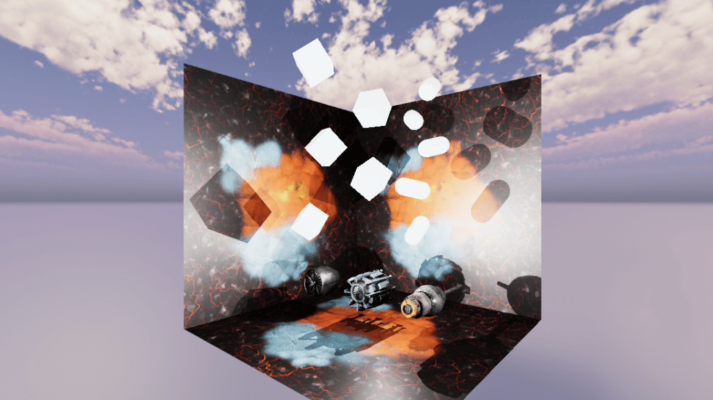
Tone Mapping Mode ACES Post-exposure +1.57
- Color Filter
Using the HDR color picker, you can apply a color filter to the entire scene.
Click on the area that says “HDR” to bring up the color picker.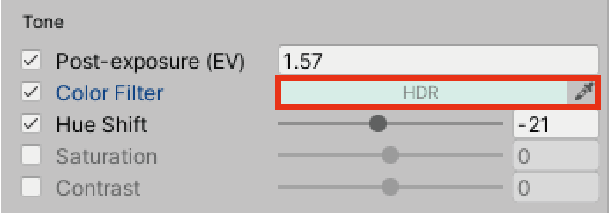
Click on the HDR part
This color picker is very useful because it allows you to select a color that is ±2 shades lighter or darker than the selected color.
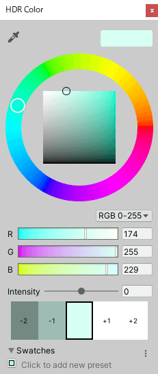
HDR Color Picker
Color Filter R:174 G:255 B:229
- Hue Shift
A hue is the difference in correlation between six colors, and a hue ring is an ordered list of hues.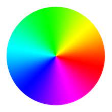
Hue Ring
Hue Shift replaces this hue ring with a bar, so you can move it +180 to the right and -180 to the left.
However, hue may not be in high demand in Tone because it is a drastic color change.
You can move it +180 to the right and -180 to the left.

Hue Shift+180
- Saturation
+The closer you get to +100, the darker the saturation becomes, and the closer you get to -100, the lighter the saturation becomes.
At -100, the color saturation is at its lowest, resulting in a monochrome world with no color.
You can also use this mode to create a monochrome space.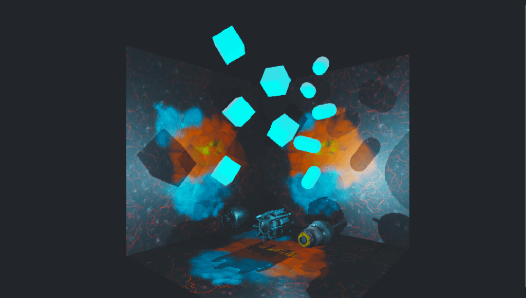
Saturation +100
Saturation -100
- Contrast
Contrast adjusts the difference between bright and dark areas.
The higher the contrast (-100), the blurrier the atmosphere with less difference between light and dark.
On the other hand, as the contrast goes up to +100, the difference between light and dark becomes more intense, so bright areas become brighter and dark areas become darker.
Contrast should be used in moderation, as either too low or too high a value will result in a poor picture.


Contrast +100
If Contrast is turned down to the extreme, the difference between light and dark will disappear and the color difference will disappear, resulting in the following screen.

Contrast -100
【Channel Mixer】
Channel Mixer is a mode for setting how much the color selected in the tabs at the top affects the input RGB, which is divided into RGB (red, green, and blue).
However, since this function is quite difficult and the same color can be achieved with the modes introduced so far, I will not discuss it here.
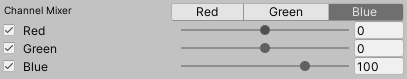
Channel Mixer
【Trackballs】
The trackball in the middle of the hue ring is used to adjust the Lift (dark areas), Gamma (middle areas), and Gain (light areas).
The closer the middle trackball is to the hue ring, the stronger the influence of that color becomes.

Trackballs
To make it easier to understand, I’ll highlight each color.
When only Lift (dark area) is close to red
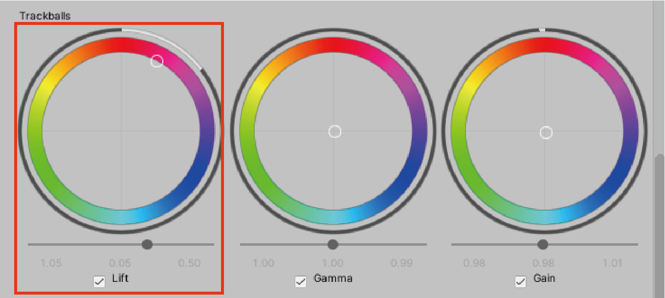
Click and hold the trackball of Lift and move it closer to red.
Then the dark area turns red.
Lift has a strong effect on dark areas.
Next, when only Gamma (the middle part) is close to green
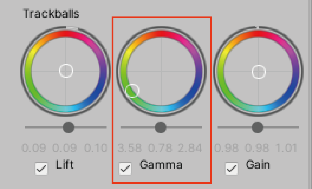
Click and hold the Gamma trackball and move it closer to green
Then the middle part of the image turned green.
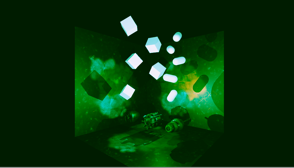
Gamma has a strong effect on the middle part of the image.
Finally, when only the Gain (bright area) is close to blue
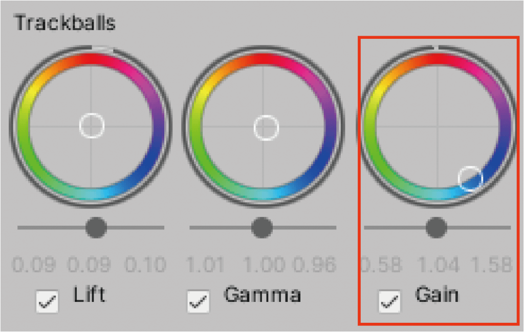
Click and hold the Gain trackball while moving it closer to blue.
Then the bright area is tinted blue.
Gain has a strong color effect on bright areas.
【Grading Curves】
This is a mode that allows you to adjust the brightness and saturation of the hue using a tone curve in Photoshop.
This mode is also relatively difficult, and can be substituted with the modes introduced earlier, so we will skip it.

Grading Curves
This is how to use Color Grading.
Color is one of the most important elements in a work of art.
Just by choosing one of these modes to change the color and atmosphere of a space, you can improve the quality of the space you have created and make your work even better.
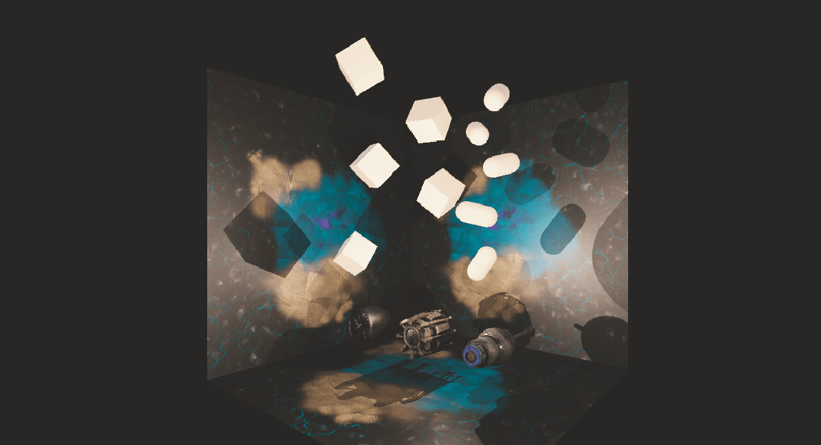
Staging the sample scene
Finally, let’s take a look at how to direct the effects of the sample scene.
For the sample scene, I used an effect called Bloom from Post Processing.
Bloom works especially well with Color Grading, and I was very impressed with the compatibility of the two effects.
Direction of the sample scene
In this sample scene, an object is made to glow and the amount of light and diffusion is adjusted using the Bloom effect.
First, let’s make the object glow.
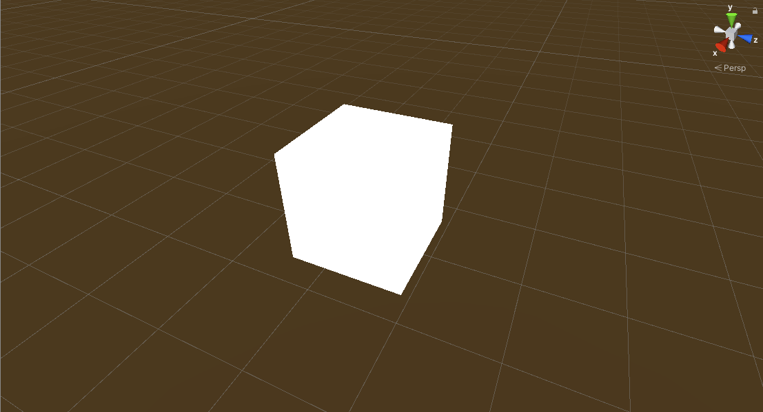
First, prepare a suitable object in Unity (Directional Light has been removed to make it easier to see the light emitted).

Place the object
Right click > Create > Material to create a material.
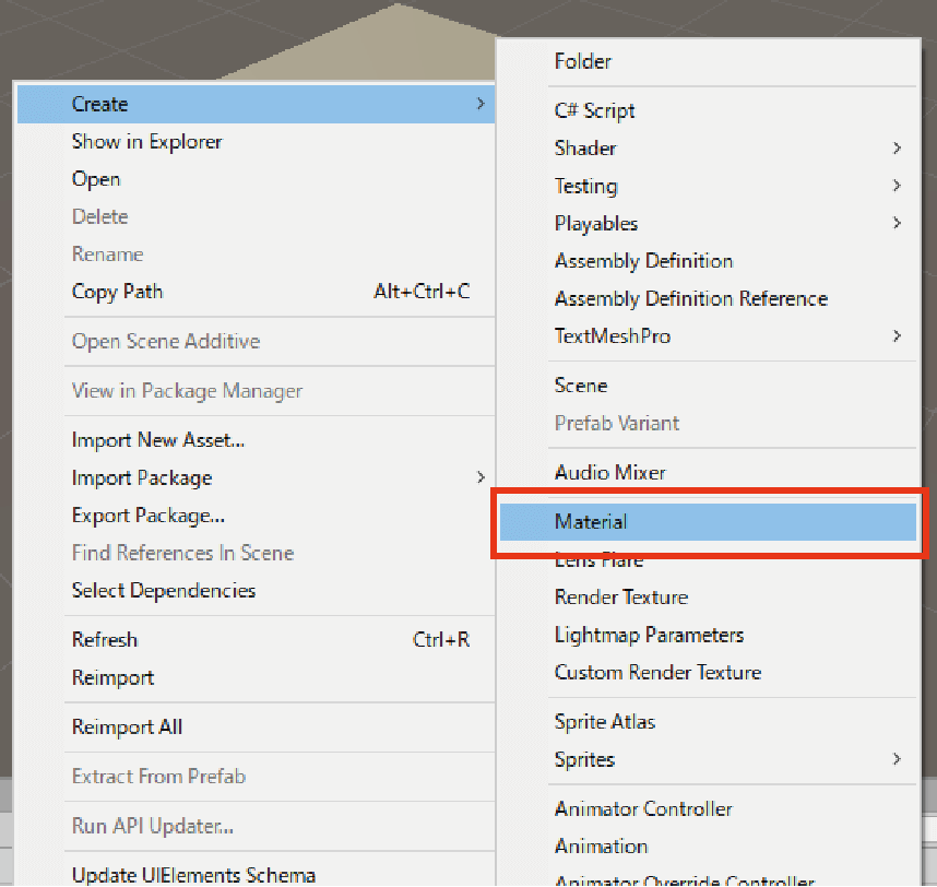
Right click > Create > Material to create a material.
Drag and drop the created material onto the object.
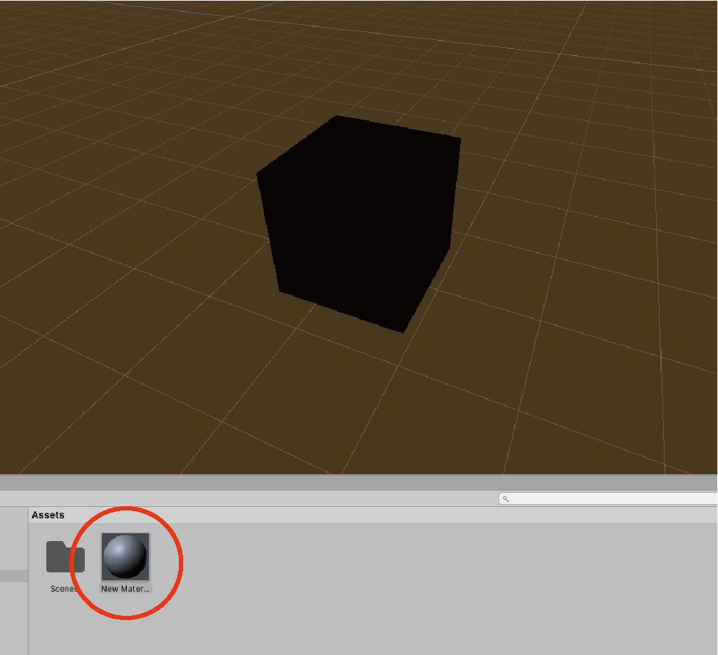
Drag and drop the created material onto the object.
Then, open the object inspector, select Emission in the Material Settings section below, and click HDR below.

Select Emission and click on HDR below.
Select the color you want in the color picker, and the process of making it emit light is complete.
Luminescence complete!
We will now implement the Bloom effect.
As with Color Grading, select Add effect… in the Post-Process Volume of the Gameobject and select Bloom from the list.
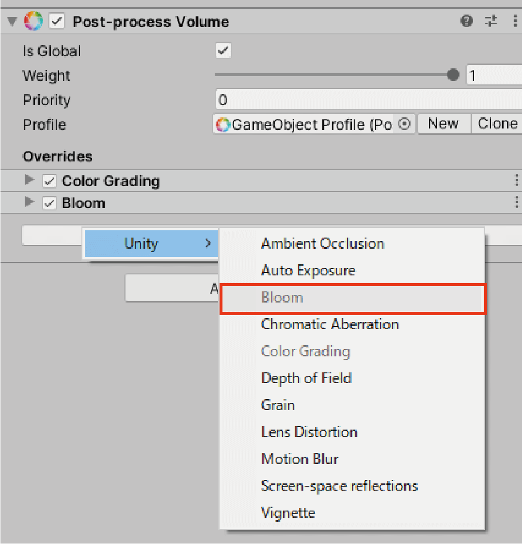
Select Add effect… and select Bloom from the list.
Place the glowing object, and change the Intensity value of Bloom to change the amount of light emitted by the object.

Changing the Intensity value of the Bloom changes the amount of light emitted by the object.
After that, use Color Grading to correct the color tone and you are done.
How to upload to STYLY
Let’s upload the created Color Grading scene and prefab to STYLY.
How to create a STYLY account

How to upload 3D models to STYLY
How to upload to STYLY from Unity
In this article, I’ve covered how to use the Color Grading effect in Post Processing, as well as the detailed roles of the modes.
This is a great opportunity to take your work to the next level.
You can use STYLY FORUM to solve the problem. STYLY FORUM is a place where people can discuss a service or technical issue on STYLY, or provide bug reports on STYLY.
https://en.forum.styly.cc/support/discussions