In this article, we’ll discuss how to place negative spaces in your 3DCG space design with those spaces in mind.
I would like to apply the basic knowledge of design, which is mainly used in 2D design such as with logos and web design, to 3DCG.
What is negative space?
What is negative space?
Negative space is the “margin”. It’s also called a blank space.
If you make good use of these margins, you can bring the main visuals to life.
Deliberately take the margins into consideration with the part of the image you want the user to see as the main one and how it will balance with the other objects.
When we think of margins, we think of monochromatic or white backgrounds, but that doesn’t necessarily mean they have to be monochromatic. Think of “margins” as areas where there are no elements apart from the main visual or other elements.
In the design of the space, it is possible to make the space look wider and emphasize the main furniture by leaving a blank space between the furniture or leaving the same coloured furniture, ceiling, and walls as margins.
In the image below, a margin is used from the left to the ceiling. This is set aside as a negative space and the furniture part is arranged as a positive space. You can learn more about positive spaces in the section below.
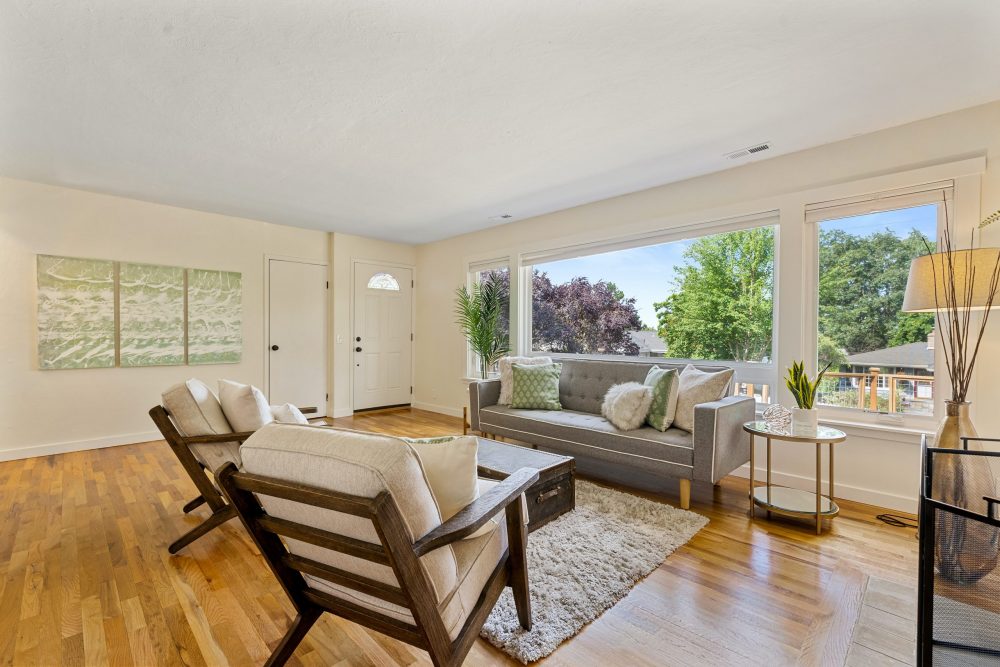
Negative space
Image reference source:https://unsplash.com/photos/RTxQBPGA3IQ
What is positive space?
The opposite of the negative space is the positive space.
This refers to the part of the main visual, such as the logo. In terms of spatial design, the furniture you want to show is placed as the main visual.
In the image below, the bike and the building are the main components, and the entire right side is reserved as a margin.
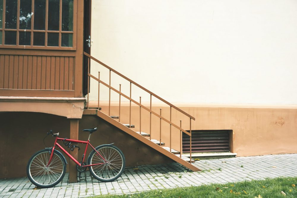
Positive space
Image reference source:https://unsplash.com/photos/8_vzxZp7l4c
Differences in the presence or absence of negative space
In the case of an arrangement that focuses only on balance
At first glance, this room looks like a tidy room.
Here, I’ve placed the fireplace as the main object, but the whole thing feels a little heavy in terms of being aware of the negative space. The image is weakened because the main object gives the impression of being equal to the other objects.
So, let’s change the layout by leaving a margin between each object. I will also add some lighting.
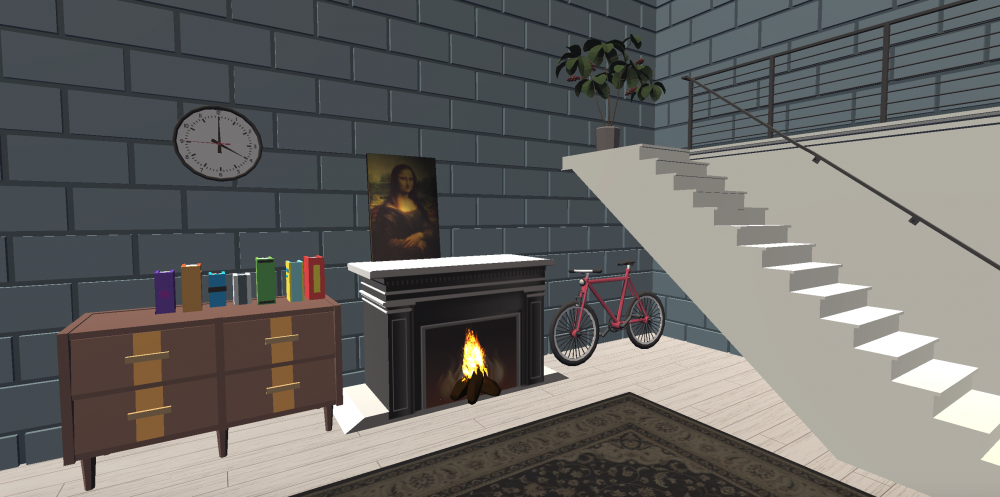
In the case of an arrangement that focuses only on balance
Negative space-conscious placement
This is a change in the placement of the negative space. Contrary to the arrangement above, the margins on the side of the wall give a sense of spaciousness and a neat impression overall.
In this article, I’m explaining this as a 3DCG space design, but this can also be applied to the layout of a real room.
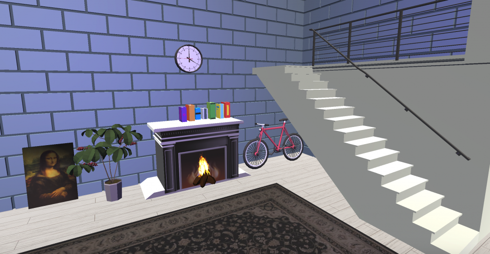
Negative space-conscious placement
The benefits of utilizing negative space
There are two benefits to utilizing negative space.
- It tells the user what you want to show them the most.
- Negative space stabilizes positive space.
By using negative space, you can make the most of the objects you want to show by arranging them.
It’s not so much about making it stand out as it is about making a positive space appear more stable by creating a negative space. That way, you’ll know what you want to show your users the most.
Examples of using negative space
Here is an example of a space design that makes use of negative space. When rendering, it’s a good idea to write with negative space in mind.
Here’s a little commentary on the rooms featured in the section on negative space-conscious placement.
Here, in addition to being aware of the negative space, I’ve placed the whole thing so that the eyeline goes down.
Placing something tall that takes up more than half of the room will give the room a sense of oppression and crampedness. If you’re putting in tall objects, put something in that’s the same color as the wall to make it feel less oppressive.
Examples of using negative space
Summing up
In light of the above, I will summarize.
- Negative space is the “margin”.
- In spatial design, think of a place where nothing is placed, or a collection of tonal colors, as a margin.
- Both positive and negative space are stabilizing factors in the balance.
Also, if you’re browsing the space with a tumble, similarly, make sure that other objects don’t overlap around the main visual and make the space noisy. The most important thing is to be aware of what you want to show your users the most.
How did you like it?
As you can see, it’s not too difficult to create negative space in a 3DCG space. When you think about balance, you will inevitably secure negative space and positive space.
If you are going to create a work of art, please check out the basic knowledge above.