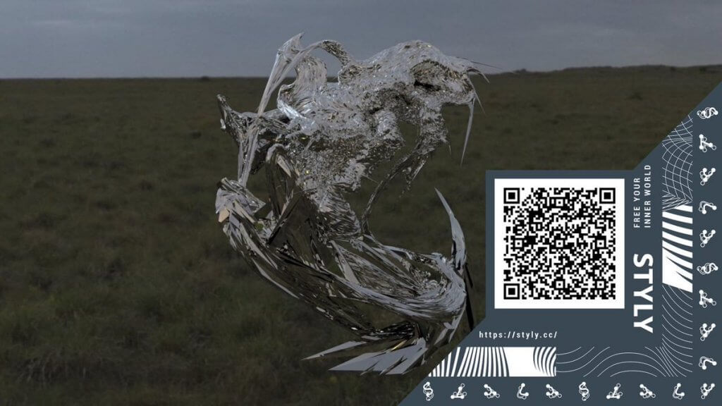
In this article, we interviewed graphic designer Heijiro Yagi, starting with his work “create typeface” at NEWVIEW CYPHER.
We will focus on the philosophy that forms the basis of his unique graphic design/typography.
Editorial cooperation = Rintaro Fuse
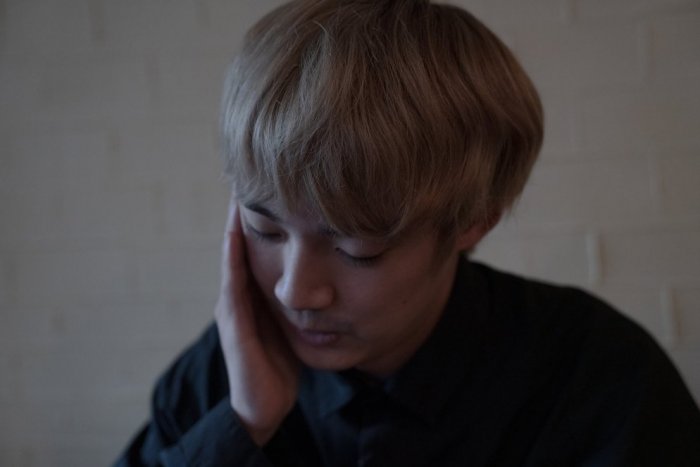
Heijiro Yagi
Born in 1999. After graduating from Tokyo Metropolitan High School of Arts, he entered Tokyo University of the Arts.
With graphic design at the core of his work, he is trying to discover the graphical elements that design should have had in the future.
His work includes graphic design for posters and visuals for exhibitions by young contemporary artists, as well as movie posters and book design.
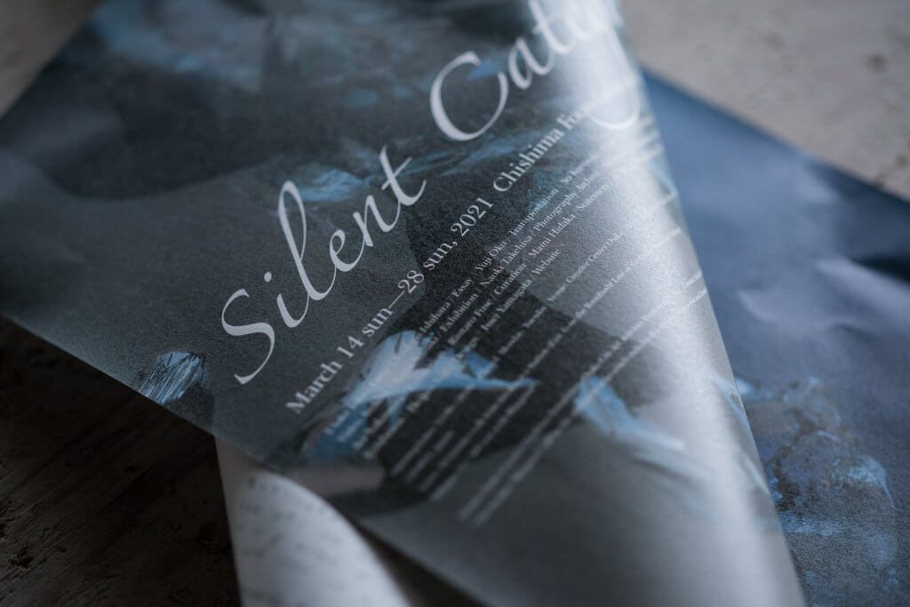
Flyer for the exhibition “Categories of Silence” (2021, Creative Center Osaka) Photo: Naoki Takehisa
“creature typeface”
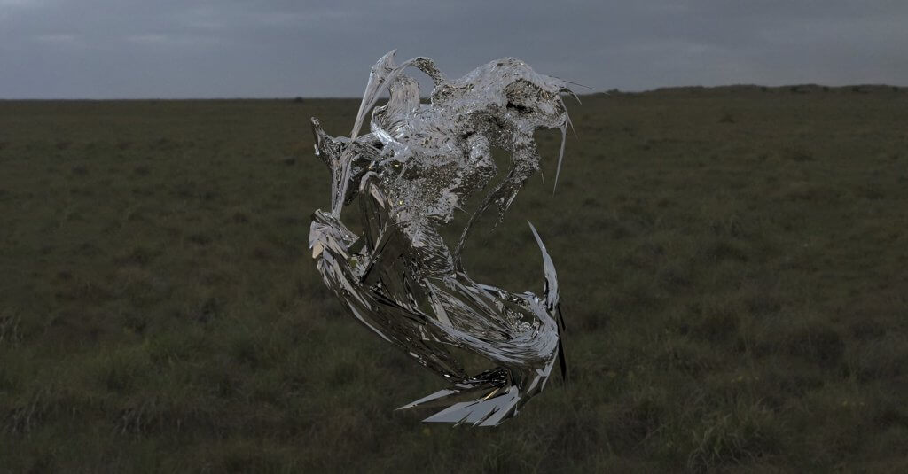
When you launch the scene, the 3DCG typography created by Heijiro Yagi appears as AR. The viewer can play with the sculptural letters, which incorporate environmental information through transparency, from various angles.
こんな感じでcgの文字とARで戯れることができます。 pic.twitter.com/JVQ3TDUTgn
— 八木幣二郎 Heijiro Yagi (@57577_hei) August 28, 2020
He sais “This is how you can play with cg letters in AR. ” in this tweet.
There are also T-shirts printed with the same typography as the one in the work, and you can access the work from the QR code printed on the back.
— Heijiro Yagi / 八木 幤二郎 (@57577_hei) September 20, 2020
Based on the history of design, an examination of the state of typography
-The fact that Mr. Yagi creates graphics using 3DCG objects with a certain style is particularly impressive.
Do you have any plans to use the AR format in the work that we will be discussing in this article?
Heijiro Yagi (Yagi):When I think about graphic design, I’m interested in a world where there are no more designers. How will graphics and typography function in such a world? First of all, I believe that there is a problem with the current trends in typography. If you look back at the history of typography, you can see that it has developed along with the changes in printing technology. For example, DTP (Desktop Publishing) has changed the history of printing, which spans over 500 years, in just 20 years. Before that, photo typesetting came out after metal typesetting, and under its influence, people like Tsutomu Toda and Kohei Sugiura liked to use the technique of transforming the letters themselves, which was not possible with metal typesetting, as a graphic element for magazine headlines. However, with the advent of desktop publishing, more and more things became possible, and the work of designers has since shifted completely to computers. With Illustrator as the main tool, which can be manipulated freely, the physical constraints of text were removed, and it became possible to create completely smooth lines and graphic elements.
-I see.
Yagi: Based on these trends, recently, designers in their late twenties to mid-thirties have been daring to rewrite characters and graphics created in Illustrator by hand, or create written characters in Illustrator. But I think this is also a trend that is occurring as people seek textures that are unavailable now that DTP and Adobe have become mainstream.
(参考文献 : 作字百景 http://www.graphicsha.co.jp/detail.html?p=38729)
-Are you saying that this is a movement in reaction to the situation where Adobe’s software has become so dominant?
Yagi: Yes, it is.
I feel that I can’t get out of the flatness of InDesign and Illustrator, and that’s why I’m thinking about the existence of the Z axis in 3DCG software.
-The XY axis of planar software is dominant, so if you do graphic design using the XYZ axis of 3DCG software.
Yagi: Since the spread of smartphones, the number of designs using “sans-serif” typefaces has also increased in order to support displays and increase visibility. That’s why I believe that when AR and iGlass become very popular, the form of typography will change as well. In other words, I think we will see more complex three-dimensional letters like the ones in Blade Runner. I wanted to think about this, so I had my typography made into AR.
Why does every luxury brand’s logo look the same? https://t.co/GF73zATg1g pic.twitter.com/9HwHlnVG1F
— The Business of Fashion (@BoF) March 12, 2019
From beast to letter with printing
-On the other hand, Mr. Yagi, after creating 3DCG objects, you place a lot of importance on the process of printing the images, don’t you? I’d love to hear what you have to say about printing.。
Yagi: I think about printing on a different scale.
Originally, I wanted to be a concept artist, someone who creates creatures, so I started using 3DCG software before I started using Adobe software like Illustrator.
In the process, I became interested in the physicality and creatures in 3DCG software, which led me to design, so in my case, the formation of letters is similar to that of creatures.
-For example, the kanji character for “件” was originally derived from a fictional creature called “kudan,” which looks like a monster.
Yagi: For example, when a concept artist creates an imaginary creature in 3DCG, he or she might think, “Let’s borrow the scales of a lizard” or “Let’s use the skeleton of a crocodile”. I think that the fact that the creature is made from such a variety of living things is itself similar to the way kanji characters are formed, with their kanji radicals.
Godzilla follows this process, and in the case of “Shin Godzilla”, I believe that it is frozen at the end to become a character.
-In the case of “Shin Godzilla,” I think it’s the freezing at the end that turns the creature into a character.
Yagi: So printing is also an attempt to see if the objects created with 3DCG software can be made into letters by being fixed on paper.
-The typography that Mr. Yagi create is truly highly abstract and creature-like, but the process of fixing it on paper is an important part of making the 3DCG image function as text, isn’t it?
Yagi: That’s right (laughs).
-However, there seems to be a bit of a leap between printing and AR.
Are you rather interested in 3DCG on the display or the materiality of 3DCG objects visible in AR?
Yagi: I think AR is the one that may allow us to touch the text.
First of all, I have a desire to touch the graphics that I have created. But it’s not a desire to touch printed matter, it’s a desire to touch it as an object or three-dimensional form.
Graphic designers create books as a way to fulfill such desires, and I often think about books myself. However, in my AR work, I tried to think of “touching the text” and “touching the design” as selfish personal work on the side of graphics alone.
-The aim is to give mass to graphics and typography by using AR’s ability to spoof mass like a sculpture in a more spatial way.
Yagi: When I’m working on graphics with 3DCG software, I’m thinking that the data itself, as a three-dimensional object that can be turned around with the mouse, is in trouble.
-It’s like the data is storing mass. It’s a wonder, isn’t it?
Yagi: Yes, it is.
I feel as if I can really touch the graphics.
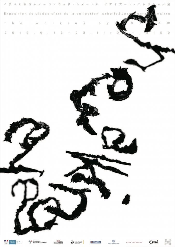
The very first typography I made with 3DCG was for an exhibition called “The Walking Eye” (2019, Yokohama Red Brick Warehouse).
I was asked to create the graphics for the title text in 3DCG.
The title of the exhibition is “Walking Eye”, so I started creating typography in 3DCG because I could read the text by walking.
When AR and VR are developed, we will be able to walk around and look at the letters, and we will be able to hold the letters as 3DCG data.
So here again, regardless of the scale of the actual output, I started designing graphics in 3DCG based on the concept that one day we will be able to walk around and look at letters.
-I see.
It’s fascinating to see the intersection of your experience and interest in creating creatures and your knowledge of design.
In a very practical sense, the typography of “The Walking Eye” is relatively close to traditional text, but the cover of fox4G, YUNG HIROPON’s EP “shape” (https://linkco.re/s5B5CzhG) and the AR work of NEWVIEW CYPHER’s AR works are highly abstract, and have a more creature-like image that doesn’t consider itself to be functioning as existing characters.
Yagi: But the basic flow of the production process is similar. When I want to show something as a character, I type the typeface in Illustrator and export it as SVG, giving it depth and texture.
On the other hand, for highly abstract works, I use 3DCG software from the beginning.
I create about five textures from my own photos, select them, and gradually adjust the textures by changing them with sliders. I use sliders to make changes, and gradually adjust the textures. It’s like I’m expanding the textures more and more.
-It’s like an extension of the writing and drawing movement itself.
Yagi: As for software, I use ZBrush. There I can manipulate objects like clay, so I feel like I’m creating with just the brushstrokes of my wrist.
In calligraphy, too, you create an image by manipulating the brushstrokes. For example, the calligrapher Ishikawa Kyuyo uses brush strokes in a montage style, so I learn how to use strokes from that. When I create with 3DCG, I replace the paper space in calligraphy with a 3D space, and draw according to that space. I draw according to the flow of textures and make the splashes and strokes. So it’s not like I wanted to write a specific character.
Characters conveyed by details
-In other words, you are creating objects created by the sense of brushstrokes in 3D space as a medium for communication, similar to the letters that people use in everyday life.
Yagi: I’m also thinking about what will happen after letters disappear completely or civilization dies out.
In such a future, I believe that civilized people who see only the form of letters will think of “a horse running” or “the wind blowing,” and I create typography with the sense of super-compressing them. I’m trying to make people imagine and communicate with just a shape.
-By evoking images through graphic details, you aim to make your graphics function in the same way as the letters we usually use.
Yagi: One of the important things to remember is the origins of the biohazard symbol. The design was based on in-depth research with citizens of 25 cities to create an “infectious waste label” that could be passed on to future civilizations and different cultures.
It’s designed to function even when there are no longer people who can read. It’s something that is communicated through details, so I think that’s a benchmark for me in thinking about my own design.
-This is a convincing example of a common design consciousness, especially in the typography and graphics that Mr. Yagi creates, which are quite abstract.
Design Trends / Design Consumption Structure
-I can sense from the interview so far that Mr. Yagi’s design work reflects a strong sense of authorship, especially in the final output.
Is it possible to say that the relationship between design and a certain kind of authorship is being reevaluated again, especially in recent years?
In the past, there was an organization called JAAC (Japan Advertising Artists Club), which was created by Tadanori Yokoo and the people around him.
After JAAC, I think the profession of designer has changed.
Originally, designers were supposed to be artists who drew pictures, created text, and created visuals, but now they’ve become something more transparent.
It became mainstream not to mention the name of the designer who created the visuals, and I feel that there was an atmosphere where it was considered bad to show one’s self.
Recently, however, there are more and more designers who are pushing their creativity, and I think this may be a turning point.
-Some people may be reminded of the acid graphics trend when they see your designs.
In recent years, designers with authorship tend to install (place) their graphics on the Internet, and people who are looking for designers tend to access them.
(Reference: Idea No.388, Special Feature: Online Portfolios Today, Collective Consciousness Emerging from SNS, Acid Graphics) Foreword: http://www.idea-mag.com/idea_magazine/388/
This reminds me of the topic of “How do you think it works?
I don’t think acid graphics are very good, I think they use the atmosphere of computer graphics from the 90’s, and the root of imagination is nostalgia.
In terms of nostalgia, I think some of the typography and graphics are related to the vaporwave scene.
-Although there is a tendency for graphics and textures to be characterized by the use of Photoshop and 3DCG software, it can also be thought of as a movement in revival culture that goes beyond graphics, as in the recent use of words like Y2K.
Yagi: That’s right.
In terms of graphics, when it comes to judging the quality of acid graphics, it all comes down to how good the tagging is. In the end, I feel like we can’t get away from the flatness of it.
-After all, when I listen to you, there is an emphasis on using 3DCG software because there are problems based on the current state of design.
Of course, Mr. Yagi’s work uses computer graphics that can only be used in the modern age, but I felt that his motivation for introducing this technology based on the history of design is to consider the “problem of the consumption structure of design” that he is thinking about.
Yagi: In graphic design, I think of “letter” and “text” separately. It’s connected to what I said earlier about “件”, but if we divide the word into “human” and “cow”, we are reminded of living things instead of text. For example, if there is text on the back of the flyer, I think the text on the front could be more free.
-For example, if there is text on the back of a flyer, the text on the front could be more free.
3DCG software has a lot of opportunities to pursue reproducibility, especially as a temporal element of the work, but the modeling process is quite sculptural, isn’t it?
Yagi: Basically, the 3DCG models I make don’t have UV development, and the polygons are messed up and the normals are flipped over. So I basically use materials to add texture. Because of this, I can only animate the model to the extent of rotating it, so I can’t use it for visual operations.
But on the other hand, the fact that we can’t move or animate them makes me think that CG models will become characters, just like “Shin Godzilla” was frozen.
-Now that the trend that used to be called “digital abstracts” has calmed down and been reflected upon to some extent, you are working to create graphics/artworks/designs that are made in the term of reexamining them.
Yagi: In terms of graphic design methods, there is a common awareness that can be seen in many countries. Around the current trend called acid graphics, there is a trend of using 3D software such as Cinema 4D and Houdini to create visuals with fluid motifs, and I think there will be more designers using 3D CG in the design industry. That’s because 3D software has become so popular in the past few years. However, I don’t have the feeling that I’m all for technology. I think it’s important to calmly make choices in the times, and since we’re only rewriting “nostalgia” with the technology available now, how do we preserve it?
If Adobe were to disappear, all designers would cease to exist, and I think that situation would be bad (laughs).
Irradiating design from a different angle
-The current trend in this approach is also to rethink the dangers of the production environment itself.
I think it’s important to have a situation or state where “design exists” even when there are no designers left.
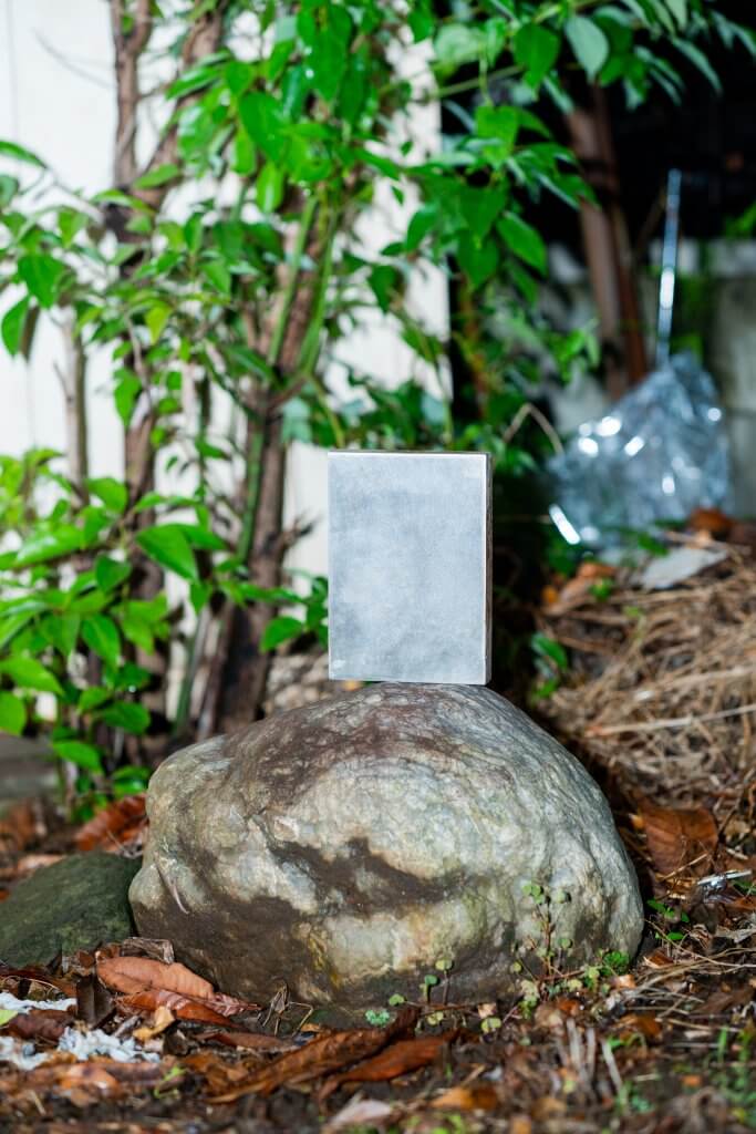
One of my personal works in the past is a book design called “easy open ends” (2021, Production: Sen Takahashi). It is a square can filled with a book and an organic solvent, and the book continues to decompose over a period of about 10 years.
3DCG models are data, so there is a possibility that they will remain in the future, but in the case of paper media, there is a huge difference in the color of the print when it is printed. And paper deteriorates.
But as long as there is a 3DCG model, even if the support material deteriorates or the designer’s position changes, the graphics can be updated. Just by rotating the model a bit, you can create a different image.
I think that’s what’s important.
It’s like the “biohazard mark” – how will we leave our designs to the future, years from now, tens of thousands of years from now?
-In essence, the speed at which designers’ creations and actions are consumed is overwhelmingly fast today, so you use 3DCG to shift that sense of time as well.
Yagi: That’s right. People often say, “You’re designing like an artist,” but I don’t want to change the fact that I’m designing as a designer.
Currently, there are only a limited number of outputs that a designer can choose from, so I think it’s okay to come up with an output from a different perspective.
-STYLY MAGAZINE can be said to be a kind of media for people who are interested in computer graphics using XR/3DCG, including STYLY.
In this context, Mr. Yagi’s work and philosophy suggest issues that people who work with computer graphics need to think about, and I think this was a meaningful interview. Thank you very much for your time today.
Scene
Let’s actually start the scene and see the work.
- Experience it from your smartphone
Download STYLY Mobile and launch the scene. Please refer to the following article for how to download.
By reading the QR code below in STYLY Mobile, you can launch the scene and view the work.

![[Summary] How to experience STYLY scenes VR/AR(Mobile) / Web Browser Introduction by step](https://styly.cc/wp-content/uploads/2020/04/スクリーンショット-2020-04-10-12.53.04-160x160.png)
