
When designing a VR space, users can easily get lost if you forget to keep in mind what actions the users can perform.
There are many creators that are using STYLY to create VR spaces. In today’s article, I will introduce how to create large VR spaces without making users get lost.
What Makes a Good VR Space?
What do you think a good VR space is? A space with spectacular visuals? Brand new ideas? There is no end to creativity, and there are countless answers to this question.
Take this question for example, ‘What makes a good reading?’ You may think that there is no solid answer, but KARAKI Gen, the ex-chief editor of Nataly says that ‘A good reading is a reading that gets read thoroughly’ in “新しい文章術の教室”. What if the tempo is bad? What if there are many grammar mistakes? What if the reading is too long? He talks about how difficult it is to write an article that people will read to the end.
Following this idea, I define ‘a good VR space is one where users do not get lost, and can see everything that the creator intended’. There is a certain tempo that the users look for in things, and for each concept a creator has, there is always a ideal area for it. It is very difficult to do this.
In a VR Space, Users Can Easily Get Lost.
When you imagine a VR space, you will think that users can move around freely. But when users put on a headset and enter such a space, they ’get lost to where to go’, and ’become unsure where to go next’.
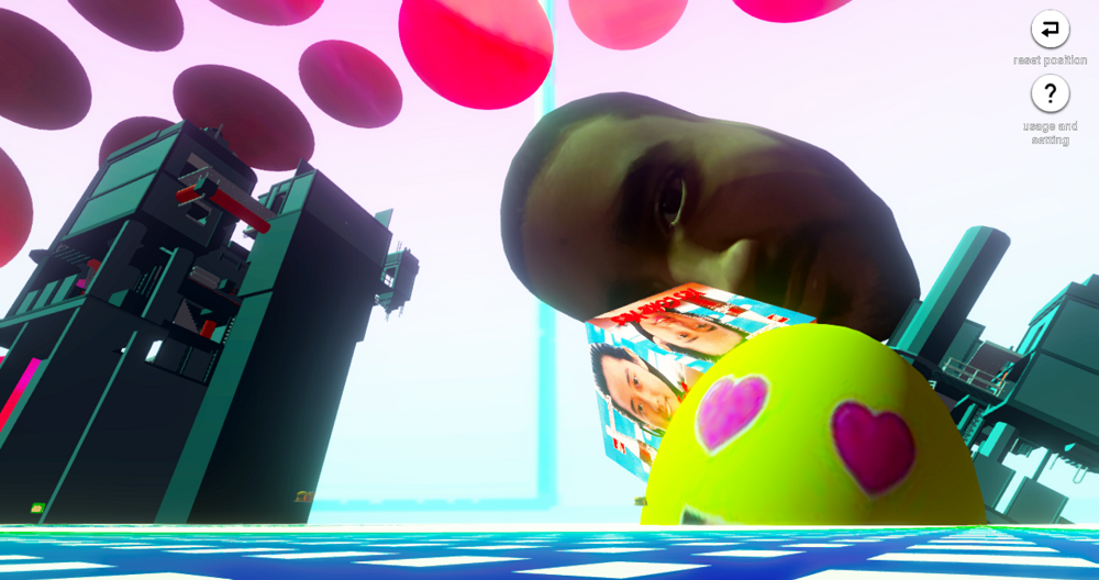
A sample VR space. At first glance, there are many objects to look at…
Please look at this vaporwave-like VR space.(Link)At first glance, there are many objects and colors that catch your eye.
But this VR space has the problem of ‘users becoming lost in deciding what to do next’. This is because this scene is created without thinking what actions users can do except move their head and look around. There is just a huge area, and the user is left on their own at the center. Even if they move a bit, there are no directions or objects that stand out.
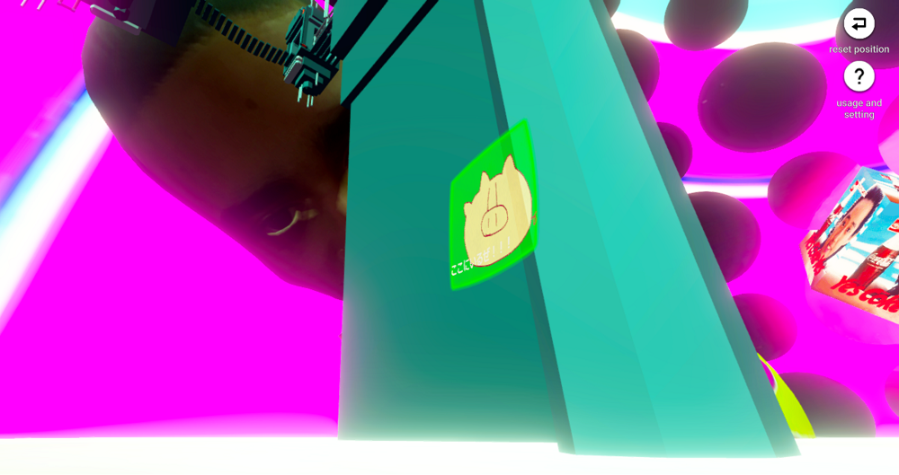
Detailed designs are not enough on their own, the creator has to imagine how the users will look at them.
What would the scene be like if the creator wants the user to walk around, and focus on the details they created? Regarding the previous space, if the user is able to find the pig picture, I think I can say that the user was able to look around the area thoroughly.
But to do so, the area is too large, and the user has to walk around a long distance. It is not hard to imagine the user becoming tired and fed up. The scene has no directions to guide the user through the area.
Designing an Ideal VR Space for STYLY
When users enter a VR space, except from moving their head around to look around, the motions the users perform are different from that in the real world. The basic functions of motion controllers, platforms, or software are limited and different for each.
A VR space is not an unlimited space, they do have limits from the platform or software. If the user can jump, the creator can create a space that height is important. If the user is able to ride a car or plane, the creator can use a large area to its full extent. VR spaces that match user actions are the best.
Then for STYLY, what kind of VR space is ideal? STYLY is now focused on enabling the user to look around, and the user is able to move too, but is mainly limited to point jump movements.
So, an ideal space will be ’where users can look around, and move a short distance’.
Of course, a scene in which the user can just look around to see the concept would match STYLY too. But by including some movement, creators can add more dynamics to the scene.
A ‘Display-Based’ or ‘Route-Based’ VR Space As In an Art Exhibition
How can one create a VR space where the user can be able to see around without getting lost?
You can gain hints from real world art exhibitions. Artist works are displayed in order according to period or theme, and visitors can look at them by moving on a route. Exhibitions are very good examples of a space designed to observed and move around in. Isn’t this a perfect example for STYLY?
Based on an exhibition, I created two guidelines for creating a VR space for STYLY. The two are ‘Display-based’, and ‘Route-based’.
Please look at last year’s NEWVIEW AWARDS 2018. The award winning creations are very good examples of ‘Display-based’ and ‘Route-based’ scenes.
‘Display-Based’ Scene Creating
‘Display-based’ scenes are scenes with the concept of showing objects in a limited space like an exhibition. This matches STYLY very well, and users will not get lost easily, and it is suitable for showing fashion or art.
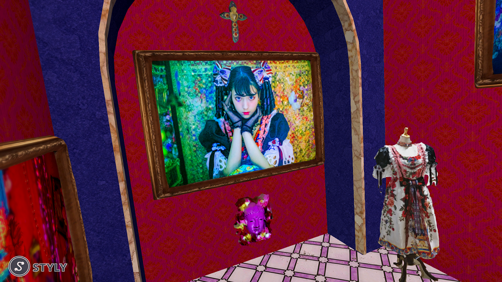
IMMERSIVE PHOTO EXHIBITION ‘Beautiful girls can kill with their eyes’ is a good example of such a scene.
A good example of a ‘Display-based’ scene is ‘Beautiful girls can kill with their eyes’ from IMMERSIVE PHOTO EXHIBITION. At first glance, users can see what the creator wants them to look at.
There are not only normal displaying of photos and fashions, but there is interaction such as looking through a hole. Users cannot get lost in what to do in this scene, and can enjoy the creator’s concept.
‘Route-based’ Scene Creating
‘Route-based’ scenes guide the user where to go next, and lets them walk around along a certain route. This means the creator can build up a story through displays. But the creator has to keep thinking how to make such a scene without making the user lost.
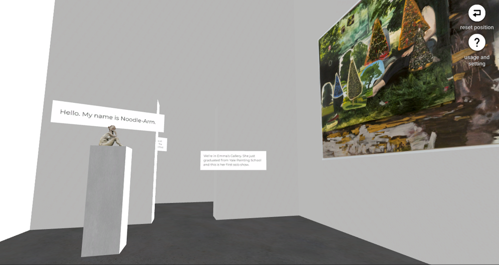
‘EMMA VR: PAINTING LIFE’ The user walks a long distance, but there are many clever designs to guide the user.
Good examples of route-based scenes are’EMMA VR: PAINTING LIFE’ and ‘身体の形状記憶装置 -SHAPE MEMORY OF YOU-’. By including reading, the scene guides the user and also creates a dramatic experience. The user can enjoy a story-like experience in this scene.
In my next article, I will talk about the pros and cons of ‘Display-based’ and ‘Route-based’ scenes. How can we make an ideal VR space to lead the user to the pig picture?
Hope to meet you in my next article!