In this article, we’ll discuss “eye guidance”, the basics of layout.
Eye guidance is mainly used in 2D design, such as web design and posters. Let’s apply this to spatial design and focus on the areas you want to show the most.
This time, we will use the space created by STYLY as an example to show you how to arrange the space with consideration of eye guidance and its merits. I hope you will practice it together with me.
Basis of Layout. “Eye Guidance”
Originally, “eye guidance” is the expression of the user’s line of sight with the layout.
By taking this into consideration, you will be able to communicate the intent of your creative in a way that users can easily understand.
The layout will be utilized for all needs of design. Whether it’s a film, animation, or web design, the balance of the composition can be considered in the creation of a story with intentionality.
Types of eye guidance
Let’s take a look at the Z, F, and N layouts, which are the main types of eye guidance used in 2D layouts.
There are many other types of layout, but this time we will focus on the above types.
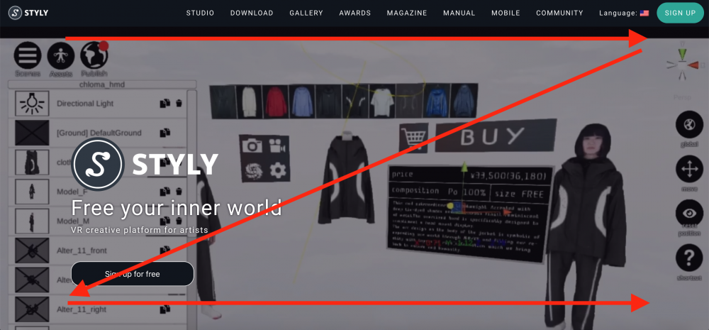
Z-type
First of all, a Z-type layout is a horizontally oriented content. And it’s better to have a well-designed piece of content than a piece of text alone.
Many websites has a menu bar at the top, and company tagline, images and text at the bottom.
By setting the line of sight to Z on a page that makes the most of the design, it is possible to direct the user’s gaze while keeping the balance stable. This is a Z-shaped layout.
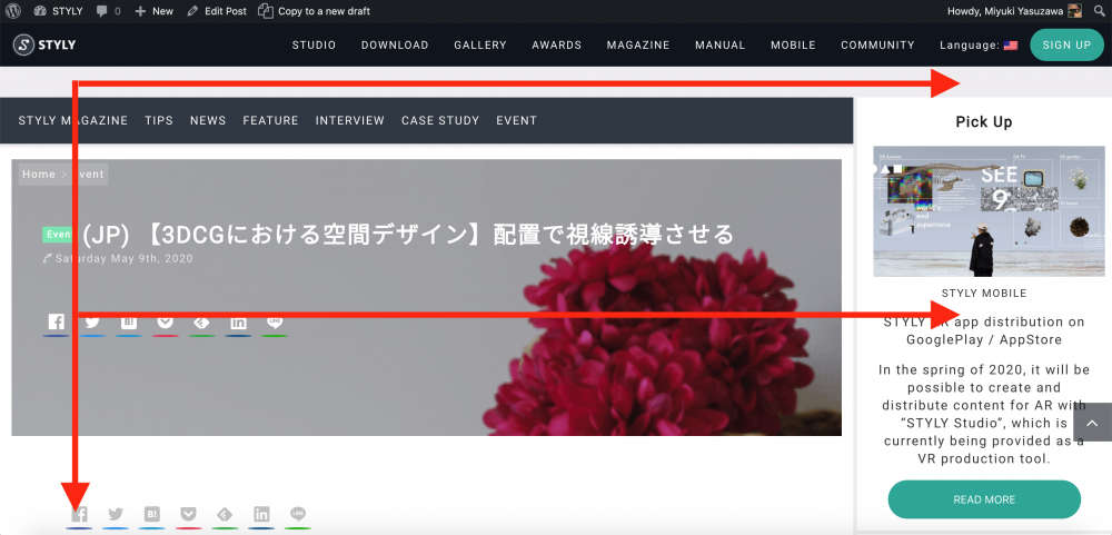
Type F
Next is the F-type layout. This layout is used for transversal text-based media. For example, it is used in web articles and various SNS (Twitter, Facebook, etc.).
This STYLY magazine also falls under the definition of F-shaped layout. This type of layout is called an F-type layout, where text is expanded horizontally and scrolls down.
Type N
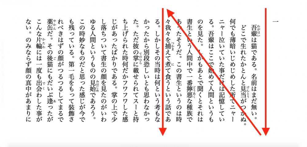
The N type is suitable for books, newspapers, magazines, etc. with vertically arranged letters.
It is mainly used in languages with vertical writing culture, such as Japanese and Chinese, where the line of sight is a leading line like N.
Information source:Aozora Bunko http://aozora.binb.jp/reader/main.html?cid=789
The Benefits of Eye Guidance
Now, let’s discuss the benefits of eye guidance.
The benefits of eye-gazing include the ability to appeal to users and the ability to add a story to your content.
In case the plot is important
n this case, it’s used in video production and cartoons.
For example, in the image below, two men are having a conversation while using a computer.
You can also understand the scene at the top of the image where multiple people are working or preparing a meal. You can also infer a communal kitchen or office café space from the furniture and the atmosphere of the room.
With this situation in mind, you can imagine a picture of a conversation in a communal space during a lunch break at work.
With the movement of the gaze, we can understand the order of the two men’s faces → the people behind them → the interior.
This becomes the storytelling imagined through gaze guidance. You can understand the scene even better if there is an explanation or a caption.
Image reference source:
https://unsplash.com/photos/1m2LQEonm2A
Make your image more appealing
Now, let’s think about eye-gaze guidance with a picture that brings out the product image from the image.
The image below can have a different storyline than the one above. There is more of a focus on “image appeal”.
The situation is that a woman is watching the setting sun from a high cliff. You can see the town and fields spreading out below. The movement of the gaze is also intended to subsequently move from the woman to the sun, then to the nature below.
Therefore, when the emotions of the woman (the product or the creator) are expressed, it gives it a narrative character. Having a product tagline or text to go along with it will make it more appealing.
Reference image source: https://unsplash.com/photos/knk0vDW0GME
An introduction to space design that utilizes line of sight guidance
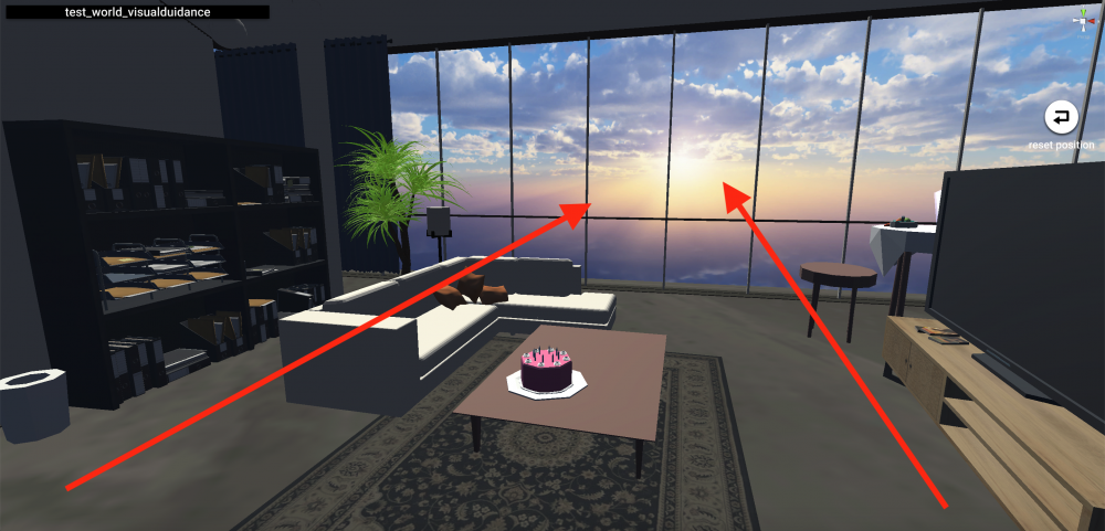
Example of a space design created by STYLY.
This time, I focused on the space design and arranged it in such a way that the line of sight is directed towards the window.
The low furniture in the center of the room and the high furniture on the wall side make the room look bigger. In addition, the L-shaped sofa gives the room a sense of movement.
When space is limited, people tend to avoid putting things in order to make them appear wider. However, you can intentionally make the room look larger by bringing in furniture that is less than half the ceiling in the center. Bringing tall furniture inside can be effective in making it look cramped.
Since there are many products in convenience stores and supermarkets, the use of brightly colored shelves creates a sense of space without oppression. If things and spaces can’t be changed, I think it’s a good idea to rearrange with other colors and light.
Summary
The following is a summary of the eye guidance.
The Benefits of Eye Guidance
- Introducing plot to the story
- Increased appeal to users
- Clarity of gist and margins, making it easier to understand the content
In this way, you can intentionally appeal to users by making use of eye guidance in your content.
If it’s too abstract, I think it’s better to supplement it with text to help guide the viewer’s gaze and appeal.
When designing a space, it is important to devise a way to show it in a way that suits the purpose. When you think about it this way, design thinking becomes more important, than sense. I think that if you think logically before dropping the design, you can create content that is more user-oriented.
How did you like it?
When we think of eye guidance, we think of the 2D world as the mainstream.
However, when we turn our attention to the world of photography and film, eye guidance is considered from composition viewpoint. We hope that this perspective could be applied to the spatial design of 3DCG and utilized in the placement and rendering of objects.
