This article uses Unity’s Button UI and combines it with the Interaction SDK provided by STYLY to create a UI in which interaction occurs.
Like Unity, an interface that uses graphics such as images is called a Graphical User Interface (GUI).
In this article, we will use the Button object of Unity’s GUI. We will begin with basic functions and then explain how to work with the Interaction SDK.
For more information about the Interaction SDK, one can read the following articles in advance to deepen their understanding
Sample Scene
A sample scene follows below. Let’s experience a type of UI to create.
Button UI Basics
This section introduces how to create and configure the Button UI.
The first method of adding a button is to directly add a button.
You can add a button by right-clicking on the Unity hierarchy window and selecting UI > Button.
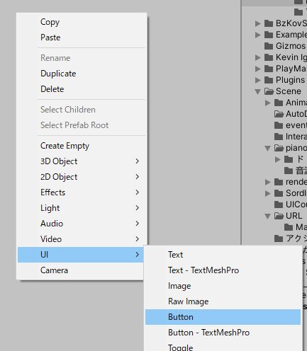
UI > Button
4 objects will be added to the hierarchy window.
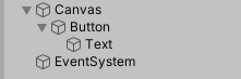
The 4 objects
- Canvas: This is the abstract area in which the UI is placed and drawn. All UI objects must be placed on Canvas to function.
- Button: The button object itself. Button: The button object itself, which sets the image data, etc.
- Text: Text. This is displayed on the button.
- EventSystem: System for sending UI events.
The button UI has now been added.
The button is pre-configured to cause interaction when one left-clicks the mouse.
This occurs because the Button component has a pre-configured “On-Click” event. By combining this event with the Interaction SDK, one can create a mechanism where the action of the Interaction SDK is triggered when the button is clicked.
On-Click Event
Detail will follow later.
First, let’s customize the Button component by changing its color.
Customizing the Button
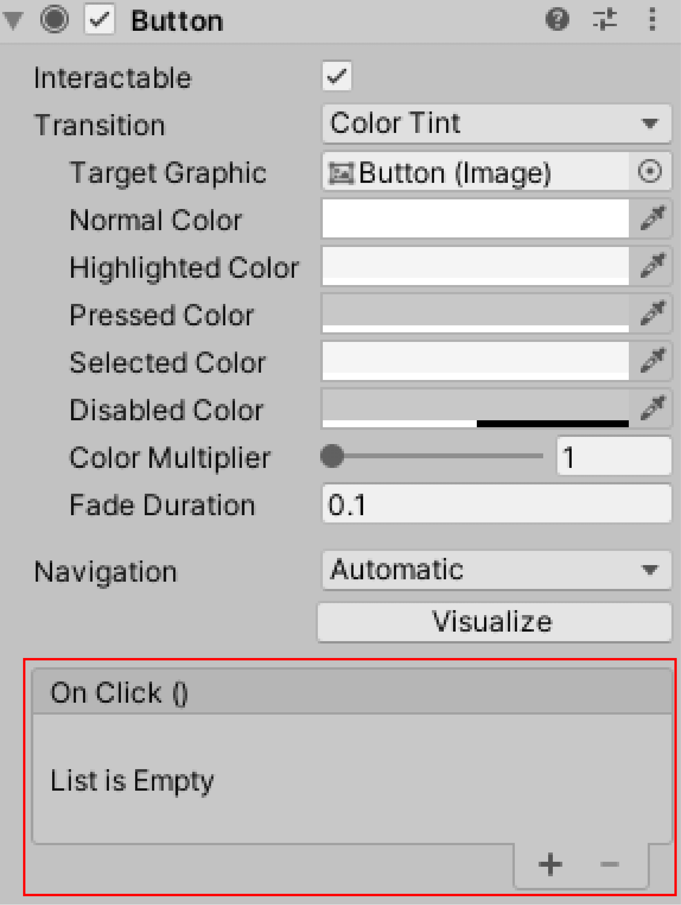
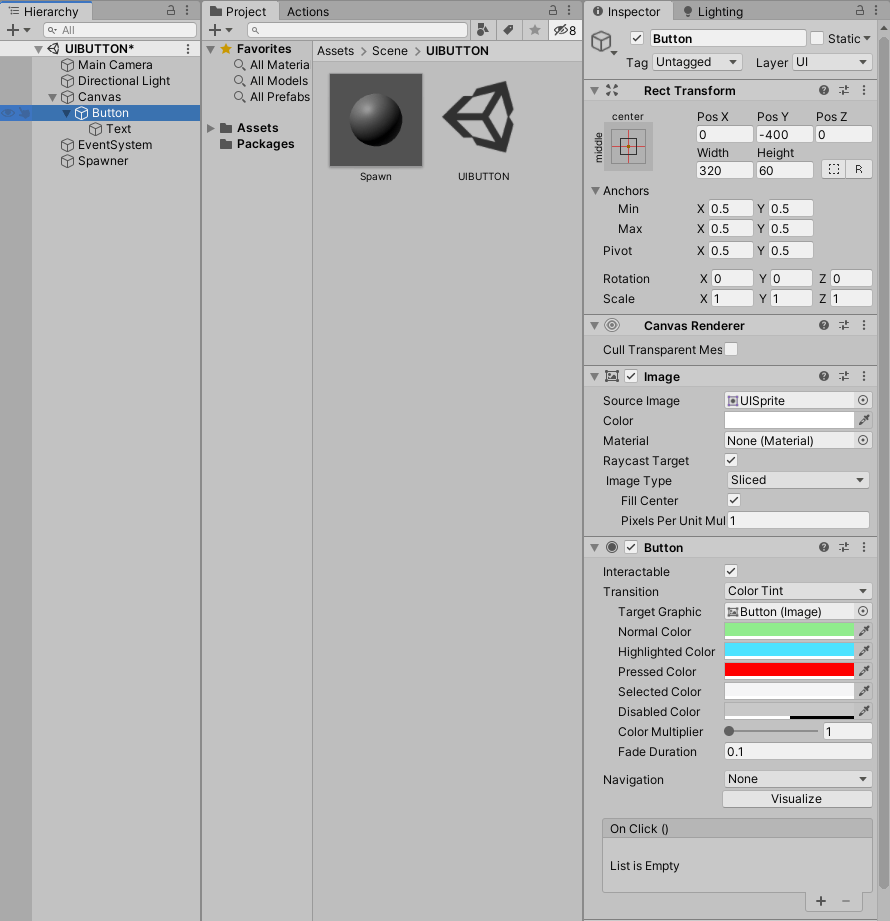
Select the Button object. Let’s set up the “Button” in the inspector window.
Button Components
In the button component “Transition”, one can set the change when the button is pressed.
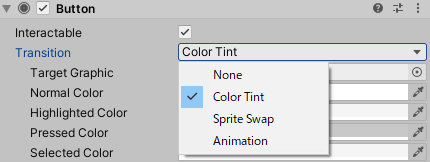
Transition
- None: Nothing changes.
- Color Tint: The color changes.
- Sprite Swap: Sprite switches.
- Animation: The animation is played.
In this tutorial, we will use a Color Tint as a basic tool.
The Color Tint is used to set up a color change when the button is pressed.
Color Tint Setting Items
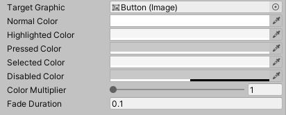
Each setting item is described.
- Target Graphic: The object whose color is to be changed. The default is the Button object.
- Normal Color: The color of the normal state.
- Highlighted Color: The color when the mouse is hovering over the button.
- Pressed Color: The color when the mouse is pressed on the button.
- Disabled Color: Color when the button is disabled.
- Color Multiplier: Multiplies the color of the transition by this value.
- Fade Duration: The duration of time to change the color.
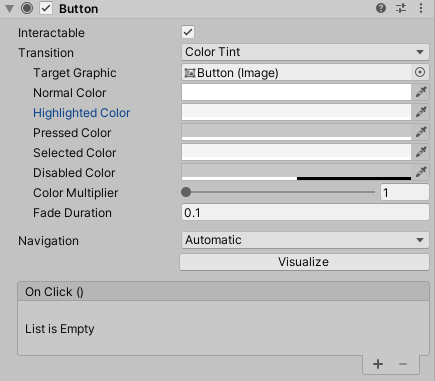
Let’s actually change the color.
Leave Target Graphic as is.
Change Normal Color to light yellowish green.
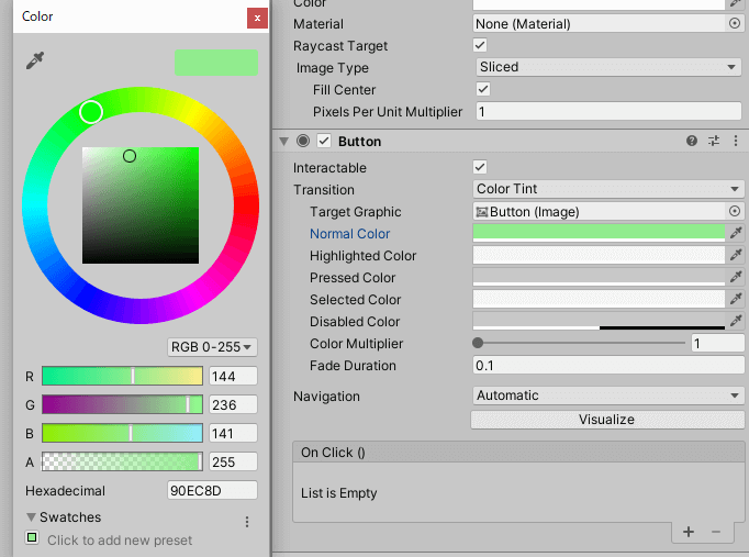
Light yellow-green
Highlighted Color to light blue
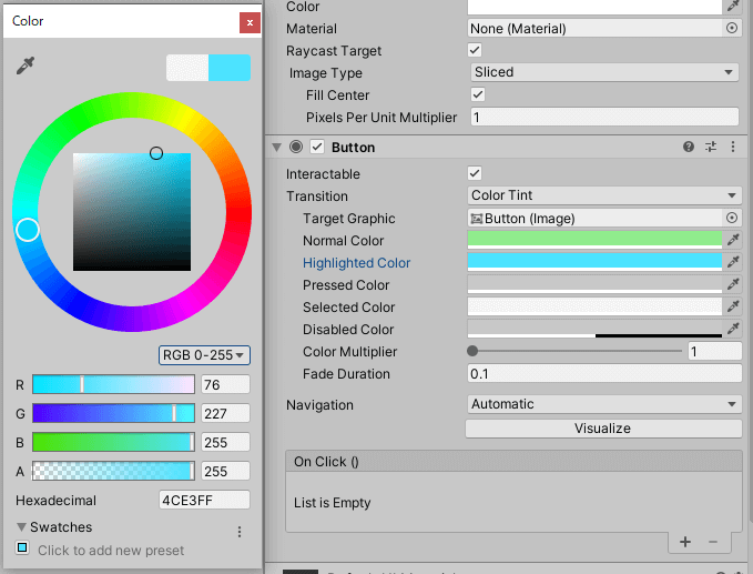
Light blue
Pressed Color to red.
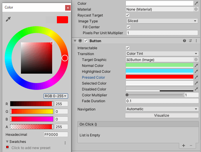
Red
Disabled Color, Color Multiplier, and Fade Duration are left unchanged.
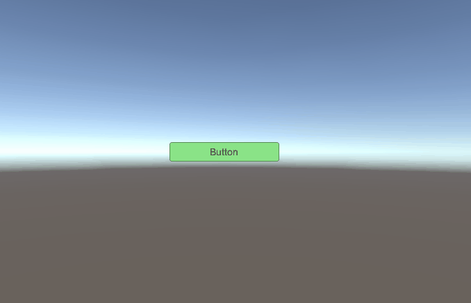
The result is as follows.
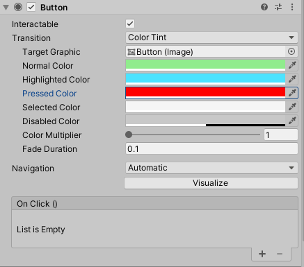
Color Tint setting of Button
Now let’s play the scene. Play it and click the button in the game window.

The color of the button has changed, but it turns white after the click. This is a result of an activated navigation mode.
Change the navigation setting from Automatic to None.
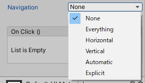
None
Let’s play it.
Play
Now the color changes as intended.
This is how one can set the action of the button.
We have only written about this color setting, but you can also set the image of the button.
We will discuss that in other article.
Button Placement
In its current position, the button is in the middle and somewhat obstructs manipulating the screen.
Let’s set the position of the button.
Select the Button object to view the Inspector window.
To set its position, size, etc., we can change the Rect Transform.
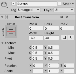
Rect Transform
You can adjust the position of the buttons by changing the topmost Pos X, Y, and Z values.
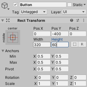
In this case, let’s increase the size of the buttons slightly and place them at the bottom of the screen.
Set the Width to -320, the Height to 60, and Pos Y to -400.
Rect Transform
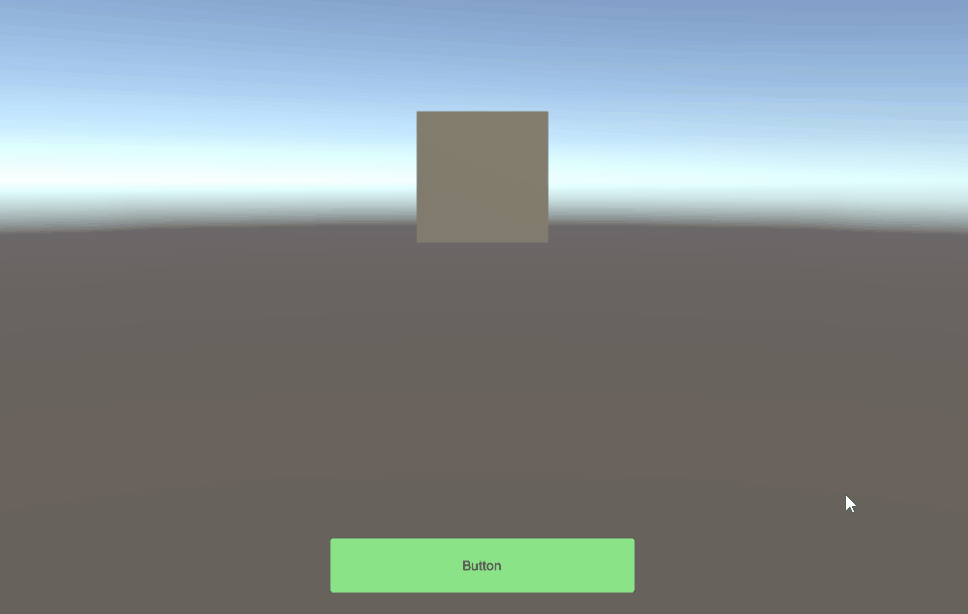
Set the size of the game window to 1920 x 1080.
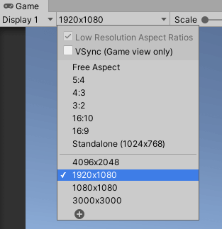
Game Window
One then has the following.
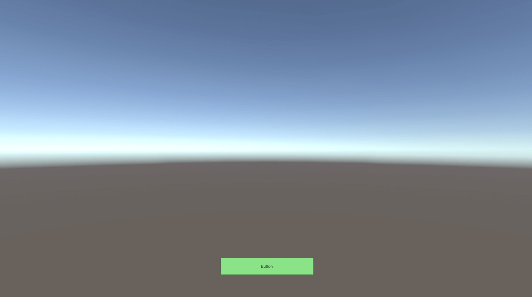
The game window
Now you can set the position!
Combining Button and Interaction SDK
Adding the Interaction SDK
Add the Interaction SDK.
Refer to the following article to learn how to add the Interaction SDK.
Making an Interaction Object
In this article, we will use the interaction SDK “STYLY_Action_Spawner” to create an interaction that generates an object when a button is pressed.
Creating the Spawn object
Create an object generated by Spawner.
Right-click in the hierarchy window to create a Sphere object.
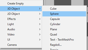
Create a Sphere
The name should be Spawn and the Transform should look like the following.
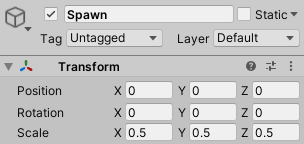
Transform
Attach Rigidbody and, when it spawns, set it to generate gravity.
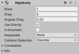
Rigidbody
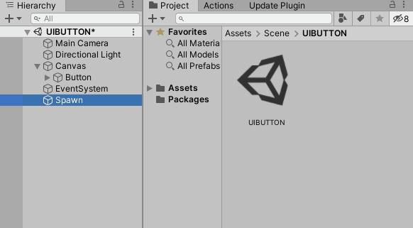
Finally, prefabricate the Spawn object.
Drag and drop the Spawn object from the Project window to the Hierarchy window.
Prefabrication
Remove Spawn on the hierarchy window.
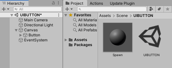
Removed from the hierarchy window.
Making Spawner Objects
Create a Spawner object to generate Spawn.
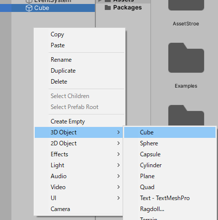
Create a Cube
Let the name be Spawner and the Transform be
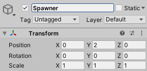
Spawner
Add the script STYLY_Action_Spawner in the Interaction SDK to this Spawner object.
Add it from the Inspector window.
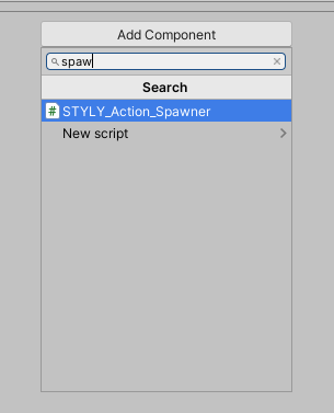
Add the script
Let’s set up STYLY_Action_Spawner.
Add a prefabricated Spawn object in the Prefab column.
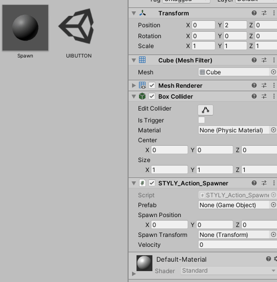
Set the Prefab
Make Spawn Transform a Spawner. Drag and drop it from the hierarchy window.
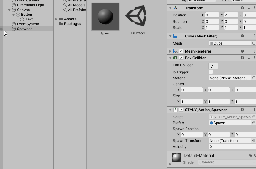
Spawn Transform
You are now ready to set up Spawner.
Button and Interaction SDK settings
Pressing the left mouse button creates a mechanism that generates a Spawn object from Spawner.
Click Button in the hierarchy window to bring up the inspector window.
Button
Configure the On-Click settings for the Button object.

On Click
Add the List first.
Let’s add a List by pressing the “+” button in the bottom right corner.
Add a List
After the List is added, drag and drop Spawner from the hierarchy window to the “None (Object)” field.
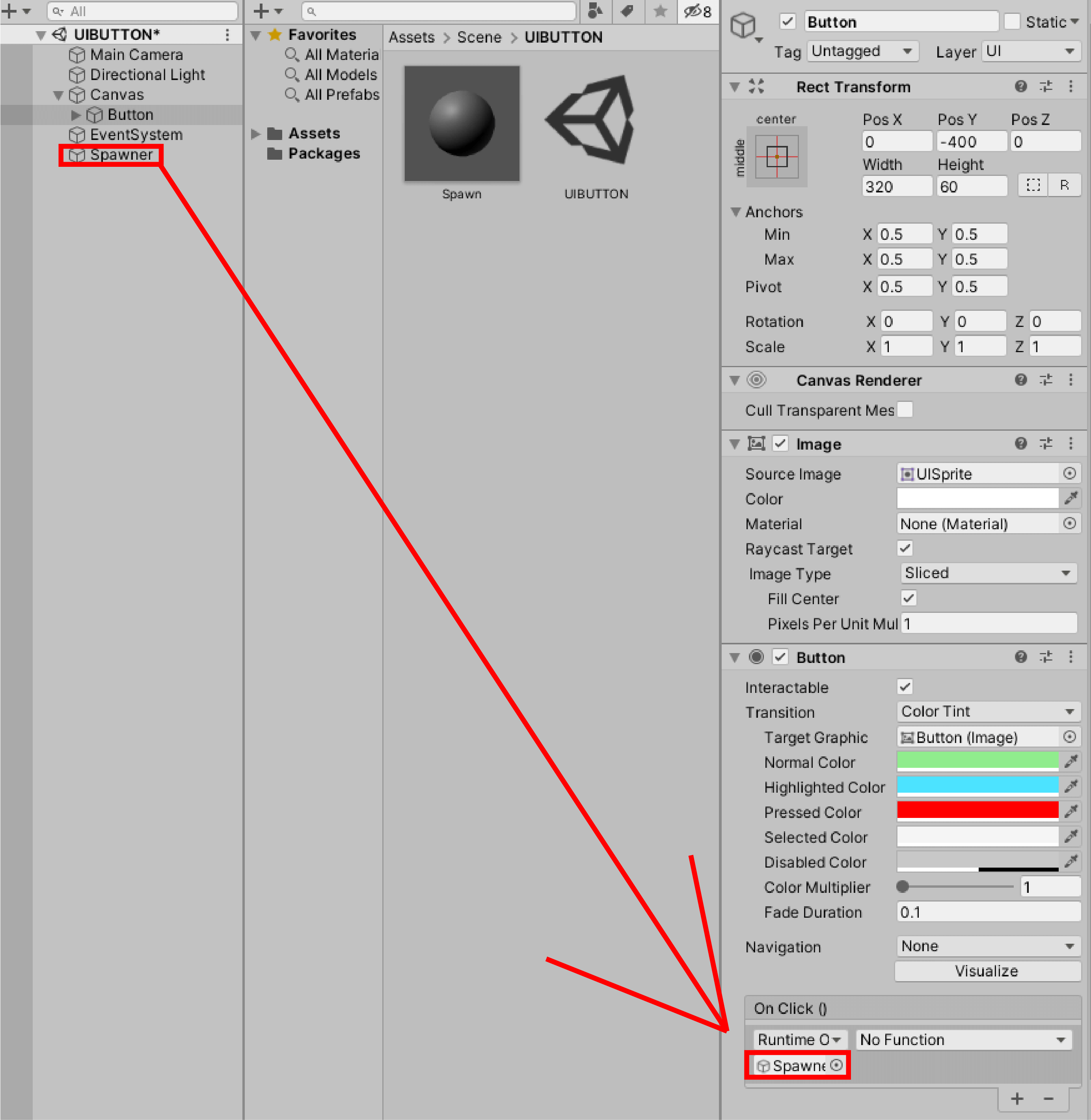
Drag and drop Spawner
Set the No Function field to STYLY_Action_Spawner > Spawn().
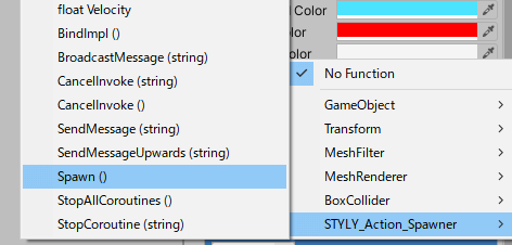
STYLY_Action_Spawner > Spawn()
You have now completed the configuration.
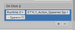
The setting
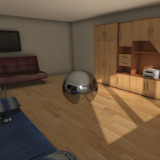
Let’s play it back to observe.
Interaction occurs
Press the button and Spawn from Spawner has occurred. It is now complete!
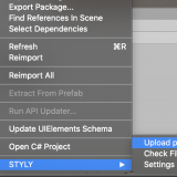
Upload to STYLY
Upload to STYLY. This time, we’ll upload it in a scene.
If your scene is too large to upload to STYLY, please see this article.
Upload your scene from your timeline to STYLY.
How to create an account

How to upload a prefab from Unity to STYLY
Introduction to NEWVIEW SCHOOl ONLINE
NEWVIEW SCHOOl ONLINE, where you can learn the basics of Unity and PlayMaker necessary for creating VR/AR content, from the basics to the application of PlayMaker, and learn the process of creating the fascinating content available on STYLY (we’ll also expose the production techniques).