Blender and Python can be used together to load time series data and visualize how the variables change over time. This technique makes it possible to express change points and other aspects of the data in a more compelling way.
This article explains how to use Python with Blender, and other points to keep in mind.
Reference Article
This article includes references to an article on visualizing earthquake data, so we recommend reading that as well.
![[Blender] Using Python to Create Earthquake VR at Home](https://styly.cc/wp-content/uploads/2022/04/blender-dataviz-howto-added-quakegraph-160x160.png)
What is Time Series Data?
Time series data is data that shows changes over an interval of time.
A common example includes population trend data, which we will use later for our graph.
Also used to analyze financial data, it is a very popular form of data with many existing applications.
Animating Time Series Data
In the next example, we will import two types of data into Blender.
The data we will use surrounds the population trends of Japan, and this includes data of population by sex.
Explanation of the Python Code
This is the code we will use in this example.
import bpy, csv

data = "FILEPATH" # (1)
current_scene = bpy.context.scene
target_object_male = current_scene.objects["Male"]
target_object_female = current_scene.objects["Female"]

scale = 20000000 # (2)
interval = 10 # (3)

current_frame = 1

with open( data, encoding='shift_jis' ) as csvfile:
  reader = csv.reader( csvfile )
  for i, row in enumerate( reader ):
    if i < 6: continue # (4)
    if i > 126: continue # (5)
    _,_,male,female = row[0:4]
    male_scale = float(male) / scale
    female_scale = float(female) / scale
    target_object_male.scale = (1,1,male_scale) # (6)
    target_object_female.scale = (1,1,female_scale) # (7)
    target_object_male.keyframe_insert(data_path="scale", frame=current_frame*interval) # (8)
    target_object_female.keyframe_insert(data_path="scale", frame=current_frame*interval) # (9)
    current_frame += 1
This code is also available on Gist.
I have added some annotations in the code for further explanation:
- Specify the location of the CSV file here.
- Since the population of Japan is very large, we will display the graph at a scale of 1:2,000,000.
- The “interval” specifies the interval value of the keyframes. For our example, we will insert one keyframe for every ten keyframes.
- This tells the code to ignore the first five lines because they are not relevant data.
- Like 4., but ignores lines 127 and over.
- Specifies the male value as the scale value.
- Specifies the female value as the scale value.
- Sets keyframes for male objects.
- Sets keyframes for female objects.
Step By Step Tutorial
Preparing the Objects
In our Earthquake data visualization article, the default cube was used as the target object.
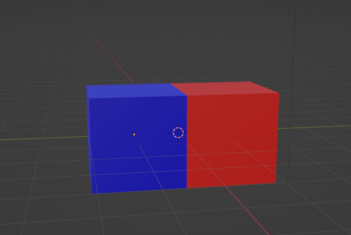
In this article we have two types of data, thus we will prepare two different objects in different colors – “Male” and “Female” respectively.
Preparing the “Male” and “Female” Objects
Next, we will set the origin point to the bottom of the objects:
- Select the object and switch to Edit Mode. Select the bottom face of your object.
- Press [Shift+S] to bring up the Snap menu and select “Cursor to Selected” (or press [2]).
- Return to Object Mode and select your object.
- Select “Origin to 3D Cursor” from the Origin Settings menu.
Repeat these steps for both the “Male” and “Female” objects.
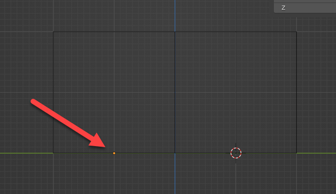
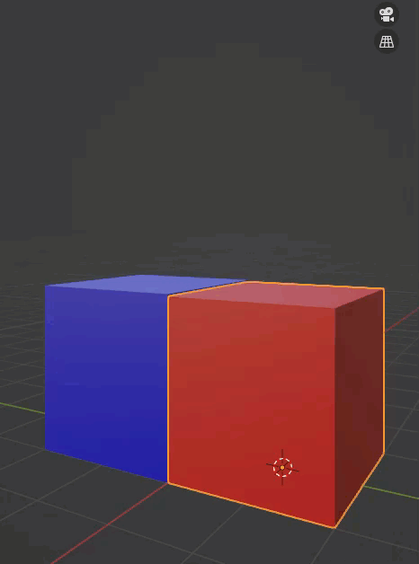
Set the origin to the bottom of the object
This will set the Z-axis scale value as the visualization value.
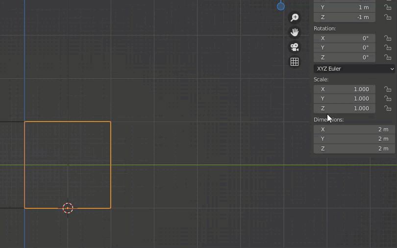
Z-axis scaling behavior when the origin is at the bottom
As you can see in the image, specifying a value for the z-axis scale will change the size of the object, while maintaining the origin position.
Importing the Data
If you import your code the same way as in the previous article, the keyframes will also be added in the same way.
We’ve specified the interval at ten keyframes, so there should be one keyframe for every 10 frames.
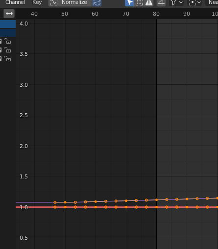
A keyframe at every 10 frames
Enter 1212 for the End frame, and your animation should turn out like this:
Population time series data (it should be displayed more smoothly)
How to Efficiently Bake Animation of Multiple Objects
Now that you have completed your animation in Blender, some specific settings are required when exporting multiple objects with different animations.
Exporting as FBX
When exporting in FBX format, disable “NLA Strips” and “All Actions” by unchecking the checkbox.
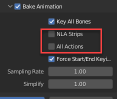
Settings for Exporting as FBX
Importing to Unity
When you import the FBX file into Unity, it should look something like this:
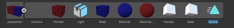
Importing to Unity
Select the animation “Scene” and press [Ctrl+D] to isolate this animation object.
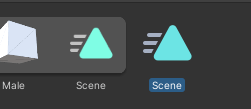
Isolating the animation object
Select Scene, and then from the top right menu of the Inspector, switch to debug mode.
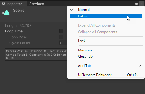
Switch to debug mode
“Inspector” should change to “Debug”, and you should see a different menu. Here, check “Legacy.”

Check “legacy”
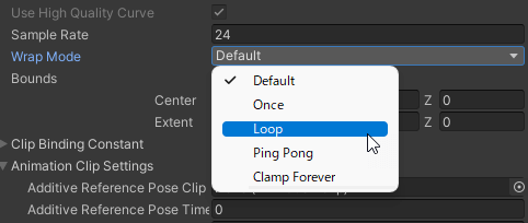
Then, set wrap mode to “loop” to make your animation loop.
Set wrap mode to “loop”
Creating Animation Components
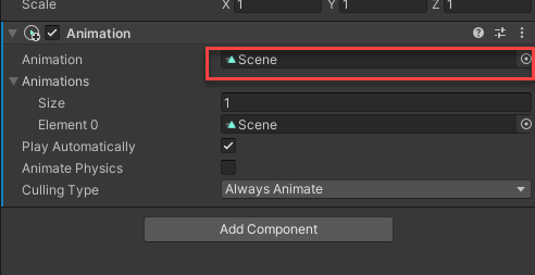
Add an Animation Component to your population object, then add the animation object that we configured previously.
Creating an Animation Component
Finally, make this a prefab and upload to STYLY.
If you want to learn more about animation in Unity, read the article below:
![[Introduction to Blender] How to make animation](https://styly.cc/wp-content/uploads/2021/05/IMG_92011-160x160.png)
That’s it! Below is an example of our completed scene from this article, with an additional bloom post-effect.
Following our example, you can add more animation to create compelling data visualizers for situations such as business presentations and marketing promotions.
Points to Note When Visualizing Time Series Data
When visualizing time-series data, there are a few things to be aware of.
Data Variation
The amount of information that can be displayed will vary depending on the density of that data. For example, data for 10 people from a population of 100 will differ from that of a population of 10,000.
If you are dealing with a very large number, we recommend displaying the data logarithmically as a workaround.
Playback Speed
The amount of information and overall impression that can be delivered will differ depending on the playback speed. There will be a difference between playing back a year’s worth of data in one minute compared to ten seconds.
To simply display the amount of change, use a short playback time. If you want to highlight the subtle movements brought about by the change, use a longer playback time to showcase your graph in more detail.
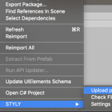
Uploading to STYLY
Let’s upload your 3D model to STYLY.
How to create a STYLY account:

How to upload to STYLY:
How to upload from Unity to STYLY:
For questions about STYLY, bug reports, and improvement requests, please contact the STYLY FORUM:
https://en.forum.styly.cc/support/discussions
By importing time-series data into STYLY, the data is visualized making the changes easier to recognize. We encourage you to try your hand at visualizing various types of data.
We have also written an article on how to simulate earthquakes based on seismographic data, so be sure to read that as well.
Certified (QA) by Shota Shawn Yoshizawa
Edited by SASAnishiki
Translated by cpnnn